Information and statistics make the world go 'round. They can tell stories, make compelling arguments, help you create plans, and even aid your cause as you make your (ultimately futile) argument about where you and your significant other should eat dinner. But smart businesses (and spouses) know that the statistics themselves are only half the battle—you also need to know how best to present them.
Some organizations bury their most important data in a wall of text or mundane charts, but that's high treason in the land of data visualization—you need to let your information shine. Instead, channel your inner Van Gogh and turn your data into a masterpiece worthy of the Museum of Modern Art (MoMA). Doing so will make your messaging more effective, persuasive, and memorable.
Here's a guide to creating the perfect data visualization that will upgrade your engagement and (maybe) land you the coveted corner slot at your local art gallery.
Table of contents:
What is data visualization?
Data visualization is the graphical representation of information. It involves turning simple data points into graphs, charts, flowcharts, and other visual wonders. Overall, data visualization helps you communicate a message.
You can use data visualization to turn any information into something that catches your audience's eye. This can be:
Creating an infographic in a blog post that shows your customers how your business is 39% more effective than the competition
Using visualizations to turn a standard product pitch into an Oscar-worthy presentation—taking potential clients from dozing off to signing on the dotted line
Transforming raw, boring data into captivating visualizations that help key stakeholders understand how your business is progressing
There are no rules or limits for how to visualize your information, but to start, you should familiarize yourself with a few common types.
14 real-life data visualization examples (by type)
Data visualization comes in all shapes and sizes, from simple lines and graphs to complex plots. These aren't the most attractive examples out there, but they're all easily accessible and createable via free apps. Instead of showing you a bunch of fancypants visualizations that would cost you an arm and a leg to outsource, these are all examples of things you could do on your own.
Here are 14 examples you can use to jumpstart your efforts.
1. Coca-Cola's sustainable sourcing (bar chart)

Bar charts are rectangular bars that show the value of different categories. They can be formatted either vertically or horizontally, with each bar proportional to the value it represents.
When to use a bar chart: Use bar charts when you want to compare a few categories that have easily distinguishable differences. This makes it easier for your audience to understand those differences—for example, if they want to judge just how sustainable Coca-Cola is operating.
When not to use a bar chart: You'll want to avoid bar charts if you need to show a large amount of data or a dataset over time.
2. Popularity of "Olympic Games" as a Google search term (line chart)

Line charts show trends and changes in data over a designated period. They consist of individual data points connected by line segments, making them easy for readers to follow.
When to use a line chart: Use line charts when you want to track or visualize changes over time. They're perfect for representing financial information or showing long-term fluctuations in the keyword "Olympic games" (which, oddly enough, seems to peak every two years—a mystery that will no doubt spark academic debate for years to come).
When not to use a line chart: Avoid line charts if you want to compare large amounts or several types of data.
3. Apple's workforce statistics (pie chart)

A pie chart is a circular graph divided into sections. The whole of the graph indicates 100%, and each section shows how much each variable contributes to the dataset.
When to use a pie chart: Use pie charts when you want to compare a limited number of categories with significant differences. These charts are a good choice for things like evaluating what devices your website traffic is coming from, seeing how you're spending your time, or illustrating how many slices of peach cobbler your uncle swiped at Thanksgiving.
When not to use a pie chart: Avoid pie charts if you have a lot of categories (more than eight) or you're emphasizing precise values.
4. Employment fluctuations 2023-24 (scatter plot)

A scatter plot uses dots to represent the correlation between variables in the same dataset. It plots points along an x- and y-axis to help users visualize patterns and commonalities.
When to use a scatter plot: Use scatter plots when you want to show how two variables relate to each other. This can be useful to spot positive or negative relationships—like the graph above showing how a percentage change in employment affects the total numerical change in different metro areas.
When not to use a scatter plot: Steer clear of scatter plots when you want to compare more than two different variables simultaneously.
5. NASA's tropical cyclone distribution (histogram)

Histograms use bars or plot points to show frequency distributions. They're similar to bar charts, but the main difference is that histograms evaluate one continuous variable while bar charts show how different variables compare.
When to use a histogram: Use histograms when you want to analyze or show the distribution of a single variable. Suitable real-world applications include the age distribution in a population, the distribution of test scores, or the distribution of tropical cyclones, which you should definitely, totally not worry about.
When not to use a histogram: Avoid histograms when you want to compare multiple groups of data—use bar charts instead.
6. U.S. temperature ranges (heatmap)

Heatmaps show the magnitude or difference in values with color. You can format them in a standard graph format or—like in the example above—as a literal heatmap to evaluate temperature ranges across a region.
When to use a heatmap: Use heatmaps when you want to highlight high and low activity in the same dataset. This can be useful in scientific applications, showing where website visitors hover their mouse and click, and when you need to argue that you're definitely not going to southwest Arizona for your family's summer vacation.
When not to use a heatmap: Heatmaps aren't a good choice if you have a small amount of data or if you need to be precise with your measurements.
7. Human development index compared to income (bubble chart)

Bubble charts are upgraded versions of scatter plots that can show up to three dimensions of data using circles or bubbles. They're typically plotted on an axis, with the bubbles themselves being larger or smaller to represent differences in data.
When to use a bubble chart: Use bubble charts when you want to compare three variables in a clear and visually appealing way. They're useful in business analytics, market research, and other situations where you want to emphasize relationships between data points.
When not to use a bubble chart: Don't use these in situations where precise values are important, as overlapping bubbles can occasionally obscure important information.
8. 2020 U.S. election results (choropleth map)

Choropleth maps use color to represent data values across geographical areas like countries or states. While they're similar to heatmaps, the major distinction is that choropleth maps always have clear boundaries, while heatmaps can be more fluid.
When to use a choropleth map: Use choropleth maps when you want to display data tied to specific locations. Applications like election results, demographic variables, and economic statistics are good choices for this method.
When not to use a choropleth map: Don't use choropleth maps when your data is not geographically bound or if it varies significantly in the regions themselves.
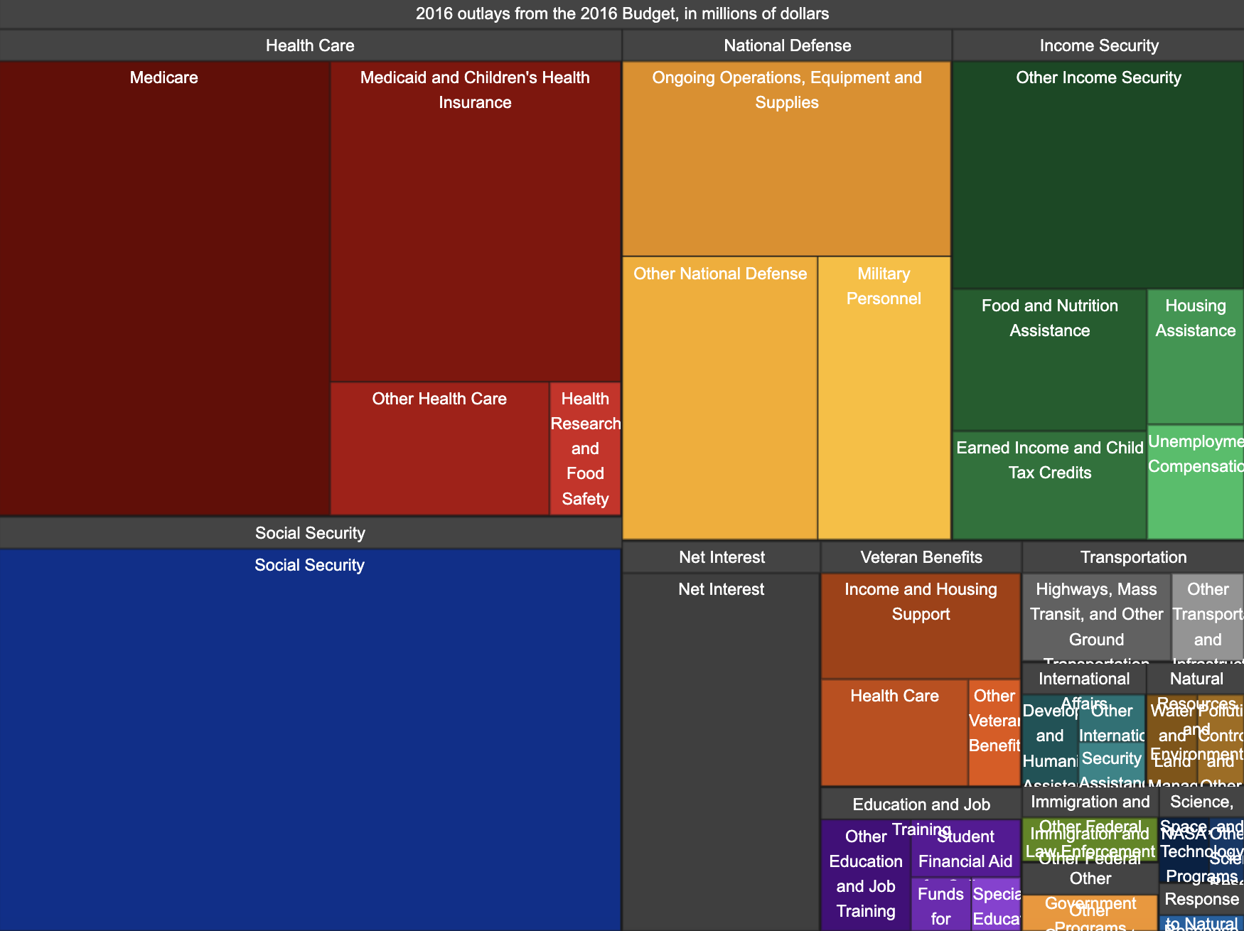
9. 2016 U.S. budget allocation (treemap)
Treemaps use nested rectangles to show how different variables contribute to a larger figure. They're similar to pie charts, but the main difference is that these visualizations can effectively show many data figures and the relationship between them, rather than just a handful you can express with pie charts.
When to use a treemap: Use treemaps when you want to visualize large amounts of hierarchical data in a space-efficient way. This can include budget allocations, financial information, and information technology.
When not to use a treemap: If your data has no clear hierarchy, try a different visualization method. In a much more serious example, you should absolutely not use treemaps when you need to evaluate where all the money in your checking account is going every month.
10. Soccer player statistics (radar chart)

Radar charts—also referred to as spider charts or web charts—display information in a chart with multiple axes. Each axis represents a different variable, and the data points are often connected to form a polygon.
When to use a radar chart: Use radar charts to compare multiple variables between two or three items, like product features between iPhones and Android or employee performance figures. Alternatively, you can use radar charts to compare your high school football stats against the current team to show once and for all that you would have gone pro if you hadn't torn your ACL senior year.
When not to use a radar chart: You shouldn't use radar charts when you want to compare large datasets or if precise information is important.
11. Target Corporation stock performance (box plot)

Box plots—alternatively called box and whisker plots—summarize the distribution of data by showing its median, outliers, and quarticles. The "box" represents the middle 50% of the data point, while the "whiskers" represent the smallest and largest values (removing stark outliers).
When to use a box plot: Use box plots when you want to compare the distribution of a continuous variable, like stock charts. In the example above, the box plot shows Target's stock price over the course of a few months, detailing the average price over that time, as well as the smallest and largest points at which it was sold or bought.
When not to use a box plot: These charts aren't the right choice for small datasets.
12. Revenue comparison (waterfall chart)

Waterfall charts are visualizations that show positive and negative data in bars. The main difference from standard bar charts is that waterfall charts show sequential data that can be both positive and negative. Each bar starts at the end of the previous one, creating the waterfall look.
When to use a waterfall chart: Use waterfall charts when you want to highlight sequential, related data. The example above is a great use of these visualizations—a chart that shows sales revenue over time. You could also use one to represent how different departments contribute to an overall business goal.
When not to use a waterfall chart: Don't use waterfall charts when you want to compare unrelated data points or if your data is large or complex.
13. Sales funnel conversion rates (funnel chart)

Funnel charts are visualizations that show different stages in a sequential process. They show how individuals move through a process or ways in which data diminishes as time goes on.
When to use a funnel chart: Use funnel charts when you want to show the difference between stages in a process. This can include showing how many consumers go from cold leads to paying customers or detailing a project management process to identify bottlenecks or areas for improvement.
When not to use a funnel chart: Don't use funnel charts with information that doesn't follow a distinct path or process.
14. EU energy balance flow (Sankey diagram)

Sankey diagrams use arrows or lines to represent the movement of data from one point to another, similar to how you might create a mind map. Typically, thicker lines represent larger datasets or information, while thinner lines represent smaller datasets.
When to use a Sankey diagram: Use Sankey diagrams when you need to track and visualize the flow of data, resources, or information. Common applications include energy usage (like the example above), material flow in the production process, or financial applications that show where a budget is going.
When not to use a Sandy diagram: Sankey diagrams aren't the best choice when your data doesn't have a clear flow or if data points are unrelated.
The benefits of data visualization done right
Data visualization can transform your ideas from suitable to spectacular. Without oil and canvas, an earless artist's opinion of the French countryside may have been lost to history as simply the ramblings of a misunderstood creative. Through the power of visualization, however, that painter created "Starry Night," immortalizing the patch of land forever.
Now, am I saying that your Sankey diagram or choropleth map is going to catapult you into international fame? Probably not. But here's what it can do:
Enhance data comprehension: Data visualization transforms complex data into charts, graphs, and maps—making the information easier to understand. Boring data charts can make even the most enthusiastic audience's eyes glaze over, but if you communicate that information in a visually appealing way, your engagement is likely to soar.
Facilitate faster and better decision-making: When people can see data, they're more likely to see the bigger picture. When that happens, they can make quicker decisions regarding next steps and future action plans.
Communicate insights effectively: Visual elements make information more appealing. This makes it more likely that your viewers—customers, employees, or whoever is viewing your visualization—will understand your message.
Identify trends and patterns: Important information can easily be buried if you don't know what you're looking for. Data visualizations can pinpoint trends and patterns that may not be immediately obvious when looking at a group of numbers.
Mistakes to avoid when working with data visualization
While you shouldn't expect to get it perfect your first time, there are a few common mistakes you should avoid when starting out with data visualization:
Overloading information: You may be tempted to include every relevant data point or piece of information in your visualization, but that's not effective. The more convoluted a graph or chart is, the harder it is to read and interpret. Stick to the most impactful data points.
Choosing inappropriate chart types: Selecting the wrong type of chart for your information can confuse your audience or misrepresent your data. Make sure you select the right type of visualization for your needs.
Ignoring the audience: Different audiences have different interests, expertise, and knowledge. Failing to tailor your messaging and visualization type to the end user can result in a confusing experience.
Neglecting design aesthetics: Choosing the wrong aesthetics or an ineffectively designed template can make your information confusing and less impactful. Poor design choices, like clashing colors or inconsistent fonts, can make your information look like an eighth-grade graphic design project.
Use the right data visualization tools
Believe it or not, you've just received a crash course certificate in data visualization. You've seen what it is, best practices, and 14 real-life examples you can draw inspiration from. All that's left to do is cut your ear off (metaphorically speaking, of course) and create visualizations that will rival Vincent's best work.
But to make the most of your efforts, you need the right tools.
Data visualization isn't effective without strong data—so consider business analytics software like Tableau or Zoho Analytics. They'll give you the data you need and help you visualize it. Two birds, one app.
Spreadsheet apps like Google Sheets and Excel can turn data into charts with the click of a button, so if your data already lives there, give that a try first.
If you're creating something simple, free design tools are your best friend. Canva—especially with its AI tools—can help you create basic visualizations quickly.
Your project management tools might have built-in visualizations, in the form of pie, line, and bar charts, or if you're tracking progress over time, Gantt charts.
If you're going all out and want to do something really fancy for a big marketing campaign, try a dedicated data visualization tool like Datawrapper or Infogram.
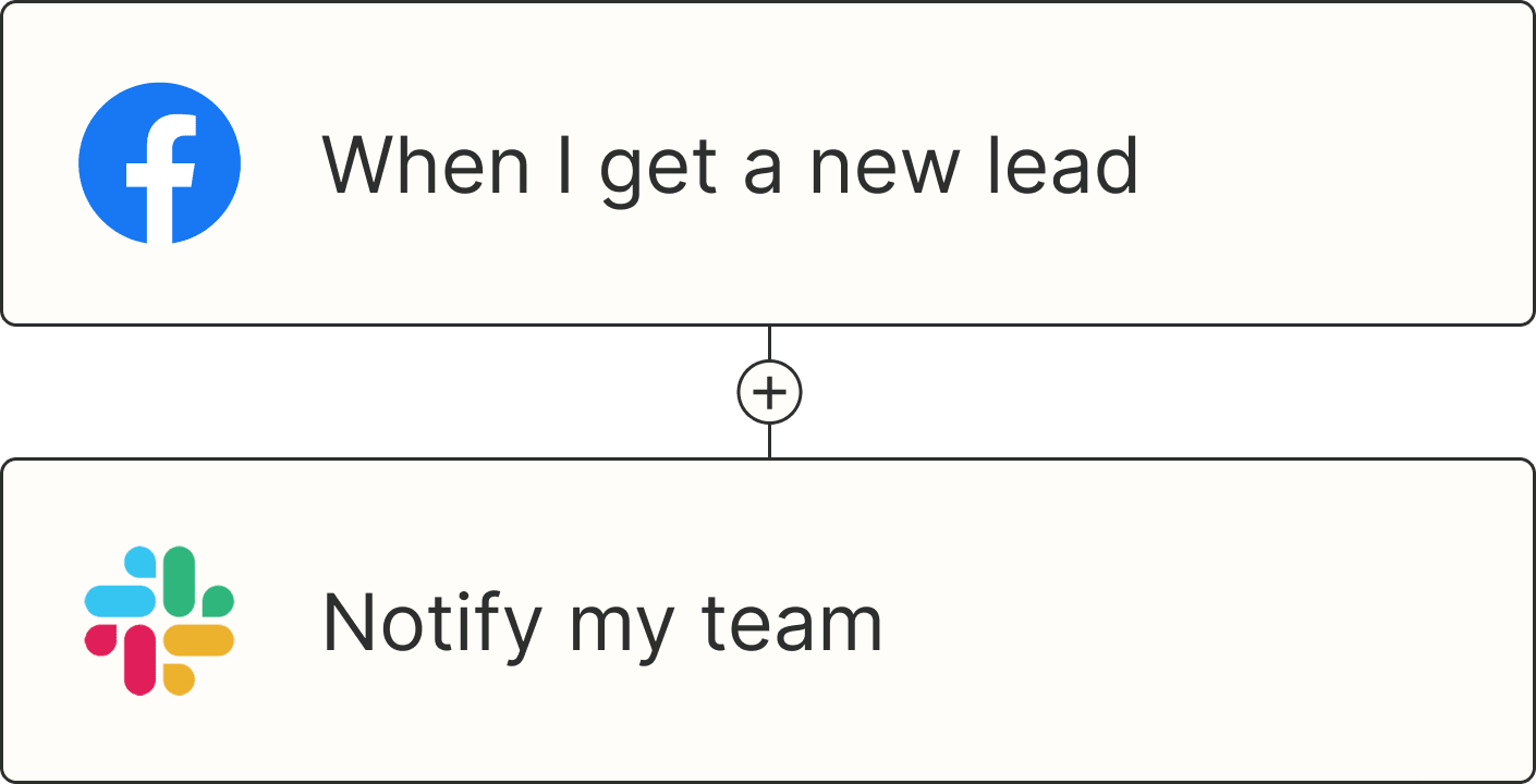
And once you've got all the right tools, Zapier can connect them to help you streamline data collection and create and visualize automations.
Related reading:
