In a world where brands are expected to pump out more visual content than ever—from social media images and online ads to printed mailers and event swag—creating designs from scratch each time isn't scalable. As a designer who's helped businesses with their branding strategy for the past 15+ years, I can tell you: design templates are a powerful way for brands to consistently deliver professional visual assets at scale.
In the work for my agency, I regularly hand off templates to my clients as part of their design packages, and more recently, I launched a DIY branding app for startups, Mojomox, which offers basic templates alongside a logo and brand kit. Not only do templates save my clients and customers money, but they also save time by removing the need for cross-team collaboration on every project requiring imagery.
But as easy as templates are, they can also easily be used poorly. I regularly see companies using wildly different templates for every graphic they make, not customizing them for their brand identity, or changing a template so much that it barely resembles the original design. Those moves lead to a lack of brand consistency and poorly-designed graphics. Plus, they create more work for folks who are just looking for a way to create images quickly.
It's time to stop complicating what's meant to be a simple tool. Here's my process for using templates as part of your workflow so that even non-designers can create pro-level graphics, faster.
1. Know your brand basics
The strongest foundation for ensuring that templates are easy to use and consistent for your brand is solidifying what your visual brand identity is: your brand colors, fonts, and general aesthetic.
This will prevent you from spending hours tinkering with colors and fonts until you get them just right—you can simply apply predetermined selections and move on. Using your brand's unique style will also ensure that your graphics will stand out from others on the web, even if they're using the same template. Your brand colors, fonts, and photo aesthetic are what will make a template look like it was designed just for you.
This visual identity is usually laid out in what's called a brand book. At a minimum, a brand book will include the colors and fonts that your brand should use in any graphic.

Some brand books share additional design guidance. For instance, they may describe the general aesthetic the brand should aim for, whether minimal, playful, bold, or retro. They may include a mood board of the type of photography that should be utilized. And they may include suggestions for color combinations that work well together when you want to mix up your look.

Once you have a brand book to reference, you can simply apply your brand colors and fonts to any template you find, and—just like that—it will feel consistent and well-designed.
Hopefully, your company already has a brand book that outlines these things. If not, consider hiring a designer to create one, or DIY your own brand book to use until a professional can help. There are plenty of tools and guidance online to help you choose colors that work well together and fonts that are legible while still standing out, like Adobe Color, Typewolf recommendations, and even my app, Mojomox.
Designer tip: Don't know how to apply your brand colors to a graphic? Your brand book should include hex codes (alongside RGB and CMYK values), which are a set of letters and numbers after a hashtag. You can copy the hex code and paste it into the color selector on any design software to populate it with your exact brand colors.

2. Pare down your template options
Anyone who's ever browsed an online template library knows just how many designs are available on most platforms. Trying to choose from all of the possible options is not only overwhelming, but it can also lead to a lack of consistency if you simply select a different template that catches your eye each time.

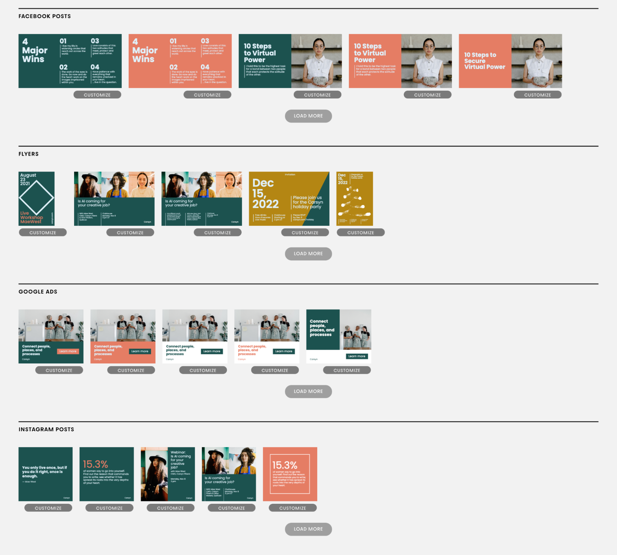
Instead, before you even start using templates as part of your workflow, build a template library. If you have the budget, pay a designer to create a custom library for you—if not, spend a few hours browsing online template libraries to narrow down some favorites to use moving forward.
As you're building your library, ask yourself:
What types of graphics do you need? For instance, you may want templates for each type of social post you publish, for event flyers, for ads on different platforms, and for newsletter images.
What information do you need to convey? The best templates are often the simplest. For each social platform, you may want a few that center an image and a few that focus more on text. For ads, you'll want to be sure there's a prominent place for a call to action.
What's the aesthetic you're going for? Whether your brand is clean and simple, bright and bold, or soft and organic may influence the templates you decide to use.
It's best to envision your ideal templates before you even start looking at what's available, so you don't get distracted by trendy designs. Instead, you'll make selections that feel cohesive and suit your needs.

I recommend choosing only one or two different templates for each channel you need to publish on regularly (including a mix of text-based, photo-based, and hybrid). When clients worry that narrowing choices down to a small batch will make their channels too repetitive, I remind them of a few things. For starters, you can create plenty of variation within each template using different color combinations and photography. And more importantly, customers don't care about every individual graphic as much as you might think. What's more important is your brand cohesion and that the information is getting across clearly instead of getting lost in a flashy but convoluted design.
Ideally, your design team can create templates for you as part of your brand kit. If not, choose a handful from the web to work with, apply your brand basics to ensure they're cohesive with the rest of your marketing, and stick to those moving forward.
Designer tip: A good template should have a good design hierarchy—in other words, it should use visual tools like text size and color to highlight the significance of information. The most important point should be set in the biggest and boldest type, while supporting text should be smaller. If you see a graphic that utilizes a lot of similar-sized text, you probably want to browse for something else.
3. Don't think about design
It sounds counterintuitive, but once you have a handful of branded templates to work with, you should never have to think about design again. Templates don't work when you start tinkering with them and rearranging elements, since that alters the careful placement and hierarchy a professional thought so much about.
Instead, start by determining the information you need to get across. Write the content and consider any photos or imagery you need before you even look at your templates. Then, select one that best suits the information at hand: Is there a lot of text or very little? Is there an image or not? This should quickly guide you to the best template to use.
Then, pop in your copy and any photos, and you'll be done—just like that!
Ultimately, good design is more about function than form. Is your marketing goal getting across? Is the text readable and arranged so that the most important point is the most obvious? Does it look and sound like your brand? With the right set of templates and a solid brand book in place, it should be easy to answer a resounding yes to all of these questions and get your graphics out the door.


