What comes to mind when I try to think of a powerful CTA (call to action) is the one my dad expertly executed by bellowing at me daily to get a job. Fresh from a college experience that promised the world but mainly delivered a mountain of student debt, I was under the assumption that adulthood was supposed to be full of quirky adventures and unexpected meet-cutes, not unsolicited career advice from a man who still struggles to connect to Bluetooth.
Eventually, his CTA successfully motivated me to become a productive member of society. And that's the power of a compelling CTA—it jolts you out of your passiveness and into action. In my case, I got a job despite a lifelong belief that work is something to avoid unless absolutely necessary. (Look at me now, Dad!)
Just as personal CTAs can lead to transformative life decisions, marketing CTAs have the potential to significantly impact user engagement and conversion. Want to craft your own magnetic calls to action? Keep reading for tips and examples of what makes great CTAs, well, great.
Table of contents:
Call to action generator
To use this CTA generator, tell the bot the specific action you want your audience to take—like signing up for a newsletter or making a purchase. The bot will ask you a few more questions to help identify your target audience and discover what messages will engage them.
Based on this information, the generator will create custom CTAs. You can then chat with the bot further to refine them, or tweak and edit on your own.
Chatbots use AI models. Because AI is a new technology that generates dynamic on-demand responses, we always encourage you to fact-check and verify responses are correct/meet your needs. Zapier can view conversation history for quality and improvement purposes (we cannot identify individual users).
What is a call to action (CTA)?
A call to action (CTA) is a prompt or message, typically formatted as a button or link, that encourages the audience to take a specific and immediate action.
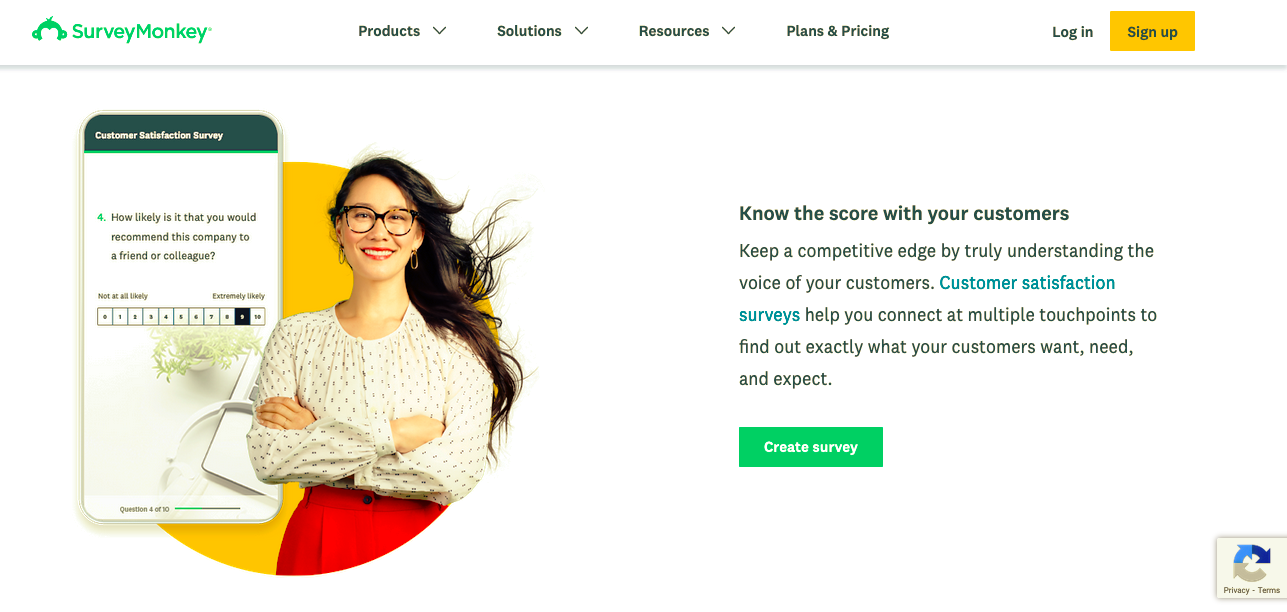
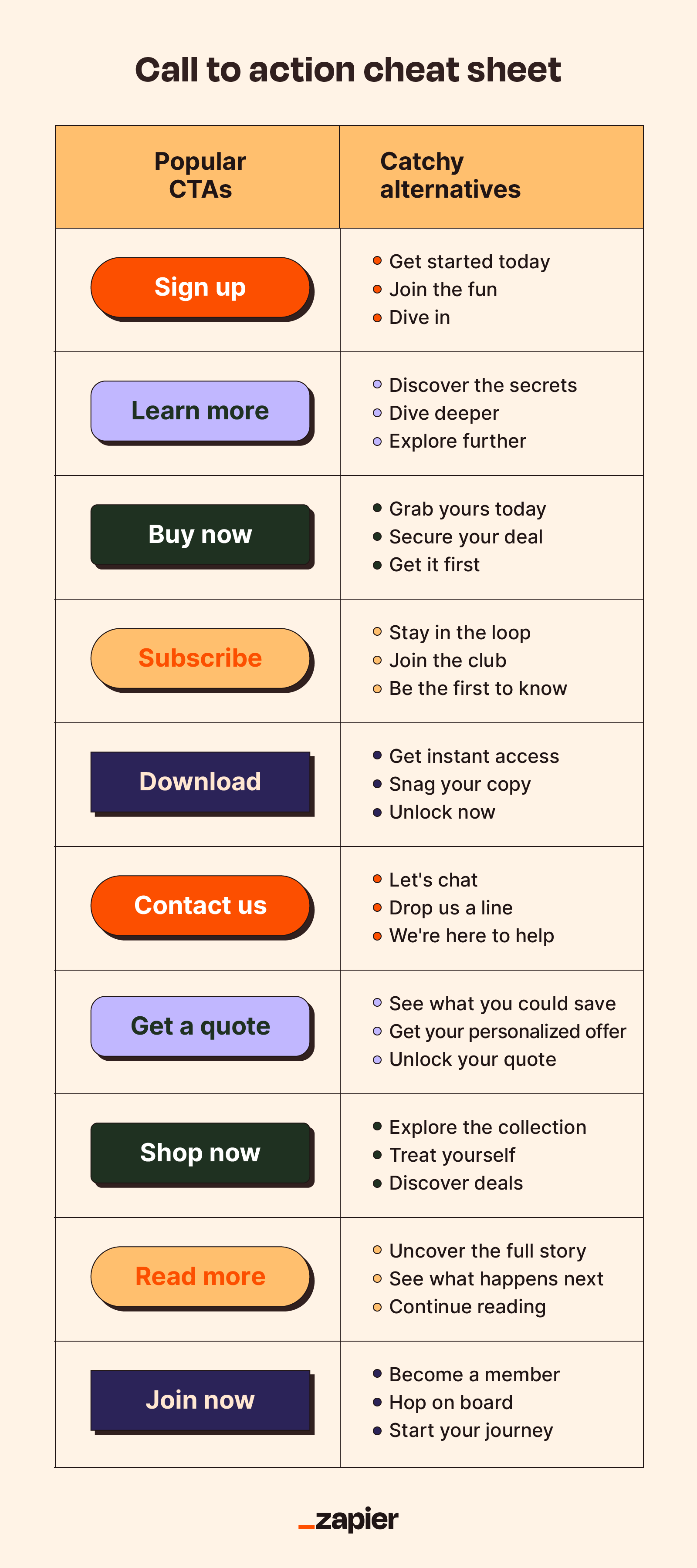
CTAs are commonly used in marketing and sales contexts to guide users toward the next step in their journey, whether that's purchasing a product, signing up for a newsletter, or forwarding that chain email to all of their friends to avoid eight years of bad luck. Some common call to action examples include:
Sign up
Learn more
Buy now
Add to cart
Contact us
Download
Types of CTAs
Here's a primer on some of the most common CTA types.
CTA Type | Purpose | Ideal placement | CTA example |
|---|---|---|---|
Form submission | Encourages users to fill out a form, providing their information for various purposes | Contact page, request for quote page, or as part of lead generation forms | "Get a free quote" |
Read more | Invites users to explore further content by clicking on a link or button | End of blog posts, related articles sections, or teasers | "Want to learn more? Click here to read the full article" |
Product or service features | Directs users to a page or section highlighting the key features of a product or service | Homepage, product pages, or service descriptions | "Discover the key features that make our new smartphone stand out" |
Social sharing | Encourages users to share content or products on their social media platforms | Near the content being shared, such as articles, images, or videos | "Share this amazing deal on Facebook" |
Lead to purchase | Guides potential customers toward making a purchase after they've shown interest or engaged with your content | Product pages, shopping carts, or as part of drip marketing campaigns | "Add to cart and enjoy 20% off your first purchase" |
Closing the sale | Used to seal the deal or complete a transaction, often found in the final steps of the checkout process | Product pages, checkout pages, or limited-time offer banners | "Limited stock available. Buy now to secure your item!" |
Event promotion | Promotes an upcoming event and encourages users to register or learn more about it | Event's landing page, email invitations, or display banners | "Register for our webinar" |
Related content | Suggests other relevant content to keep users engaged and exploring your website | End of articles, blog posts, or in related articles sections | "Explore more on this topic" |
25 call to action examples (and why they work)
Let's dissect some real-life CTA examples to learn how to use strategic copy, design, and placement to transform an ordinary CTA into a magnetic, can't-resist-clicking force.
1. JD + Kate Industries

CTA placement: Exit intent pop-up
CTA type: Lead to purchase
What it does right: Attention-grabbing, offers a valuable incentive, humorous and lighthearted
The brazen use of "WAIT" isn't a gentle suggestion; it's a command. Like someone grabbing your elbow just as you're about to duck out without a goodbye. It's intrusive, but in a way that makes you think, "Alright, what did I miss?"
Combine that with the sheer audacity of telling someone they've forgotten to buy not just one candle but HUNDREDS of candles. It's dramatic, it's over-the-top, and frankly, it's memorable. With copy like that, it's hard to resist giving away your email address because one can only wonder what their emails would be like.
2. Giftwrap.ai

CTA placement: Display ad
CTA type: Lead to purchase
What it does right: Engaging, personalized, visually appealing
It's refreshing to see something that doesn't pretend to know you better than you know yourself. Instead of telling you what your significant other might want, it's asking you to fill in the blanks. A little bit of personalization without the personal touch. Clever, really.
As for the CTA button, the emoji is a nice touch. Plus, the use of "show" rather than "buy" or "see" is like a little magic trick. "Voila! Here are your gift options."
3. Who Gives A Crap

CTA placement: Facebook ad
CTA type: Lead to purchase
What it does right: Benefit-oriented language makes the CTA more appealing to users and encourages them to take action
By comparing "Us" and "Them," they're not only offering a quantitative argument (385 sheets versus a paltry 299), but they're also injecting a bit of humor. And while I've never been one to count sheets, if you're telling me I get more for my money and it'll look cute next to my collection of HUNDREDS of candles, I'm sold. Also, describing the competitor as "objectively very boring" is a sentiment I've often used to describe my social life, but to see it on toilet paper? Well, that's something.
"28% cheaper than Charmin," followed by a "Shop Now" button, isn't just a call to action; it's a call to revolution! A revolution of, well, saving on toilet paper and perhaps bringing a touch of flair to a decidedly unglamorous aspect of life.
4. Ahrefs

CTA placement: Homepage header
CTA type: Lead to purchase
What it does right: Creates curiosity, addresses pain points, social proof
There's something oddly reassuring about a direct, no-nonsense headline promising exactly what every website on this overcrowded internet wants: visibility.
The name-dropping of heavy-hitter customers serves as a strong endorsement. It's not saying, "Look who trusts us," but rather, "Look who you'd be in company with." And that "17,961 users joined Ahrefs in the last 7 days" is a nice touch. It's not boastful, but it's certainly not modest. It's a subtle prod to the undecided that says, "While you're contemplating, thousands have already decided."
This CTA is a perfect blend of self-assuredness, social proof, and just the right amount of peer pressure.
5. Ruggable

CTA placement: eCommerce email
CTA type: Limited-time offer
What it does right: Straightforward, creates a sense of urgency, sparks curiosity
There's something unapologetically direct about this ad. "Final hours to save until Black Friday"—it's not asking you, it's telling you. Time's running out, and if you're the type who thrives on the thrill of a last-minute decision, this is your moment.
The CTA is a master class in suspense. That "% OFF" lurking behind the button is like when someone says they've got news, but they'll tell you later—except instead of being left alone with your intrusive thoughts, conjuring up worst-case scenarios, you get a sweet discount on a cute, machine-washable rug.
6. HEY

CTA placement: Homepage header
CTA type: Product demo
What it does right: Solution-oriented, benefit-driven, relatable
"Email sucked for years. Not anymore—we fixed it." You mean that thing everyone's been complaining about since the dawn of the internet? It's about time, and I'm all ears.
The rest of the copy succinctly addresses customer pain points and aspirational desires. It paints a picture of a world where checking your email might feel more like reading a postcard from a friend rather than sifting through a pile of bills.
The CTA button, "See how HEY works," is straightforward. No flowery language, no over-the-top promises. Just a simple invitation.
7. Big Blanket Co

CTA placement: Facebook ad
CTA type: Limited-time offer
What it does right: Creates a sense of urgency, visually appealing, reassuring
The urgency of "limited quantities available...Reserve yours now before it's too late" is classic retail psychology. It's both an announcement and a challenge, like when a kid hears the whistle signaling the end of adult swim and races to be the first one to cannonball into the pool.
The "Limited Restock [Massive 10'x10' Blankets] 100 Night Guarantee + Free Shipping" is the clincher. It promises a combination of rarity, quality, reliability, and convenience, like a call to action Megazord.
8. AirHelp

CTA placement: Homepage header
CTA type: Lead to purchase
What it does right: Addresses pain points, benefit-oriented, actionable
The genius of this homepage lies not just in its promises but in its initial question—a direct prod at the pain point of its target audience that immediately evokes a visceral response. Most, if not all, travelers will mentally answer "yes" to this, recalling their own airport nightmares. It's a calculated reminder of a situation everyone wants to avoid, making the solution they offer even more enticing.
"Get up to $700 compensation per passenger, no matter the ticket price." The clarity here is commendable. They're not promising the world, but a very tangible, specific amount. And the Trustpilot rating is a nod to credibility. It's like a friend vouching for a restaurant they swear by, but in this case, it's 157,892 friends.
The two fields for the departure and destination airports are a clever touch. It's interactive, pulling me in, like when a quiz promises to tell me which '90s sitcom character I am based on my questionable life choices. (I'm George Costanza.) The button, with its sharp contrast to the rest of the page, effectively captures attention while still aligning with the brand's colors and aesthetic. "Check compensation" offers an inviting, low-effort action, subtly guiding users toward their potential relief without overwhelming them.
In a world where we're constantly sold solutions to problems we didn't know we had, this CTA addresses a very real grievance with a straightforward promise. And in the often convoluted world of travel woes, that's a breath of fresh, cabin-pressurized air.
9. Crazy Egg
CTA placement: Homepage header
CTA type: Lead to purchase
What it does right: Actionable, benefit-oriented, simple
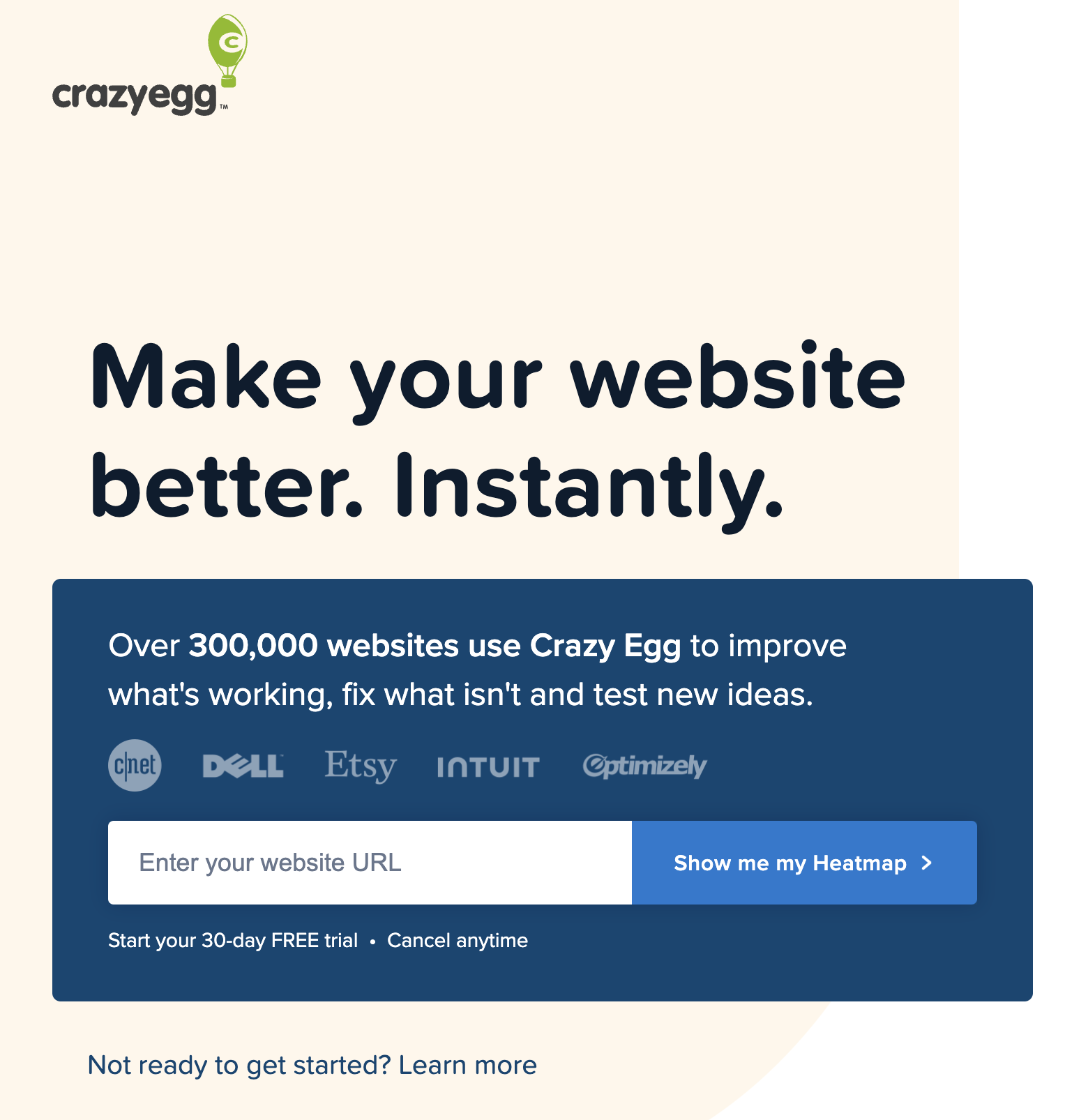
Crazy Egg's CTA isn't trying too hard to impress. It's just good—well thought out, concise, and to the point.
First, the headline: "Make your website better. Instantly." A rather bold proclamation but commendably straightforward. Its use of the word "instantly" suggests that Crazy Egg has the answers, and they're not going to waste your time.
The "Show me my Heatmap" CTA button is, once again, admirably direct. It's not pleading for a click or asking for a moment of your time. It's telling you, in no uncertain terms, what's on the other side of that click.
10. Zappos

CTA placement: eCommerce email
CTA type: Limited-time offer
What it does right: Clear and concise, visually appealing, strong call to action verb
First off, big ups to Zappos for not making me do math. Half off? I'm already intrigued and haven't even seen the shoes yet.
"Reveal today's deals" feels like a game show moment. What's behind door number one? A pair of boots? New house slippers? It's that momentary thrill, like unwrapping a gift—even if you end up paying for it yourself.
In an endless sea of emails screaming for attention, this one from Zappos does what it needs to do: it grabs you, shakes you gently by the shoulders, and says, "Hey, want something good for half off?" And in this economy, who can say no?
11. Uber

CTA placement: Landing page header
CTA type: Lead to purchase
What it does right: Interactive and dynamic, personalized, sparks curiosity
By providing three clear choices (drive or deliver, eat, and ride), Uber shows that they understand and cater to the diverse needs of their users. This personalized approach instantly makes the user feel valued and attended to, whether they need a ride to the airport or just want to stuff their face.
The interactive nature of this dynamic content creates a sense of empowerment and involvement for the user. Even the tens of people unfamiliar with all of Uber's offerings will be intrigued by the distinct options, sparking curiosity and potentially leading them to explore other services beyond their original intention.
12. CareerBuilder
CTA placement: Homepage header
CTA type: Lead to purchase
What it does right: Clear and concise, click-worthy secondary CTA
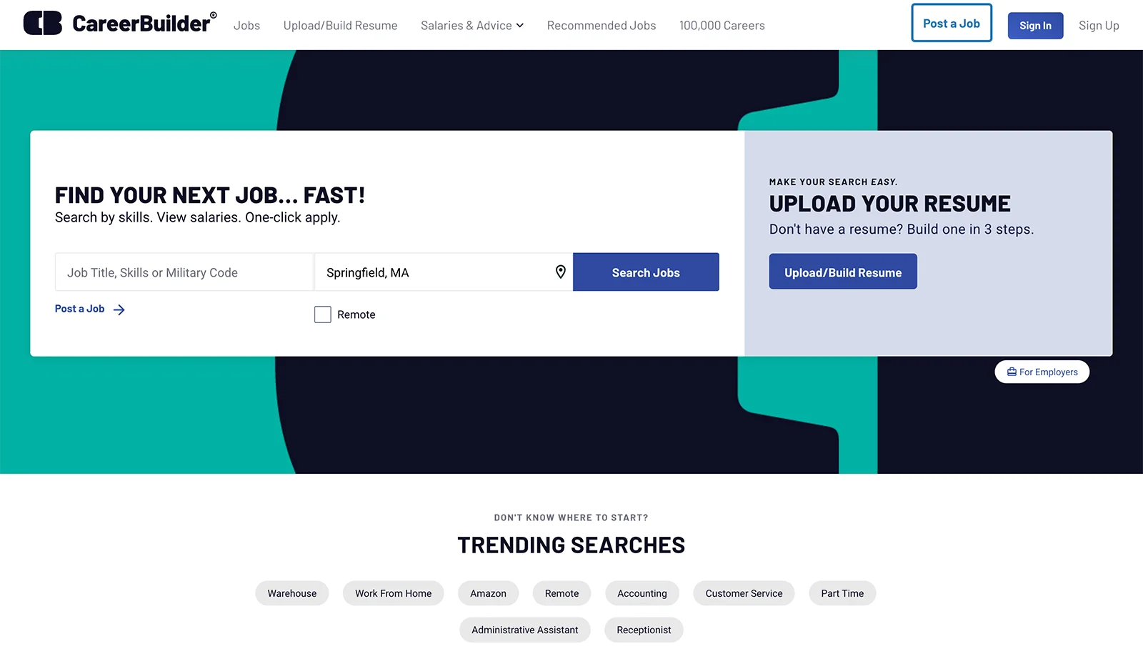
"Find your next job…fast!" Who are you, my dad? Although I suppose if someone's clicking their way onto a job-finding website, they're there for one reason: to snag a job, and preferably one that doesn't make them want to put a campfire out with their face.
CareerBuilder doesn't dilly-dally—they allow you to type in your wildly specific and/or desperate job requirements. And who's going to turn down the resume help offered in the secondary CTA? Talk about a lead magnet.
13. Airtable

CTA placement: Landing page header
CTA type: Gated content
What it does right: Social proof, sneak preview, clear and concise
You may be wondering why I included a very basic "submit" button in a CTA showcase, but pairing a straightforward button with great supporting elements like the headline, social proof, and sneak preview, is like sipping top-shelf wine from an old jelly jar. Sometimes, the simple stuff just ties everything together.
The large headline is as direct as my comments on whether a hotdog is a sandwich. (It's not.) Aimed at the so-called professionals in campaign planning, it speaks to a certain crowd, much like literally anything speaks to Swifties looking for Taylor's latest Easter egg.
The mention of leading companies like Shopify, Time magazine, Spotify, and Hearst adds credibility and trustworthiness. It's basically saying, "If these giants trust us, maybe you, in your comparatively minuscule existence, should, too."
The bullet list detailing what's inside the eBook provides clarity on the content, letting users know exactly what to expect, including insider tidbits from recognized brands. So, not only do you get smarter, but you also get to casually name-drop at the next girls' night. "I've been implementing campaign planning strategies inspired by Equinox and Taylor Guitars. NBD."
14. Max

CTA placement: Landing page header
CTA type: Closing the sale
What it does right: Showcases diverse selection, clear and concise, highlights affordability
Max presents an impactful CTA through the Neapolitan ice cream of Disney, Hulu, and Max streaming options, all on one screen. Collectively, these three flavors depict a panoramic view of the bundle, emphasizing a wide variety of choices only rivaled by the Cheesecake Factory menu.
In a world drowning in content, they've managed, quite succinctly, to sum it all up with "It's all here." The ensuing "Get Max" or "Get the bundle" CTA buttons invite visitors to subscribe, anchoring the CTA by providing a straightforward pathway to accessing all the consumable content your heart desires.
15. Adobe Stock

CTA placement: Google Search ad
CTA type: Free trial
What it does right: Benefit-oriented, actionable, relevant to the target audience
This paid search ad nails the CTA with a clear and easy-to-understand message. The headline "Free trial - Find the right image faster" immediately grabs attention by offering a low-risk way to experience the service. It also addresses a common pain point for users, highlighting the platform's efficiency.
In very few words, Adobe found a way to combine attention-grabbing language, address user concerns, highlight the platform's strengths, and offer a valuable deal, making for a cleverly crafted CTA. If I were into such things, I might even click on it. But I have people for that.
16. Zapier

CTA placement: Email
CTA type: Event promotion
What it does right: Simple, attention-grabbing, personalized
The header image here immediately grabs attention with its vibrant graphic detailing key event highlights. This provides a quick snapshot of what to expect and builds anticipation.
The body of the message is simple and details exactly what you're going to experience at ZapConnect—adding AI to your workflows or learning to build in a hands-on workshop. It's short, simple, and to the point. If you want in, just click the button to "Save your spot."
17. Pit Viper

CTA placement: Email
CTA type: Lead to purchase
What it does right: Pit Viper nails the originality test every time. The email (which is advertising a new line of sunglasses) is set up to look like the nutrition facts on a food label. It's surprising, provokes curiosity, and doesn't read like marketing copy.
The CTA itself is humorous and prompts a specific action: "Put your greasy fingers on your mouse and click here." They don't even tell you they're selling sunglasses in the copy—you have to click to find out.
I'd argue they're not sacrificing clarity for humor, either. The CTA is still clear: click here.
18. Slack

CTA placement: Website (resource page)
CTA type: Read more
What it does right: The CTA "Read more" is easy to understand. We all know what's happening here. It invites users to explore additional content (in this case, a report) without overwhelming them with too much information upfront. This simplicity is effective because it aligns with a common user behavior: clicking to learn more about a topic of interest.
This is a simple and direct next step in the user's journey through Slack's content. It clearly lets the reader know what to expect (the full text of a report) and then delivers it. While it would be easy to overcomplicate this, I have to admire the simplicity of a good "Read more."
19. Canva

CTA placement: Website
CTA type: Closing the sale
What it does right: This button guides you gently down the sales funnel without making you feel like you're making a major commitment. The trial is marked as "free" in the button, so you're not expecting to immediately fork over $$ just to try the product—but the prompt to try the product is very clear.
Visually, the button stands out with its bold, dark color against a white background, grabbing attention and inviting clicks. The headline is clear, and the body text expands on the Canva Teams offering in a way that makes it clear what the product is: an "all-in-one visual communication platform designed for work." When you get to the button, you already want to click.
I also appreciate that they add a secondary CTA here if you want to skip the fluff and go straight to sales. Very efficient.
20. Patagonia

CTA placement: Event page
CTA type: Event promotion
What it does right: Rather than going for a boring "Sign up now" or another common event CTA, Patagonia uses the charming "RSVP here!"—on a high-contrast button—to grab the reader's attention and suggest that you attend their event.
I know it's a copywriting trick, but the fact that it reads like a personal event invitation from a friend does make me want to register. And the illustration hints that the event will also be quirky and fun.
21. Starface

CTA placement: Website pop-up
CTA type: Form submission
What it does right: This CTA appears as a pop-up on Starface's homepage, prompting you to join their marketing list. The ask is big—they want my phone number, not my email address—but they're so cute about it, I can hardly resist. The conversational tone encourages me to trust them, which in turn makes me more likely to hand over my phone number.
Fun copy combines with a clear value add (exclusive discounts) to make this CTA a winner. Even though the action on the button isn't necessarily clear, the surrounding copy is, and I'm now invested in whatever communication this brand wants to have with me.
Blast off? I think I will.
22. Vidyard

CTA placement: Website homepage
CTA type: Read more
What it does right: Because of the specificity in this CTA ("Get the eBook"), I know exactly what I'll get to read if I click the button.
The text above the CTA tells me a little bit about the eBook, but not so much that I feel like I don't still need to take a look inside.
23. Purple

CTA placement: Email
CTA type: Lead to purchase
What it does right: While the design of this CTA isn't top-notch—it's not set off from the copy, embedded in a button, or in a different color—I really like that it comes with a discount code right above it.
I'm incentivized to click that "Shop Now" button armed with a coupon in a very tangible way. Not just a vague idea of a discount, and not a promise that one will be applied for me at checkout if I ever get there—but a very specific number ($50) that I can apply myself with the provided code. And the CTA itself is clear: go shopping.
24. AllTrails

CTA placement: Website
CTA type: Product or service download
What it does right: AllTrails does something interesting here by linking to their app download on the homepage with this cute little QR-logo-button combination.
Since there's no purchase necessary—though I highly recommend buying before you're stuck without good cell service—the ask is pretty minimal. And who wouldn't want to test out the App of the Year? That context makes the CTA more compelling. (I definitely redownloaded the app as I wrote this article.)
25. Kit

CTA placement: Blog
CTA type: Closing the sale
What it does right: That bold blue button stands out from the page in such a good way. It's a flashing sign that says, "Click me!" The first word is clear and action-oriented, and you know just what you're getting when you click the link. The dark text is also set off from the button so the bright color doesn't make the text unreadable.
I appreciate the stylized screenshot on the side, which gives a visual of what to expect when I sign up, and the copy packs a lot into very few words. As far as clear communication goes, it doesn't get better than that.
How to write a call to action
Your call to action should be unique, specific to where it's featured as well as your particular audience and targets. That said, the best CTAs do share some characteristics that you can apply wherever they may be.
1. Provide an incentive
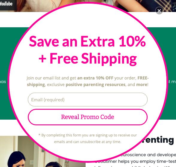
If you're looking for one secret to effective CTAs, here it is: give them a reason to click, share, or hand over their email address. More important than the wording, placement, or color of your CTA is the underlying incentive a person has to follow it. How will answering your call to action help them?
A good call to action restates its benefit bluntly and succinctly.
If you're offering a discount, remind them what percentage.
If they're getting a free PDF, mention the words "free" and "PDF."
Here's where you can borrow from traditional sales techniques, such as adding urgency with a time limit or bringing up the pain point they're trying to avoid. Just remember the CTA shouldn't be too wordy, so stick to the highlights and keep it brief.
If you're using a standard link, typically you write the incentive in your CTA's anchor text (the clickable text). In the case of social media posts and ads, you should reserve the last line in your message for your call to action, so mention any benefits there.
2. Be transparent

One of the biggest reasons CTAs fail is because people don't trust them. Most web users have a healthy suspicion when clicking links online, especially on new or unfamiliar sites. You can mitigate this fear, and increase conversions, by being open and honest.
For starters, say exactly what will happen when you click. Remove all mystery with specifics. For example, saying "start your download automatically" is more descriptive than "click here to download." (For button CTAs, with limited space, you can include secondary text nearby.)
You want to acknowledge any user doubts and assuage their fears. If visitors are worried about security, they're not going to click, so reassure them that you understand their concerns. One of the big fears, in the case of email signups, is spam. You might want to gently remind visitors that you won't share their information and that you'll only email them once a week, twice a month, or whatever the case is, to keep their imagination in check.
You can build trust just by being upfront about everything from the beginning. You'll find people are more receptive to your CTA pitches when they know precisely what to expect.
3. Use powerful language

Don't be shy about calls to action! Some people soften their language to avoid being pushy, but CTAs should be strong and unapologetic. After all, if you followed rule #1 (incentive), then what you're offering is beneficial to the visitor.
That's not to say you should be rude or demanding (please don't); there's a perfect balance somewhere in there between a strong suggestion and a forceful command. Above all, the reader must always feel they have a choice—your call to action is there to convince them of the choice you think they should make.
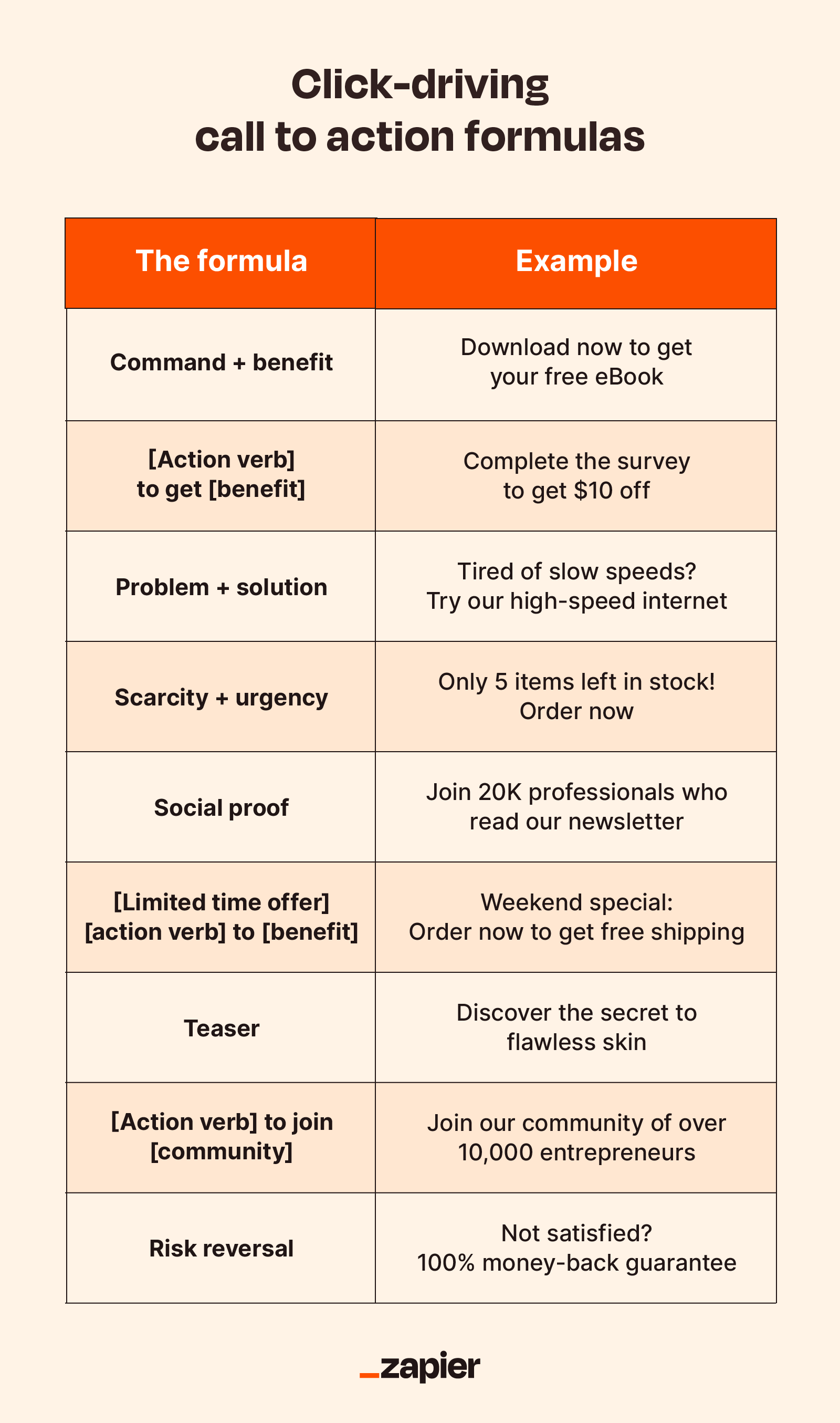
In practical terms, calls to action should be imperative sentences, which is the grammatical term for commands. A best practice is to start CTAs with an actionable verb:
Share this post
Join our newsletter
Subscribe for more deals
Find your favorite
This makes the statement sound stronger, and at the same time, clearly communicates what the user should do.
Likewise, avoid wording that weakens your call to action, including "please" (no matter what Grammarly tells you) and modifiers like "could" and "would." There's a time and place for gentle language, but calls to action are not one of them.
Word choice is important to CTAs, not only for making a persuasive argument, but also for fitting the space allotted.
It's not foolproof, but in my experience, this approach tends to improve CTA performance and the effectiveness of most sales copy. And because most of those action words are short, you should have no problem fitting them into your CTA space.
4. Evaluate performance

Last but not least, you should evaluate how successful your final call to action is and identify room for improvement. Creating your CTA may feel like a lot of guesswork and shooting in the dark—because it is. Testing it is much more clear-cut.
To get a basic idea of your CTA's performance, take a look at your analytics. Compare the page traffic to the number of conversions, and see what percentage of your total visitors clicked.
Don't be alarmed if your conversion rate percentage feels low. Although there's no universal figure that applies to everyone in every industry, a reliable general metric is around 3%. If your conversion rate is higher than 3% but you're still not hitting your goals, try focusing on improving traffic to the site or page rather than tweaking the call to action.
If your conversion rate is significantly lower, it's worth doing an A/B test on your design and copy. Try two different versions of your call to action, experimenting with different phrasing, colors, or fonts, and see which one performs better with your target audience. It's the most efficient way to reveal what works and what doesn't with concrete, empirical data, ensuring your CTA resonates with the target audience and drives the desired action.
CTA design best practices
If you're placing your call to action on a web page or other content you design yourself, you want to place it at the top of your visual hierarchy. Your CTA should be the most noticeable element on the page. To achieve this, you want to pull out all your design tricks:
Contrasting colors: CTAs should generally contrast with the rest of the page's design. Visitors shouldn't have to work to find what to do next. Use a vibrant color for your CTA, especially against a dull background. Can you spot it from six feet away? Good.
Optimal size: Make the button and text larger than the surrounding elements but not so large that it overwhelms other content. It should also be easily clickable, especially on mobile devices.
Clear typography: Use a legible font that complements your brand. Ensure the text is large enough to read but doesn't crowd the button. You can play with typography to emphasize key words. Commonly, operative words like "free" are set in a different color or sometimes even a different font to attract more attention.
Negative space: Surround your call to action with plenty of negative, or empty, space. Setting your CTA apart from the other elements makes it more noticeable and gives it more importance in the eyes of your visitors.
Emoji use: Some brands find success with emojis, but if you choose that approach, remember that a little goes a long way.
Consistent styling: While CTAs should stand out, they should still align with your brand's overall design aesthetic. Consistency in design builds trust.
Improve your CTAs now, free!
While my dad's approach might have lacked the finesse of a well-designed button or the allure of clever copy, the sentiment was clear. And that's the heart of every good CTA. Whether you're nudging a visitor to make a purchase or nudging your offspring out of the nest, the principle remains the same. CTAs are about engaging your audience, prompting action, and, occasionally, a very pointed reminder to update your LinkedIn profile.
Now it's our turn to practice what we preach—try Zapier for free!
Call to action FAQ
Or, as they say in the biz, "CTA FAQ." Because there's no such thing as too many three-letter acronyms. L-O-L.
Why are CTAs important in marketing?
Calls to action provide your audience with a clear sense of direction, guiding them toward specific actions like making a purchase, signing up for a newsletter, or downloading a resource. They tap into the Action > Reward system that our brains thrive on, offering satisfaction—like pressing an elevator button. This inherent desire for interaction can be leveraged by crafting compelling CTAs that prompt users to engage further.
What makes a call to action effective? The effectiveness of a CTA depends on its copy, design, placement, and relevance to the user. For example, depending on your audience, the phrase "Snag your copy" might resonate with a larger group than something more generic, like "Download now." Or, if someone visiting your eCommerce store is a first-time browser, they're likely not ready to click "Buy now." But they might be curious enough to click "Learn more."
Identify which action(s) will bring the most value to your business, then use your CTA to steer users in the right direction.
Where should I place my CTAs on my website?
Place your CTAs where they'll catch the attention of viewers on your website. Think of them as your own personal billboards by the highway advertising the closest Subway… and your viewers want sandwiches.
Key locations include the top of landing pages, within the middle of content, or at the end of blog posts. Use contrasting colors and surround them with negative space to make them stand out. This will help encourage viewers to click.
How can I test the effectiveness of my CTAs?
One way to test CTA effectiveness is to use A/B testing with different designs or wording. Take two versions of your CTA and pit them against each other to see which one gets more clicks. Set a time limit and monitor performance over that time to see which performs better. You can also do this by comparing other types of campaigns or tracking conversion rates against benchmarks.
Related reading:
This article was originally published in November 2023. The most recent update, with contributions from Abigail Sims, was in November 2024.
