No matter how revolutionary, life-changing, and industry-disrupting your product or service is, that alone isn't going to sell it. You still need to convince people of its value.
I've been a product marketer at Zapier for almost seven years, and one thing that's been particularly helpful as we work to teach the world about automation is our messaging guide. It's a document that keeps our marketing message focused on Zapier's unique selling points, so we can be sure we're speaking directly to our customers' needs.
Here, I'll share the template we use to house our messaging guide, and I'll show you how you can use this brand message template to highlight your own company's unique value and tell a consistent story across many touchpoints.
Brand message template
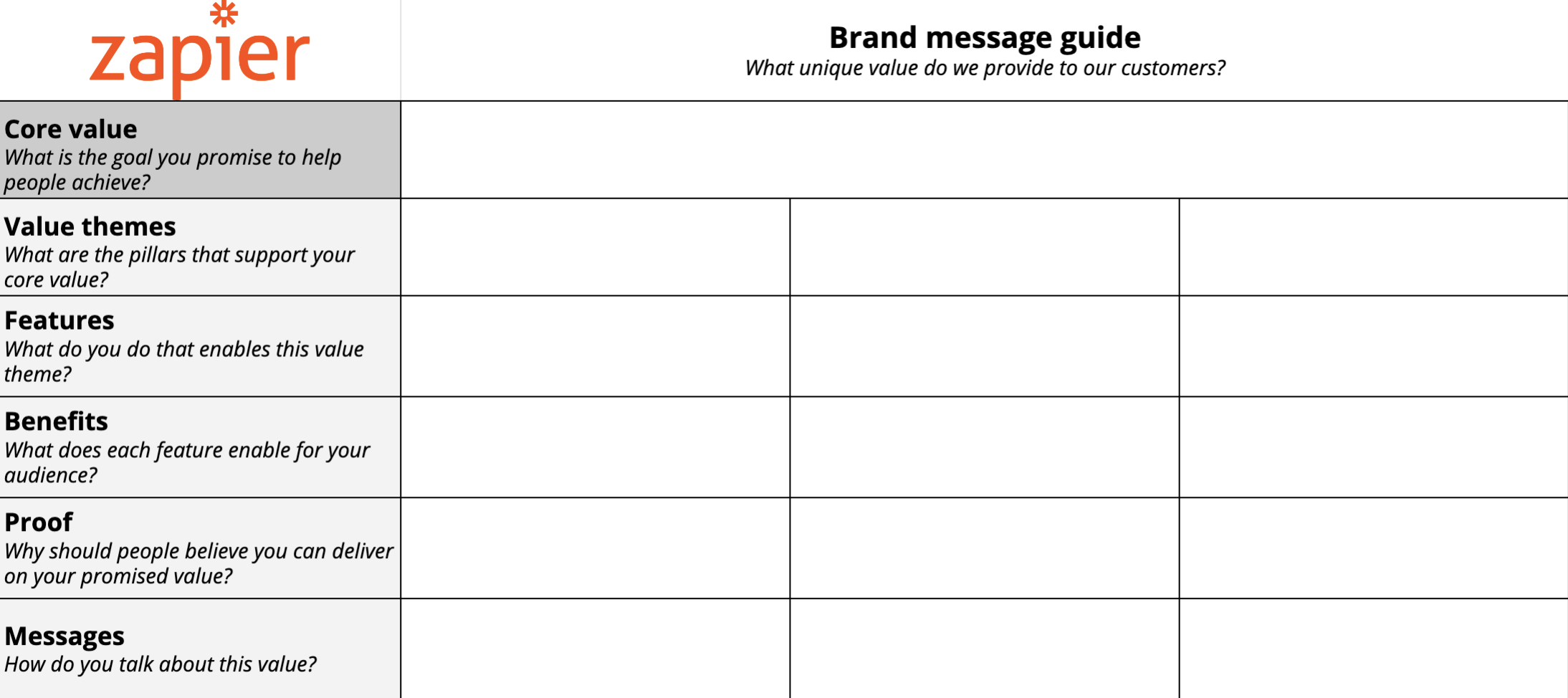
Here's the marketing message template we created and use at Zapier. Make a copy, and adapt it to your brand. But first, read on for tips on how to complete it.
How to fill out the brand message template
There are five main sections in the template:
Core value
Value themes
Features
Benefits
Proof
Messages
This might feel like word salad at first, so here's the breakdown of what to include in each section and how it'll help you communicate with your customers.
Core value
Your core value is the goal you promise to help your customers achieve. What's the pain point your leads and prospects have, and how does your product or service make that pain point go away?
This core value might become your tagline, or it might serve as an easy way to succinctly describe your business to customers. But its most important role is to serve as a guidepost for all the words and visuals you use to communicate with your audience. For that reason, you should make sure this core value really speaks to your unique selling point. If it could apply to any other company in your industry or niche, it's not right for a core value.
Any time you work on a marketing campaign, ask yourself: is your core value guiding the message?
Value themes
It can be hard to identify a core value without feeling like you're missing nuance. That's where the value themes come in: what are the pillars that support your core value?
Let's look at Zapier as an example (without giving away all our marketing secrets, of course). Our core value has something to do with automation—makes sense. But...what does that mean? Our value themes answer that: they speak to things like automating manual, repetitive tasks or connecting the apps you use every day. Yes, that's the same as automation, but it helps uncover what about automation our audience relies on most.
These value themes are important because they'll guide the features, benefits, proof, and messages in the rest of the template.
Features
What are the primary features of your product or service, as they relate to your value themes? These are the things your business does that enable each value theme.
The word "features" can feel software-oriented, or at least product-oriented, but it works for the service industry too. For example, if you're a career coach, and one of your value themes is that you help aspiring entrepreneurs streamline their processes, one of your features might be your own personal background as a process-oriented entrepreneur.
Some other things you might consider including under features that aren't traditionally considered features:
Outstanding customer service
Money-back guarantee
A large network of partners
Educational resources
Of course, don't forget about your product's or service's core features—make sure you include the standard stuff here too. It's ok to include more than one feature under each value theme as long as they all support that theme.
Benefits
Now it's time to really get into the heads of your potential customers. What would a customer using your product or service think and feel when they were making use of that feature? I recommend writing these in the first person, as if you were the customer. If you've done customer interviews, you can even use direct quotes, if they're relevant.
For a neighborhood bakery, these statements might look like this:
I can treat my friends, family, and coworkers to something that makes them feel loved and appreciated.
I can satisfy my craving for something sweet with an expanding selection of baked goods.
I feel welcome, like I've been a regular patron for years.
I feel content that I'm supporting a local business and growing my community.
Don't worry too much about the language here—you'll never use these word-for-word in your marketing messages (since they're in the first person). Instead, they're a way to be sure you're tapping into the more emotional side of the features you offer.
Proof
Why should your audience believe that you can deliver on your promised value and offer people each of these benefits? This is a proof-is-in-the-pudding situation, so start bragging.
Proof can come in lots of forms, but here are some ideas:
Stats related to how you've helped your customers (e.g., X customers have done Y because of your product or service).
Specific examples of prominent customers who've seen these benefits.
Details related to things like customer service availability, uptime (for software), or materials used (for physical products).
In some cases, the proof might be similar to the features—that's ok. Use this opportunity to be super descriptive, so you have specific evidence to point to that supports your theme. For example, if one of your features was "24/7 customer service," the proof might be "Jake, Jean, and Jesse from our customer service team are on call 24/7 via phone or email to help you troubleshoot any issues."
Messages
Now we're getting down to the actual language: what words do you use to talk about the value theme? You'll use all of the sections above to inform your messages.

When writing copy for your landing pages or marketing campaigns, you can pull from these messages, but also be sure to adapt them to the medium (you'll say things differently on your checkout page than you will on Twitter, for example).
Now what?
You can't create your brand message guide in a silo. Make sure you're incorporating what you know about your audience and their pain points, and then have team members from across your company review the guide and offer feedback. For example, your customer support team can help you identify value themes (based on how customers are using your product or service), and your content marketing team can offer feedback on the wording of the messages.
Once you've finalized your message guide, make sure everyone at your company knows it exists—and understands how to use it. Every time someone on your team builds a landing page, creates a marketing campaign, pitches your company to the press, or anything in between, they can go back to your messaging guide.
And, of course, be sure to keep the guide updated as your customers and product change.


