I genuinely hate presenting anything finance-related. It's dull yet still somehow really emotional? Just streaming a bunch of numbers on a screen doesn't really tell a good story, but what if there was a way to translate all those numbers, percentages, and jargon into something that would actually resonate?
Excel's waterfall chart is kind of like "Reading Rainbow" for the board room.
Instead of drowning your audience in a sea of data, this chart paints a vivid picture of how your starting point (your quarterly revenue, for example) changes over time. No more confusion, no more blank stares. Just a clear, easy-to-follow illustration that shows how your money is being spent (or earned).
If you're ready to ditch the financial jargon and embrace a more intuitive way of communicating, I've summarized everything you need to know about Excel waterfall charts. I've also put together an easy-to-use template that would make LeVar Burton proud—even if you don't know how to use Excel.
Table of contents:
What is a waterfall chart?
A waterfall chart, sometimes called a bridge chart, is a type of bar graph that helps you visualize the step-by-step changes to an initial value. It's a visual breakdown of how a series of additions and subtractions affect your starting point—whether it's your savings account balance, your project budget, or your company's quarterly profits.
Each element of the waterfall chart serves a specific purpose:
Starting value: The first bar in the chart represents the initial value, setting the baseline for subsequent changes.
Floating bars: These are the middle bars of the chart, each representing an individual positive or negative change. Positive changes are shown as upward bars and negative changes as downward bars. These bars are "floating" because they begin at the end of the previous bar rather than at the baseline.
Ending value: The final bar in the chart shows the ultimate result after all changes have been applied, highlighting the net effect on the initial value.
Connectors: These thin lines visually link the end of each floating bar to the beginning of the next bar, helping you trace the progression of the value.
You can use the waterfall chart in conjunction with the Waterfall project management methodology, which follows a linear, sequential approach to project execution with distinct phases. But the waterfall chart's versatility extends to Agile methodologies, too. Regardless of the project management approach, a waterfall chart can be a valuable tool for understanding how a project's budget or other key metrics change over time.
How to make a waterfall Chart in Excel
Creating a waterfall chart in Excel is surprisingly simple thanks to a built-in feature. Let's walk through it step by step.
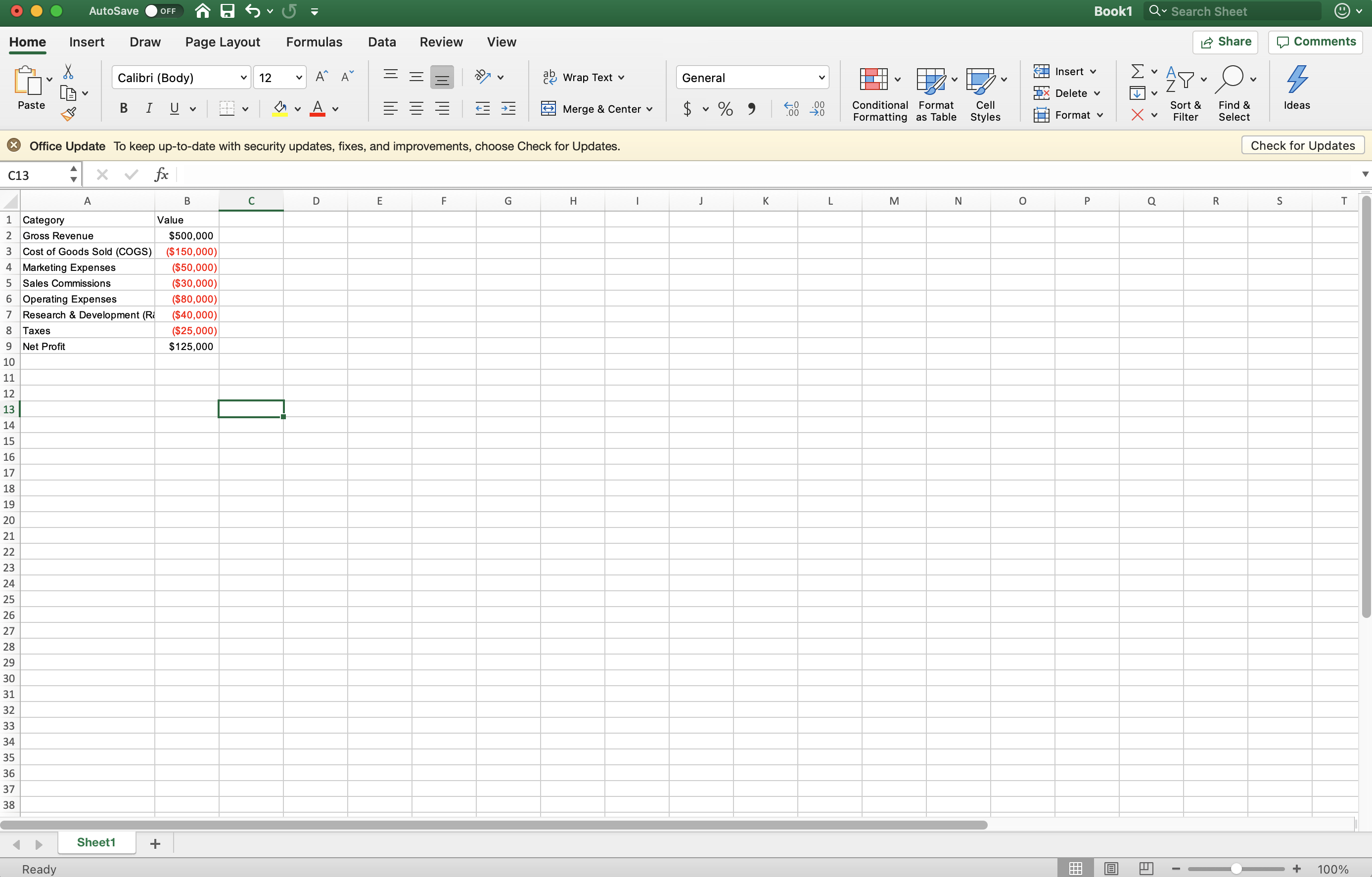
Create the data table: In cell A1, type "Category" (or a similar header for your labels). In cell B1, type "Value" (or a similar header for your values).
Label the categories: Starting in cell A2, enter the labels for each of your categories in column A (e.g., "Gross revenue," "Cost of goods sold," "Marketing expenses").
Add the values: In column B, starting in cell B2, enter the corresponding numerical values for each category. Use positive numbers for increases and negative numbers for decreases.
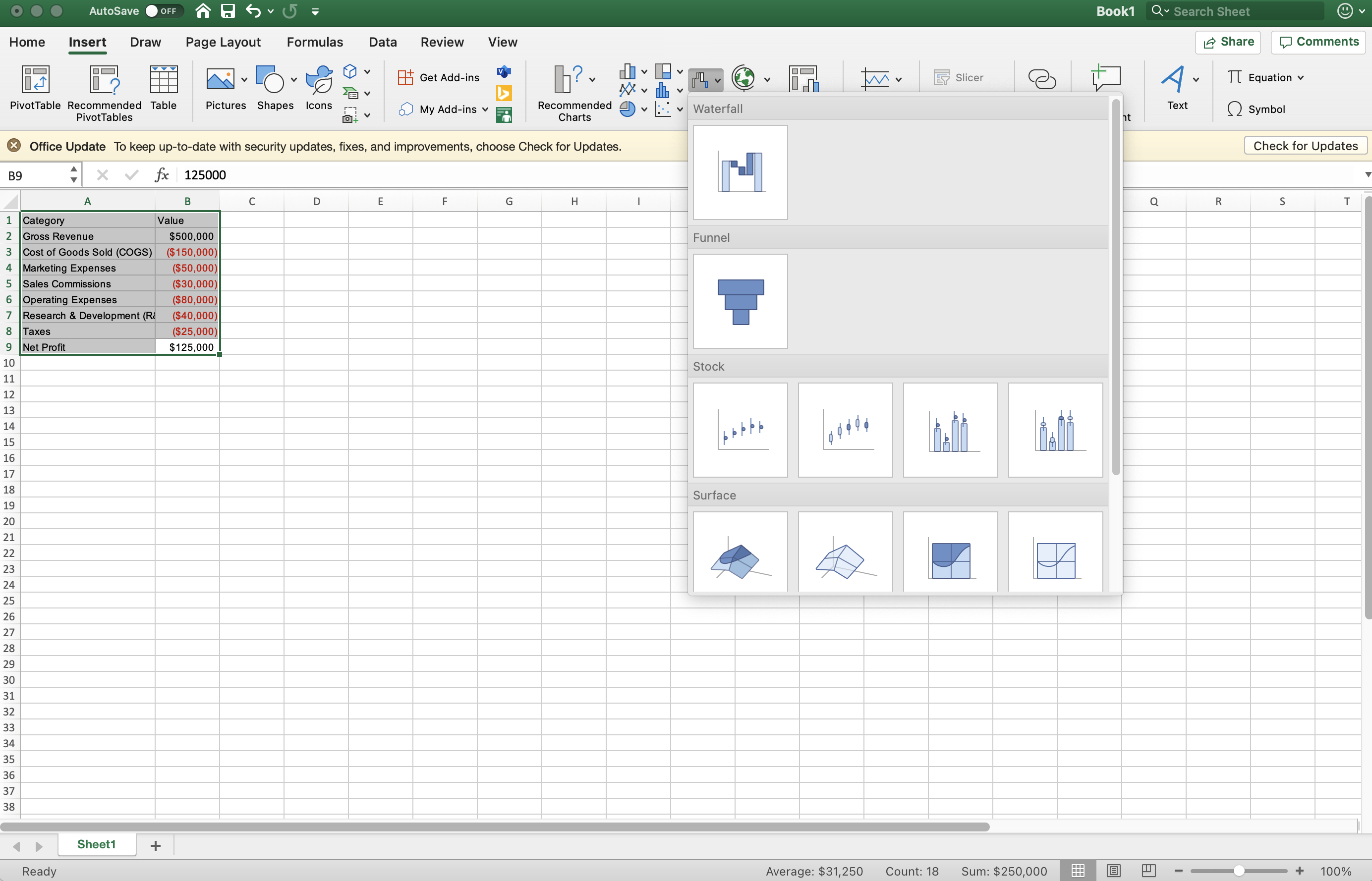
Select the data: Click and drag your mouse to select all the cells in your table, including the headers and values.
Insert the waterfall chart: Click on the Insert tab in the Excel ribbon. In the Charts group, locate the chart icon that looks kind of like a waterfall and select the Waterfall option from the dropdown.
Format the starting total: A chart will appear over your sheet. Click on the first bar in the chart (typically representing the starting total). Check the box next to Set as total in the side panel that appears.
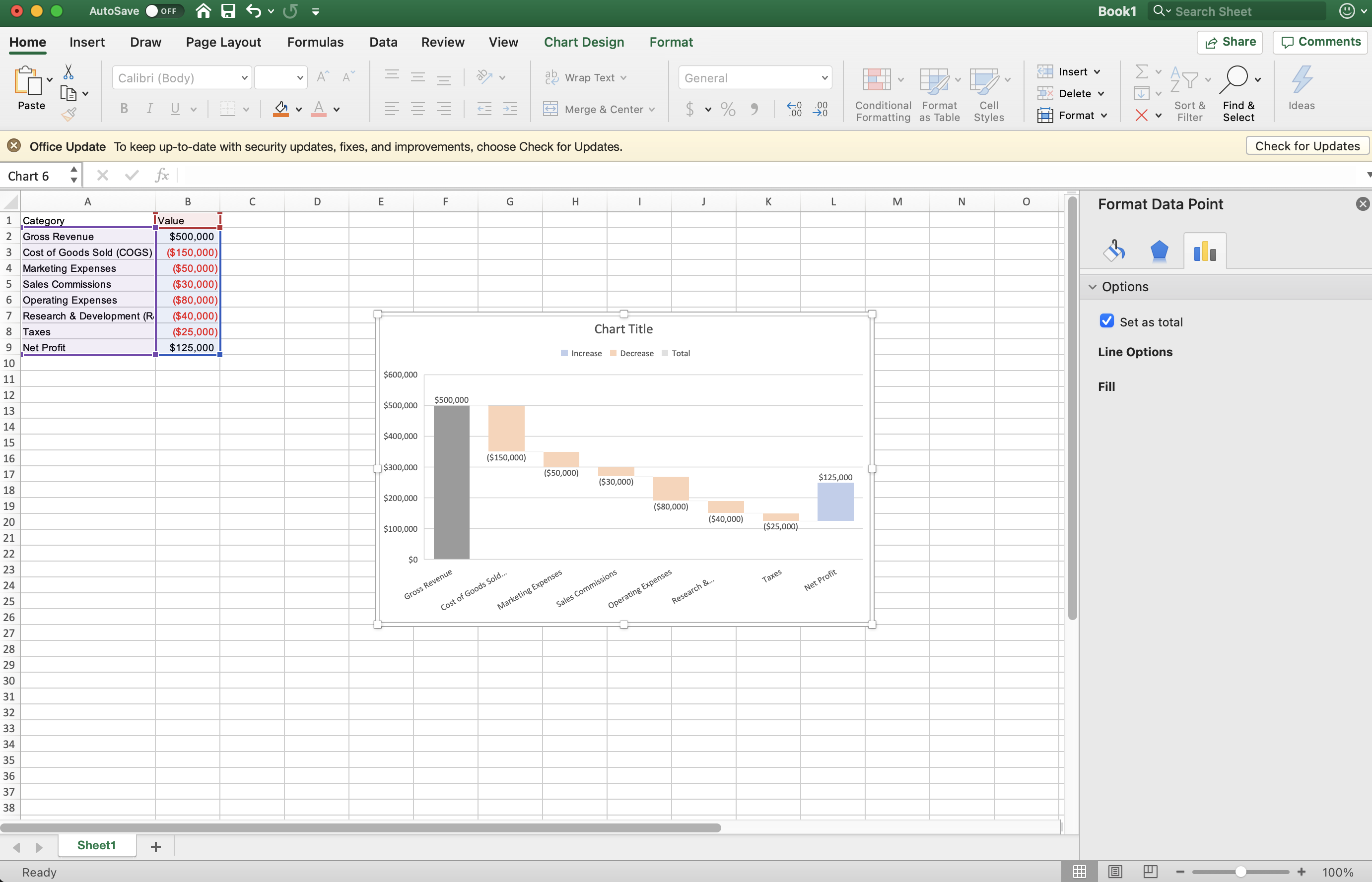
Format the ending total: Click on the last bar in the chart (usually the ending total). In the side panel, check the box next to Set as total.
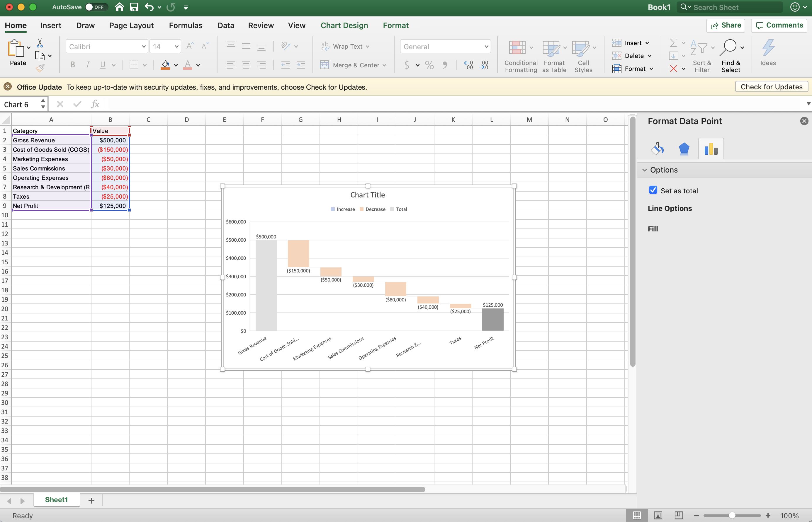
And that's it! You've successfully created a waterfall chart in Excel. If you want to add a bit of flair, play around with the fonts and colors of the chart.
Waterfall chart example
Say you're tasked with presenting the quarterly financial report for your company's flagship product. Sales have been decent, but several factors are impacting the overall profit. You want to clearly illustrate how each factor contributes to the final profit figure. It might look something like this:

In this case, the waterfall chart begins with a total bar representing the initial $500,000 revenue. Subsequent bars illustrate the individual changes. The final total bar depicts the total net profit. Here's how each of those expenses breaks down:
Gross revenue: The starting point of the chart represents the total revenue generated by the product in the quarter.
Cost of goods sold (COGS): The first floating bar will be a significant downward drop, representing the direct costs associated with producing the product.
Marketing expenses: The next floating bar will also point downward, illustrating the costs incurred in marketing and promoting the product.
Sales commissions: Another downward bar shows the commissions paid to the sales team.
Operating expenses: This downward bar represents the general costs of running the business, such as rent, salaries, and utilities.
Research & development (R&D): Investment in R&D is shown as another downward bar.
Taxes: The final downward bar represents the taxes paid on the profits.
Net profit: The final total bar at the bottom of the chart shows the remaining profit after deducting all expenses and taxes.
The waterfall chart visually represents the cumulative effect of each change on the initial budget, making it easy to identify the key drivers of budget fluctuations and the final budget outcome.
Excel waterfall chart template
While Excel's built-in feature is convenient, a template can help you get started even faster, especially if you're new to waterfall charts. Here's the template I made from the project above.
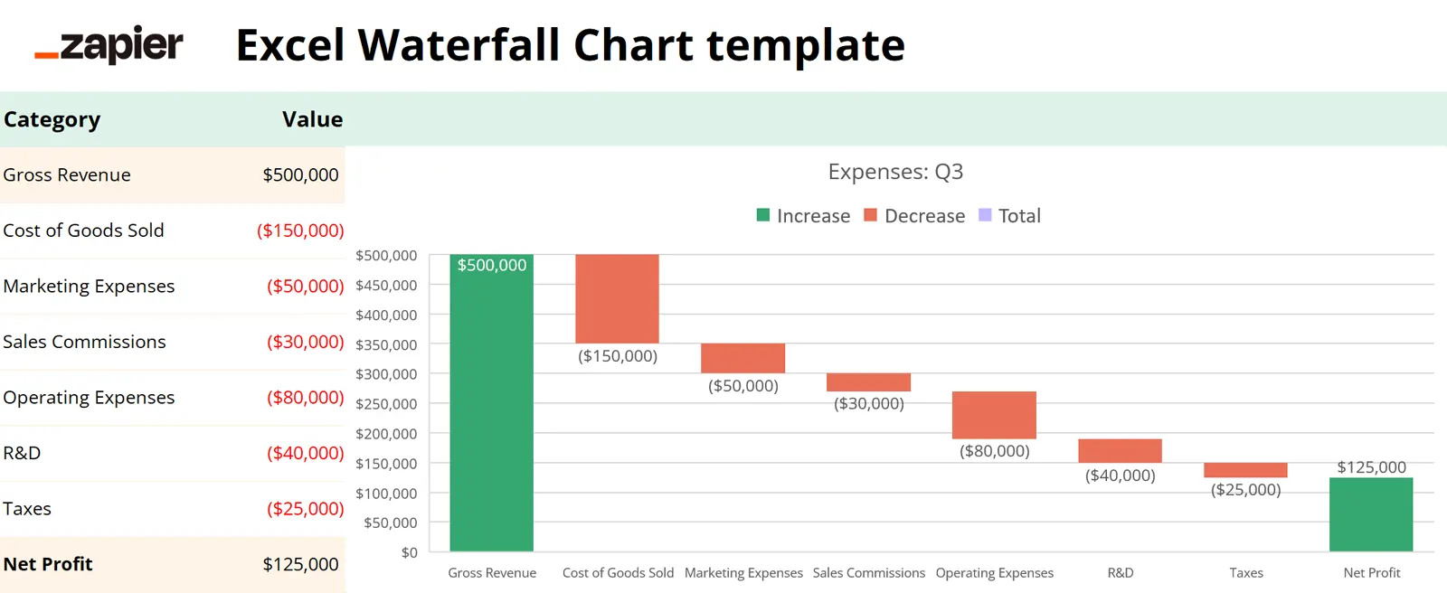
And here's how to use it:
Download and open: Click the Download template button and open the file in Excel.
Enter your data: Replace the generic labels in the Category column with your actual categories. This could be your starting budget, costs, client payments—things like that. Then, in the Value column, enter the corresponding numerical values. Remember, positive for gains, negative for losses.
Transform it: Now that your data is in place, you can customize the template to fit your needs. Add more rows, change the colors, or even add conditional formatting to highlight certain values. You can also experiment with the design options in the Chart Design and Format tabs.
Tip: Save a copy of the blank template before you start filling it in, so you have it on hand for future use.
Alternatives to Excel waterfall charts
Excel might be your go-to tool, but it's not always the most elegant solution—especially when it comes to complex projects with massive amounts of data or when you need to collaborate with others in real time. Here are some other options for creating more attractive, user-friendly visualizations.
Dedicated data visualization tools
If you're looking for a more sophisticated and interactive way to create waterfall charts, consider business intelligence tools like Tableau or Power BI. These platforms offer more customization options and can easily handle larger datasets. Plus, they often come with built-in features for sharing and collaborating on data visualizations, which is handy if you're working with a team.
Project management software
If your main goal is to track project finances, project management software like ClickUp or Asana can help. Many of these platforms include built-in waterfall chart functionality, allowing you to visualize your budget alongside other project data like timelines and tasks. This can give you a more comprehensive view of your project's overall efficiency.
Specialized charting libraries
For those of you who enjoy dabbling in code (you know who you are), specialized charting libraries, like D3.js and Chart.js, offer even more flexibility and customization options. This path requires some technical know-how, so it's not for the faint of heart.
Zapier Tables
Zapier Tables is a flexible, spreadsheet-like tool that integrates seamlessly with other Zapier apps, making it easy to connect your waterfall chart data with other parts of your workflow.
Automate Excel with Zapier
If you store your data in Excel, you want to be sure it stays in sync with all the other apps you use at work. Zapier lets you connect Excel with thousands of other tools, so you can integrate your Excel waterfall charts with your project management software, CRM, and any other source of truth.
Learn more about how to automate Excel with Zapier, or get started with one of these pre-made workflows.
Add new Jotform submissions to Excel spreadsheet rows
Add new Jotform submissions to Excel as rows in a table
Add new Jotform submissions to Microsoft Excel as rows
Zapier is a no-code automation tool that lets you connect your apps into automated workflows, so that every person and every business can move forward at growth speed. Learn more about how it works.
Related reading:


