There's something visually satisfying about lines. Second to the dot, it's the simplest graphic element you can draw, yet it can convey a huge amount of meaning. (If you're not here to wax poetic about lines, I don't don't know why you're here.)
Gantt charts help project managers and their teams get a quick bird's-eye view of project progress and team availability—all thanks to the humble line. Throw in some color coding, and you've really got a project management stew cooking.
Most project management software can readily change dashboards to Gantt views. But if you're looking to stick to the Microsoft Office suite and DIY, here's how you can easily create one with a handy free Gantt chart template for Excel.
Free Excel Gantt chart template
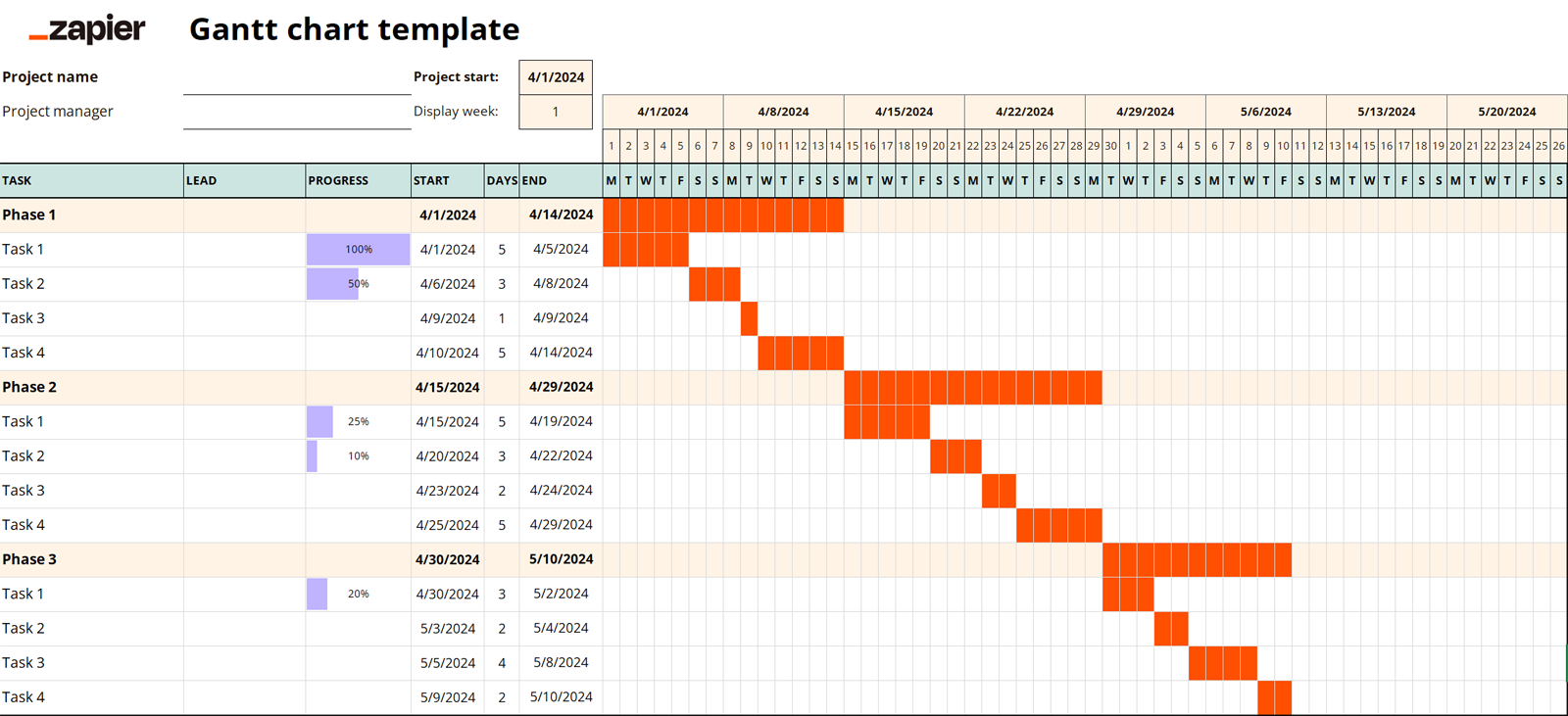
This intricately designed Gantt chart template should handle just about anything you need a Gantt chart to do. The idea is to give you a quick view of task timelines, project progress, and overall utilization. When multiple tasks overlap or there's a significant gap, you'll be able to visualize it and make changes on the fly.
Ready to take a Gantt-er? (I'm so sorry.) Here's how to open it:
Download the template.
Open Excel from your desktop or log in to your Microsoft 365 account and open Excel in your browser.
Click File > Open, and locate the .xlsx file you downloaded. (Select the Open files from this device option in 365.)
Notes for Microsoft 365 users
You should also be able to upload the template file to your dashboard, but the interface usually doesn't cooperate with me when I try this. If the file doesn't do anything after you open it, disable your pop-up blocker. I tried about 10 times before figuring out that's why mine wouldn't open.
How to use our Gantt chart template in Excel
So your shiny new project management toy is loaded up in Excel and ready to go, but you Gantt figure out what to do next. (I'm so, so sorry.) Here's how to use the template every time you have a new project to visualize:
Delete any unnecessary example data from the template.
Always save a new copy of this document (File > Save As) before starting a new project, so the template file stays blank.
Change the file name, title, and tab title to the project name (or whatever you want to call it).
Change the project start date, and the rest of the dates will automatically update.
Update the project, manager, task, and phase name fields as needed.
Update estimated start and end dates for each task. Once you add the number of days to the column between those two columns, you'll populate the chart with the Gantt chart's signature lines.
As your team progresses through tasks, you can update the left cell of the "Progress" column with the completion percentage, and it'll update the handy little percentage meter.
Tips for using the template
If you keep making the same changes to new files, you can always change the core template file to save time.
You can toggle the date range views without deleting any data by changing the display week field.
Updating the length of one task will automatically shift ensuing task dates.
When you want to clean up some visual clutter, use the +/- icons to the left of the row numbers to open and close phases.
How to create your own Excel Gantt chart template
So maybe you've got your own ideas about how you'd like your Gantt chart template to look. (Don't worry, only a little offended.)
I'll note that it's almost always easier to create one in dedicated Gantt chart software like Ganttic, project management software like ClickUp, or database applications like Airtable. You can even automate those tools using Zapier. For example, you can add Ganttic tasks for new Google Calendar events or add Excel sheet rows for new Airtable records, and much more. Here are a few examples to get you started.
Add Microsoft Excel sheet rows for new Airtable records
Create TeamGantt tasks from new Google Sheets spreadsheet rows
Zapier is a no-code automation tool that lets you connect your apps into automated workflows, so that every person and every business can move forward at growth speed. Learn more about how it works.
But if you've got all your data stored in Excel or if your workflows are so entrenched in the Microsoft Office universe you can't see daylight anymore, you can create your own Gantt chart template in Excel from scratch just like we did. (Just maybe not quite as nice.)
Note: I'm using the web version of Excel, but the desktop version should look pretty similar.
Step 1: Fill in and format your data
First things first: fill in the basic data you want to populate the Gantt chart template. We'll start simple, with just columns (from left to right) for task name, start date, length, and end date. Feel free to insert extra rows for phases if you're into the granularity thing. (Don't forget to label your column headings.)
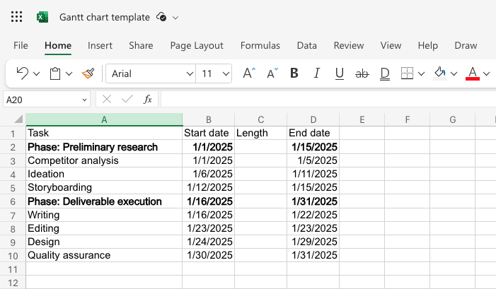
Once you've got the basics set up, you'll want to format your cells:
Task name: Text format
Start and end dates: Date format
Length: Number format
To do this, select the entire column by clicking on its corresponding letter. Then, holding Command (Mac) or Control (Windows), click the column header so it deselects it. Right-click the highlighted column (sans header) and select Format Cells. In the Number field, you'll find both the date and number formats. (You can leave the Task column alone—it's text by default). Be sure the Length column is formatted to have no decimals.

Lastly, you could mental-math your task length, but why? Set up a quick formula in the first cell of the Length column of end date minus start date. (In my case, this is =D2-B2.) Once that populates the cell with a number, hover over the bottom-right corner of the cell until your cursor turns into a +, then double-click, and it'll automatically apply it to every ensuing cell in the column. (If this doesn't work, just copy the cell and paste it into the remaining cells.)

Extra lastly, I recommend visually differentiating your phases by adding a highlight or, in my case, bolding the text. Feel free to do the same to your column headings or task names.

Step 2: Insert bars
Here's where things really (I can't express how sorry I am) Gantt going.
Highlight your whole table of data, then open the Insert tab in the top nav. Find the little caret dropdown at the edge of the graph options, and select Stacked Bar under the Bar options. (You could also do 100% Stacked Bar if you'd prefer to view percentage completion rather than dates.)

Boom, Gantt chart. Sort of. Now you need to edit the data in your table. To do that, right-click the chart and select Format, then select the Data tab. Under the Setup caret, hit the trash can to remove the start date and length fields. (We'll come back to this later.)

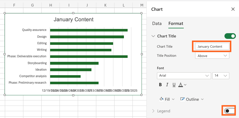
Now go to the Format tab. Under the Chart Title caret, change the name of the chart to your project name (or leave it blank). Then, deselect the legend option. Your chart might look a little scrunched, but it should be pretty clean now.
Step 3: Format the horizontal axis
You'll probably notice the date range is too broad now. To remedy this, copy/paste the project's first start date and final end date into new cells. Then, select them and change the format like you did earlier, switching those two cells from dates to numbers. You'll get very specific-looking values.

Select your graph, then right-click the dates on the horizontal axis, and go to the Format option. Enter the start date value into the Minimum field and the end date value into the Maximum field. Finally, change the Major Units field to 7 to display your dates in weekly increments. (If you prefer to view individual days, change to 1 instead.) Now your Gantt chart should match your table data.

Step 4: Format the vertical axis
Discerning users will notice the vertical axis is displaying tasks in reverse order. (Less discerning users will now check their charts and verify this is true.)
To invert them, right-click the vertical axis of the chart (aka, the names of the tasks), and click—you guessed it—Format. Under the Format tab and Vertical Axis caret, check the checkbox for Categories in reverse order.

This handily also brings your horizontal axis dates to the top of the chart. Exit out, and you'll see your shiny new Gantt chart.
Step 5: Customize formatting
Want to incorporate task progress into your bars that visualize how far each task has progressed from the start date to today's date? Right-click the chart and go to Format. In the menu, switch to the Data tab. Under the Bar Values heading, click Add Field and bring back the Start Date. Then, click the up arrow to move it before the end date field.

You can leave the color coding as is, if you're into that, or to make it more Gantt-y, switch back to the Format tab. Under the Series "Start date" caret, change the Fill paint bucket to No Fill. Use the Outline dropdown next to the paint bucket to select an outline color (I chose a tasteful light gray). Bam, blank space leading up to start dates.
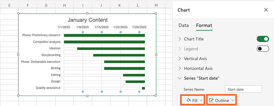
While you're at it, you can also change the end date bar colors to whatever you like. You can even change individual bars if you want to visually group tasks or delineate phases. Just click the bar of your choice (which will select every bar), then click it again to select just that bar. Right-click it, and you should see another Fill bucket and Outline icon.

To finish up, add any extra columns (like task assignee), update highlight colors, and then drag and drop the chart next to your table. Expand it to the size you want, and you're done.

How to automate your Gantt chart template with Excel
Whether you've grabbed our Gantt chart template or followed the steps above to create your own, when it comes to visualizing project timelines, this is one chart you really Gantt beat. (For the last time, I'm sorry.)
Unless, of course, you use project management tools that make it even simpler and more refined—not to mention more automatable. Zapier's no-code automation helps you do that with custom workflows that combine multiple apps into streamlined sequences.
Related reading:


