Google Sheets makes it easy to create charts or graphs out of the data in your spreadsheet—like, "just a few clicks" easy. In this guide, I'll show you how to create, configure, and customize different types of graphs in Google Sheets.
Table of contents:
How to make a graph in Google Sheets
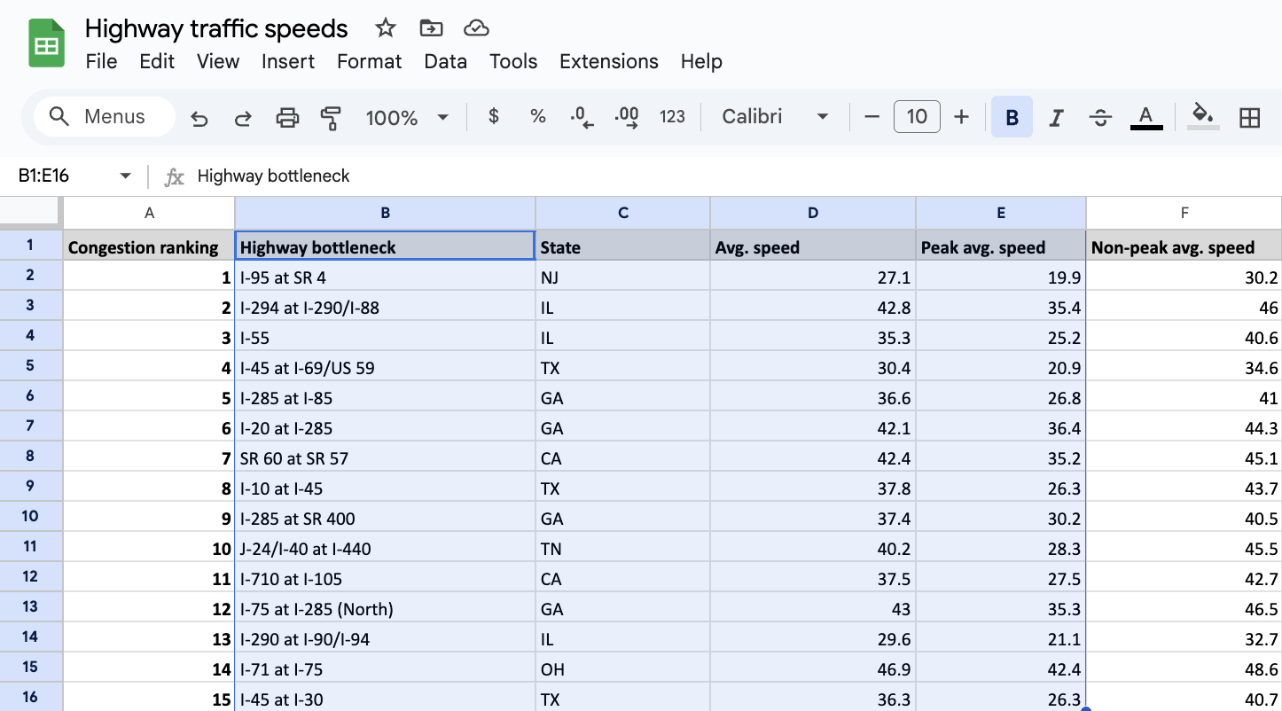
Before you can create a graph or chart in Google Sheets, you'll need a sheet with some numbers in it. For this example, I'll be using highway traffic speed data. Fun, I know.
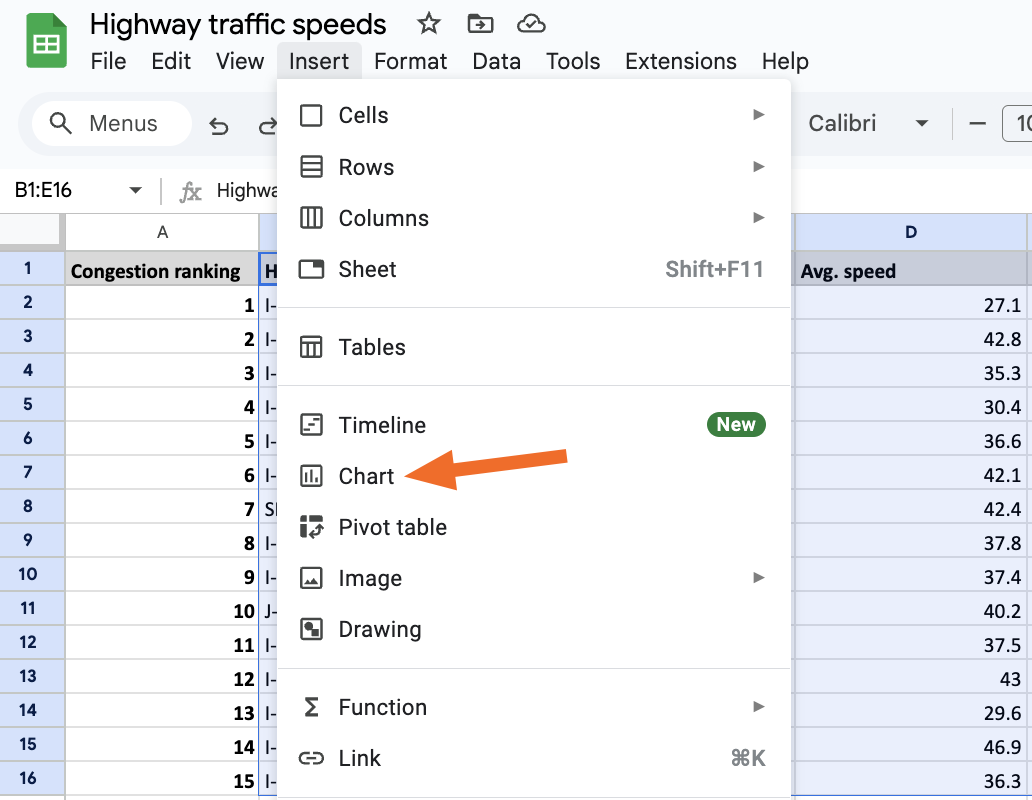
In Google Sheets, highlight the data you want to include. (Don't worry if you're including data you don't actually want to use. You can remove columns later.)
Click Insert > Chart.
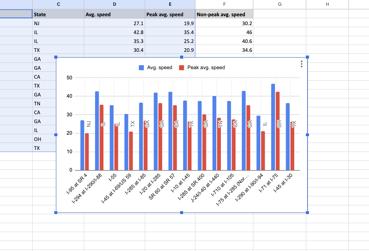
A chart will appear in the middle of your spreadsheet, but you can click and drag to move it out of the way. (Google Sheets defaults to a column chart, but you can change that in a bit.)
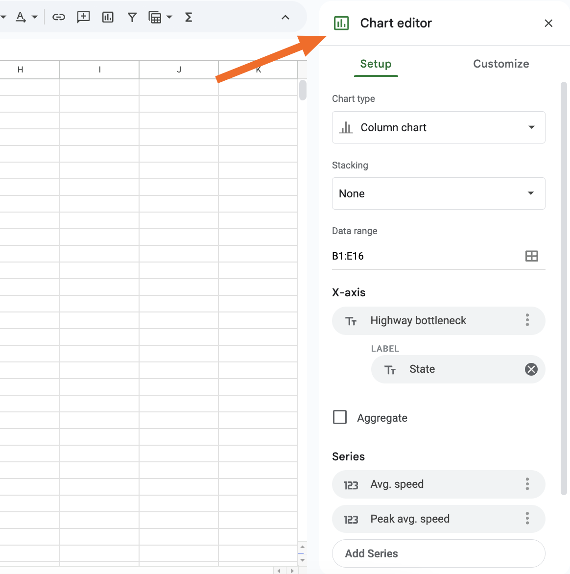
The Chart editor panel will also appear on the right when you insert a chart. It has two main tabs: Setup, where you choose a chart type and which data to include, and Customize, where you can change your chart's appearance.


How to make other kinds of graphs in Google Sheets
Google Sheets lets you create more than 20 different kinds of graphs and charts using your data, including bar graphs, line graphs, waterfall charts, scatter charts, histograms, and tree maps.
You should choose the one that works best for your data, and if you've got choice paralysis, Google has an overview of every chart type that'll help point you in the right direction.
You can choose which one you want by clicking the Chart type dropdown in the Chart editor panel.

While it really is that simple, let's still take a closer look at how to create some of the more popular chart types (i.e., the ones most likely to appear in end-of-year reports and PowerPoint presentations).
Pie chart
You can create a pie chart by scrolling down a bit in the Chart type dropdown menu. You'll have three options to choose from.

Some datasets work better with pie charts than others. For my pie chart, I'll highlight just the State column. This will tell me how many times each state appears on my list of congested highways.

You can see that, among the states on my list, Georgia has the most highway bottlenecks—which, as a Georgian, sounds about right.
Bar graph
You can also create a bar chart, which is like the default column chart but horizontal. Just select Chart type and scroll until you see the option right under the column charts.

Sometimes, a bar chart might be better for data visualization than a column chart, like if you have long y-axis labels and prefer vertical scrolling. But in my case, both work about equally well.
Line graph
A line graph probably isn't the best way to visualize my particular dataset, but that doesn't mean it won't work for yours. You can find it in the Chart type dropdown, where it's the first option listed.
Line graphs are an especially good choice if you're trying to show changes over time. Here's an example line graph using my data.

Maps and geo charts
You can also use Google Sheets to create maps, though this won't work with every kind of dataset since it requires a column with locations. You can find the map option under Chart type toward the bottom of the list.
If I highlight my data's "State" and "Average speed" columns and select a map chart, I get something that looks like this.

You can change your geographic region under Customize > Geo > Region. Because my location data is limited to just U.S. states, I have to click the Region dropdown and select United States for the map to display properly.

How to customize a graph in Google Sheets
No matter what chart type you choose, you'll probably have to do some fine-tuning to get it to display in a logical, aesthetically pleasing way. You can easily tweak the data shown in your chart in the Setup tab of the Chart Editor.
If you don't see the Chart editor panel, click the three-dot menu in the top-right corner of your chart, then click Edit chart.

Under Setup, you'll see options to change your chart type, data range, X-axis, and displayed series. Some options (like stacking) are only available for certain graph types.

If you want to change the look of your graph, select the Customize tab.

Under Chart style, you can adjust your chart's background color, font, and border. Other dropdown menus let you do things like add titles, change the position of your legend, format your axes, remove gridlines, and more.
What you see will vary depending on the kind of chart you're making. For example, you can add a donut hole to the middle of a pie chart but not (for obvious reasons) a line graph or a scatter plot. I recommend testing out a few different chart types to learn your way around.
Automate Google Sheets with Zapier
Making charts in Google Sheets is an important step on the road to spreadsheet mastery—a road with decidedly less rush hour traffic than a Georgia freeway. By using Google Sheets with Zapier, you can put things on cruise control. Connect Google Sheets to thousands of other apps and do things like creating Google Sheets rows for new leads or sending messages or emails whenever Sheets rows are updated.
Learn more about how to automate Google Sheets, or try one of these pre-made templates.
Save new Gmail emails matching certain traits to a Google Spreadsheet
Create Google Sheets rows for new Google Ads leads
Send emails via Gmail when Google Sheets rows are updated
Add new Facebook Lead Ads leads to rows on Google Sheets
Zapier is a no-code automation tool that lets you connect your apps into automated workflows, so that every person and every business can move forward at growth speed. Learn more about how it works.
Related reading:
This article was originally published in April 2019 by Justin Pot. The most recent update was in January 2025.