Digital tools were the bread and butter of most workplaces well before any of us ever heard the word coronavirus. But that's not the case when it comes to virtual learning: there's a significant gap between the potential of online education and the knowledge of how to utilize the tools available. COVID-19 made this all too apparent.
At my institution, where I teach Earth science college classes, the course catalog started referencing the use of distance learning technologies in 1990. And by the early 2000s, they were showcasing the ability to offer some courses "via bulletin board conferencing and the World-Wide-Web" (golly gee!). Now, the school offers fully online courses in addition to traditional classroom learning and a hybrid model.
But despite early adoption of distance learning, the art of educating online is very much a work in progress. So I was lucky that, when everything had to go remote (and fast!) in Spring 2020, I already had some experience under my belt—I've taught classes both in-person and online before. But that's not the case for most teachers who are now faced with moving their entire curriculum online. So I'm here to reveal a trick of the trade: you don't need fancy tools to make distance learning work.
And that's why, for a recent project, I turned to a surprisingly lesser-known app from everyone's favorite tech-giant-of-all-trades: Google Forms.
Why Google Forms?
In most science classes, the major hurdles of remote learning are labs, which are the hands-on, active learning hallmark of science curricula. Online labs often end up as digital replicas of the same activities from in-person classes, which doesn't tend to translate well. As a result, these assignments can lose their vital experimental feel.
In 2019, I was tasked with helping redesign an online natural hazards class (think: volcanoes, landslides, tsunami, and earthquakes). Much of the material was already available, but it had that digital-replica feel, so I wanted to give it an overhaul. One lab in particular caught my attention. I thought that it had some great potential, and with the right digital makeover, could be impactful and fun for my students. I looked over the lab carefully and came up with three main goals, which I think should apply to any online learning activity.
Simplified access and interface for the students
First, I wanted to make my material exceedingly easy to access. Students come in with a huge range of skills and knowledge in the online and technology realm, especially when most are experiencing online classes for the first time. My ultimate goal was to have students follow a link to go through the lab activity in a very simple user interface. I wanted students to be able to focus on critically thinking about the material, not the mechanics of how to even do the lab.
Improved ability to gauge participation
The second thing I hoped to address was participation. In a fully online classroom, it's difficult to gauge participation from students to see the effort they put into an assignment. I wanted to have a way to record students' responses so that I could better understand who simply showed up, and who actively participated. This way, I could help guide their progress for the remainder of the term, and also understand how to make the lab better for future terms, too.
An expanded component of exploration to keep things fun but not burdensome
The final goal that I had in mind for the labs was to build in some fun, surprising content and encourage students to play along with the material. I wouldn't go so far as to say that I set up "have fun" as a rule (because really, how cliché is that). But after a year like we've had, we all deserve to have a good laugh about something.
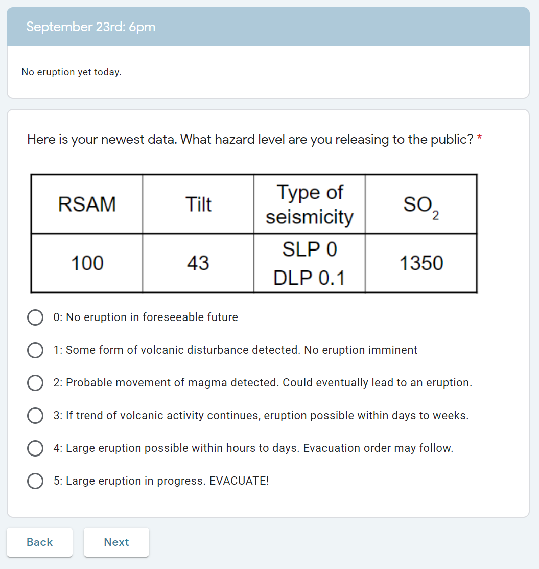
That's where Lavatopia comes in. This lab is set up as a fictitious choose-your-own-adventure style game where students are tasked with assessing data to issue hazard warnings and potential evacuation orders for a fake volcano. They are given data for each "day" of the simulation and are then asked to make a decision about what to do next.
I didn't make the original lab, but it was a fabulous concept, and that's what makes it an excellent candidate to show how simple digital tools can make all the difference. Google Forms isn't fancy, but it gets the job done.
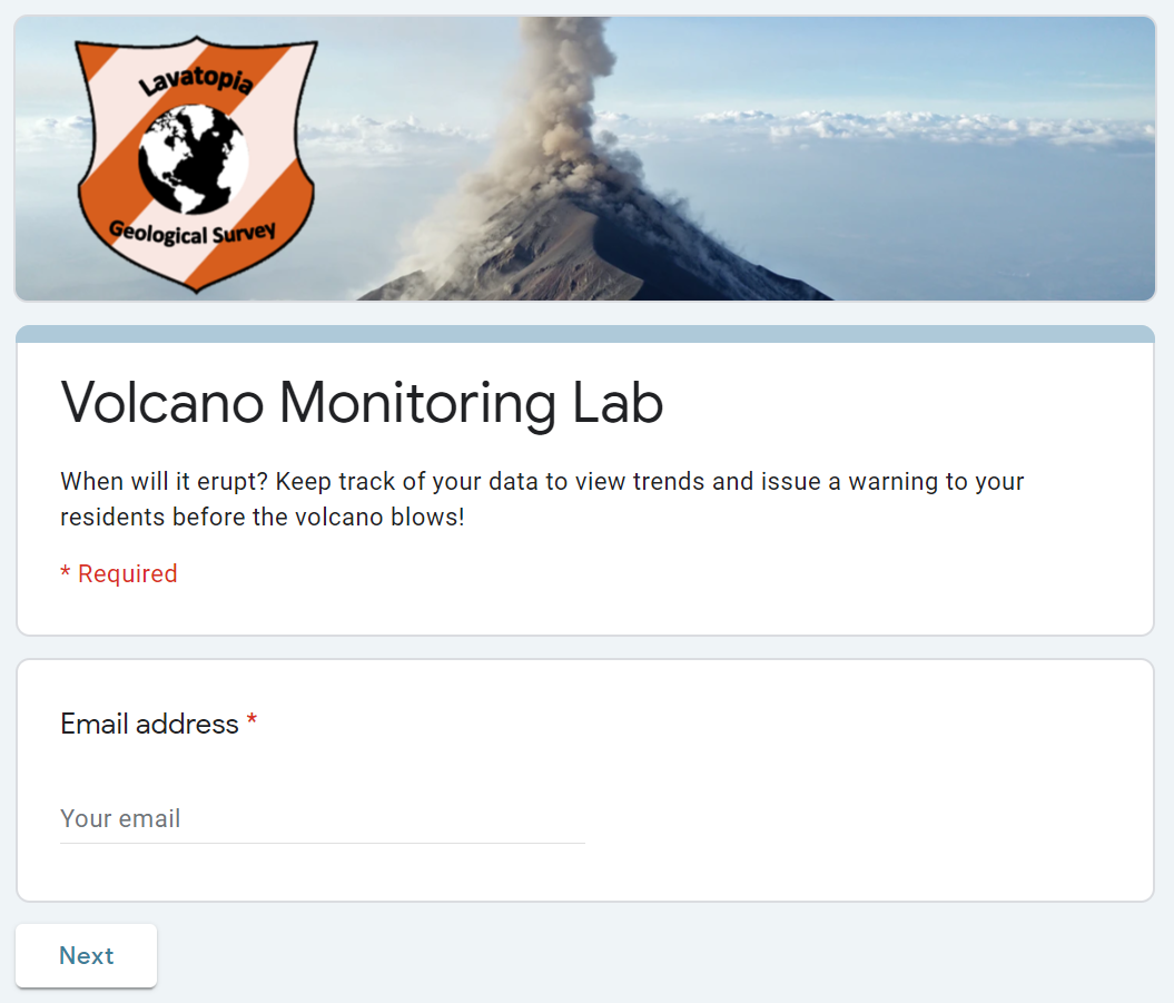
Using Google Forms to update this lab gave me the best bang for my buck, both literally and figuratively. Since it's free for students, teachers, and institutions alike, nobody has to shell out for fancy software when they're just trying to make rent. Students also don't have to download software and learn a new interface, because users can simply click a link to get started right away. And in true Google fashion, distracting bells and whistles are kept to a minimum.
Even so, it gave me just enough options to make solid progress on the three goals I created. Realistically, even though I used this for my classroom, these are useful features in lots of cases—I've actually used them many times since this lab in both my personal and professional life.
Free Google apps are great tools for teachers. Here's a look at 5 ways teachers can save time using free Google apps.
Getting to Lavatopia
For starters, Google Forms gives you a couple of options for getting your users to the right place. From the big Send button in the top right-hand corner of the forms editor, you can use the link option (with either a full-length or shortened link) to email to your users or hyperlink to it from a classroom homepage.
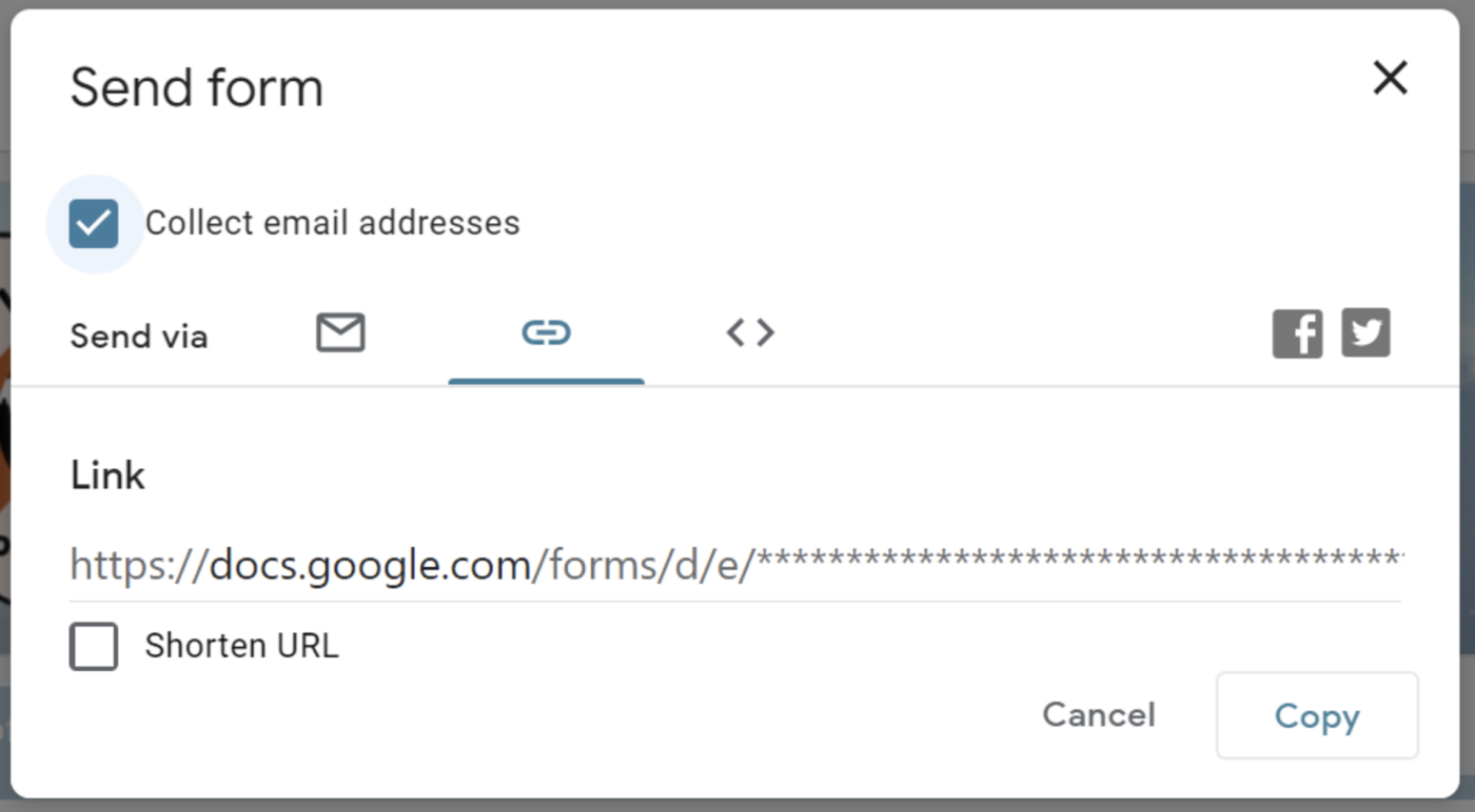
That being said, if emailing your users is the format you prefer, Google Forms has a built-in feature for that, too, which is located right next to the link option.
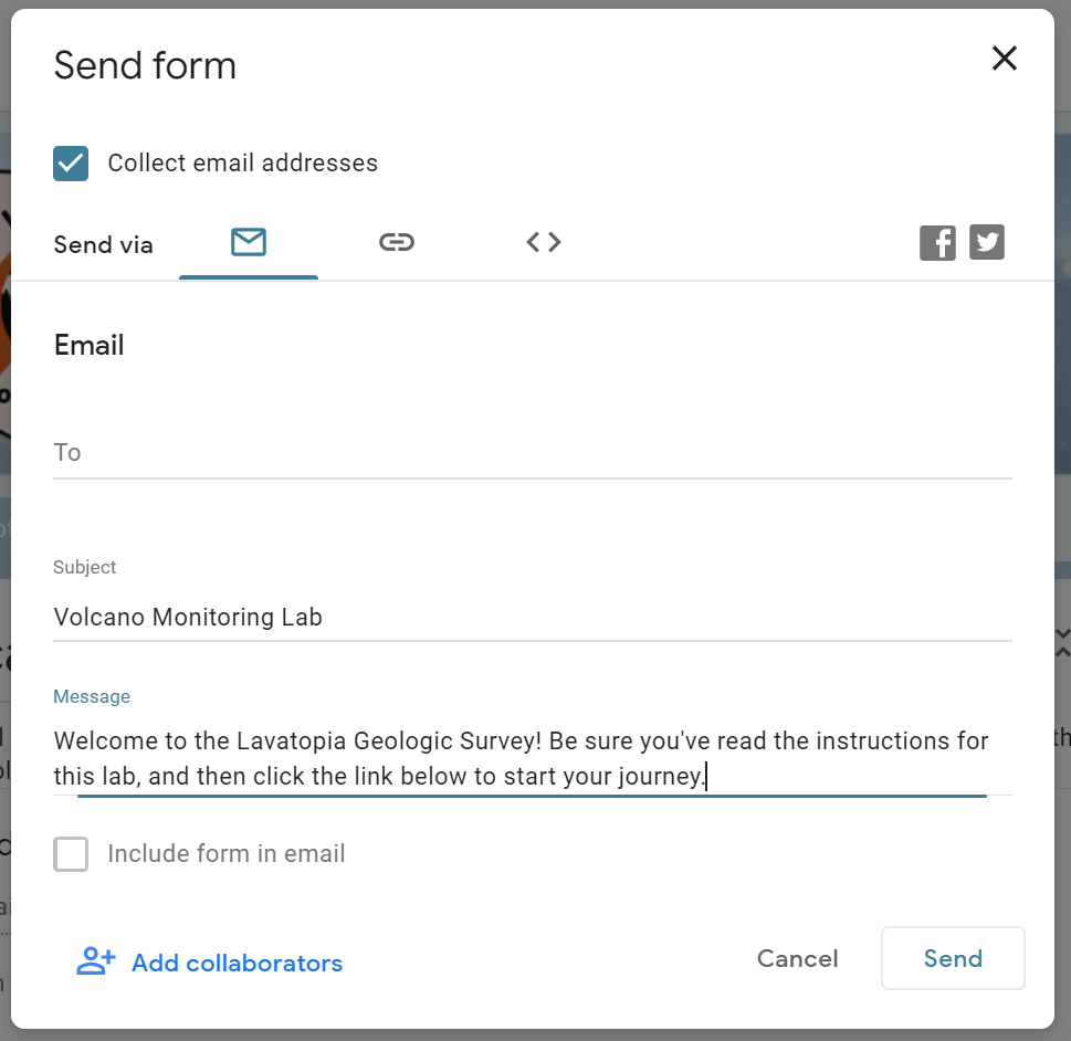
A caveat for this: if you're making a choose-your-own-adventure style form, like I was, where you want the options or steps to be a surprise, definitely don't click the Include form in email option. That will literally write out every option from every question in the whole form, and that's no good. A link to the form will automatically be generated in the email either way, and you don't want to ruin your carefully planned surprises before users even enter the form.
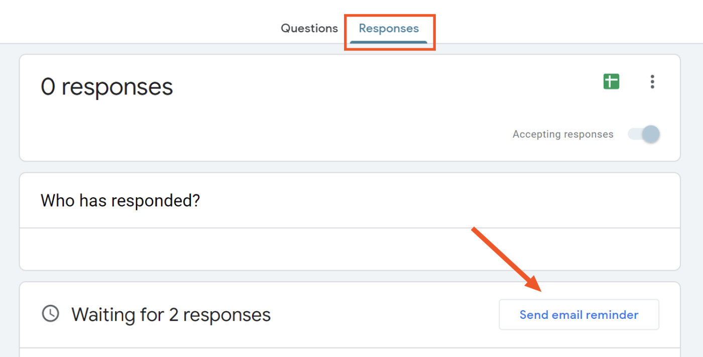
Regardless of which option you choose, Google will track the email addresses that were used to submit the form. But one benefit with the email option is that you are essentially registering users into your form. As a result, under the Responses tab from the main editor, you can see at a glance who has submitted the form—and who hasn't. You can even hit Send email reminder to gently nudge those who like to procrastinate a little too much.
Navigating Lavatopia
Once users had found the survey, I wanted the journey through the lab to also be easy to navigate. Here, I needed my students to only see one question at a time, because in this format, what users should see next depends on what they previously selected.
The way to do this is to use the sections feature, where each section is essentially its own page: users get to the end and need to click Next to move on to the next section.
With my lab, students are tracking their data on separate graphs so they can see the trends happening in "real time," but all they need to do for the Google Form is simply click a button, which makes it very easy to play along. Even if your options aren't conditional (for example, you just want to make one big survey), it's a good idea to use sections, so users aren't confronted with an eruption of 50 questions all at once.
So: what's to stop students from just clicking through without actually doing the activity?
Well, for one, I make them turn in their data graphs separately because this is still for a science class. Beyond that, Google Forms has a wonderful feature to link the responses to a Google Sheets spreadsheet. This allows me to see all the participants of the survey with a timestamp of when they submitted it, and it displays all their responses with each answerable question as its own column.

Even though, technically, all this information is visible from the Responses tab as well, this is a solid way to view a larger group's data all at once, instead of having to click through person-by-person. This way, I can see which students have simply button-clicked the same response over and over again, or (and hopefully more often) which students' responses are engaged and insightful. For this particular lab, I have my students submit reflections at the end through our learning management system, so it's easy for me to leave them feedback they can view later. But you could easily have text-based questions built into your Google Forms "survey" and then grade or otherwise assess them using the spreadsheet as well.
If you want to be notified whenever a student submits a form or send all new responses to your to-do list for grading, you can use Zapier to connect Google Forms to your other apps. Learn how Zapier works.
Unforeseen Lavatopia
Ok, so I've set up a survey, and I'm confident that it's fairly easy to navigate. This is necessary, but it's not what'll keep college students on their toes and learning. To help students deal with some of the realities of science (social policies, anomalous data, etc.), I recognized that it would be beneficial to add at least a small handful of jokes or ironic commentary on life.
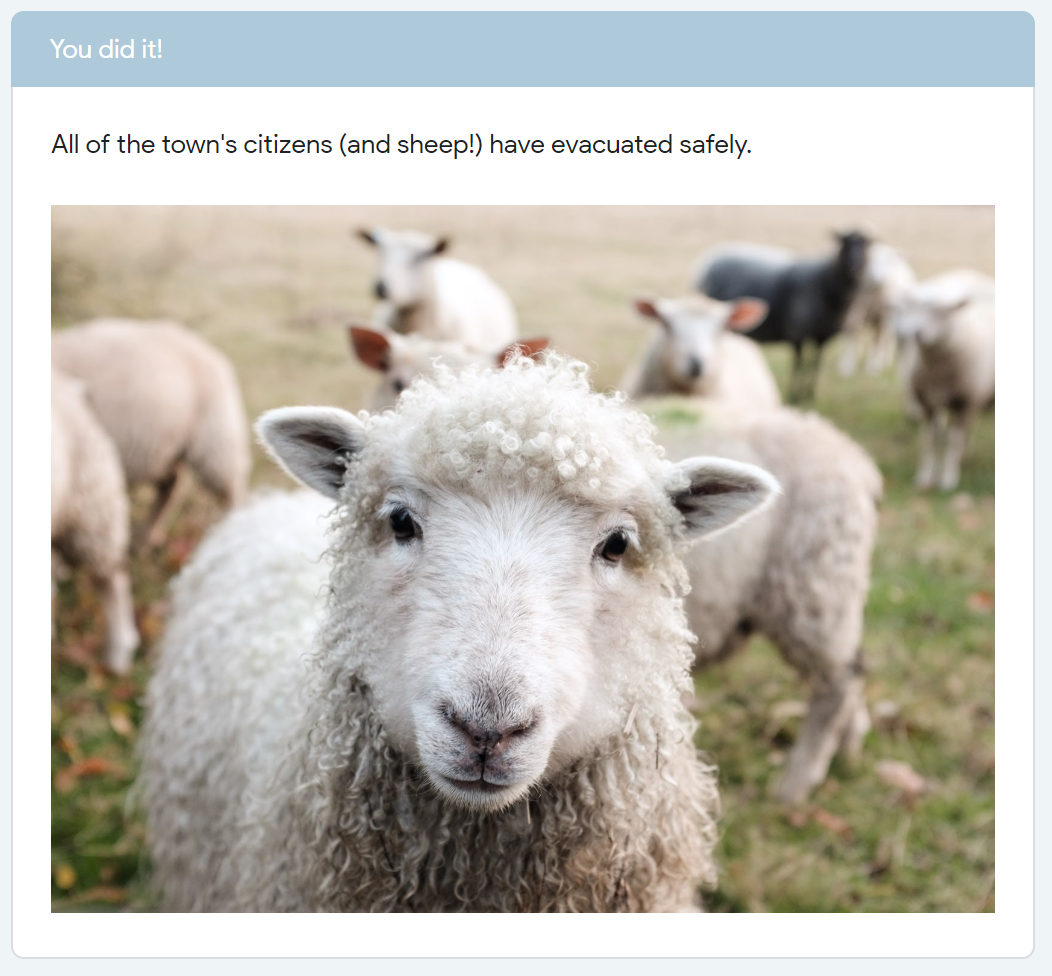
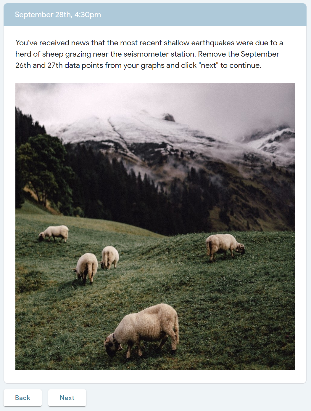
One surprise that I loved from the original lab involved some aggressively seismic sheep.
Another surprise that I added for my version involved a press conference with demanding local news crews.
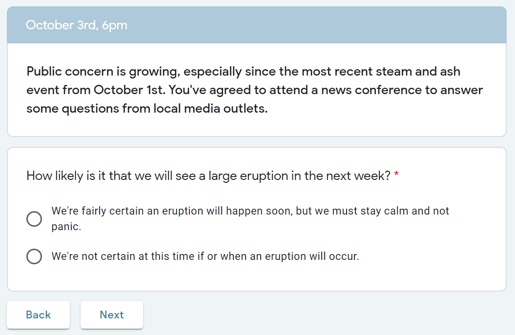
The trick here was that I needed to make each result specific to the option students chose. This was also the foundation of the choose-your-own-adventure nature of the lab, with option A leading down path A, and option B leading down path B. Here, I used the Go to section based on answer option to segment what would happen next.
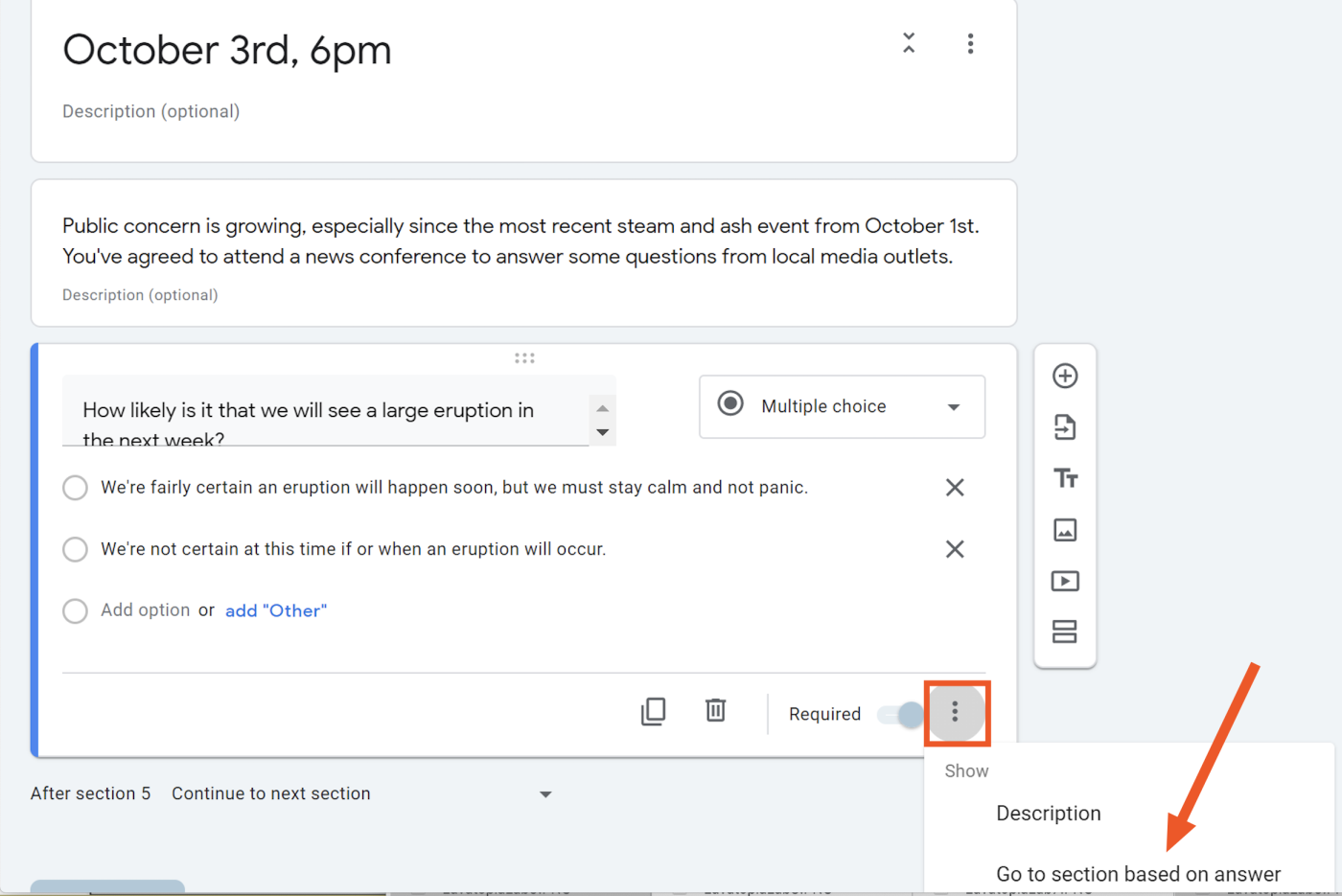
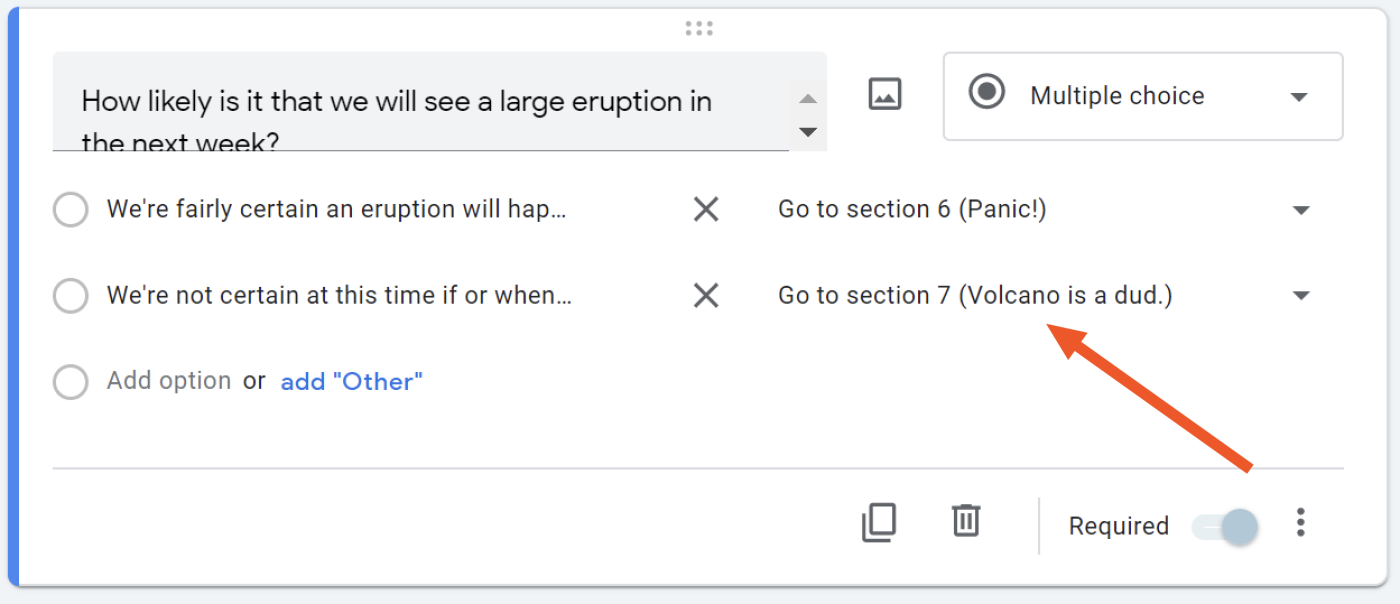
If students select the first option, it throws everyone into panic mode. If students select the second option, everyone stops caring. Either way, not so good for the town. Lesson learned: it's difficult to be the scientist in charge.
Reflecting on Lavatopia
Of course, building a volcano-menaced civilization wasn't without its challenges. Among them: Google Forms appears to have an upper limit of sections before the form editor page becomes exceedingly slow. For my lab, the magic number seemed to be around 150 sections before it became less stable and started lagging. That being said, the user side of things still worked well, and I'm not sure you'd want a survey longer than that anyway.
There also isn't a built-in way to disable the "Back" option at each step, so students could still back up if they didn't like the direction they were headed. This wasn't great for my purposes, but I can imagine lots of use cases where going backward might even be encouraged.
Overall, this lab worked very well as an update to the original and gave my students a much-needed respite from some of the less creatively packaged labs in the class. It took time to create, but it was worth it to gain a more streamlined experience for both me and my students. My students can now wave fondly to Lavatopia and depart for other labs: the digital makeover of Hurricane Cove awaits.
