Zapier has been around for over a decade, but we've never had a clear story or way that we talk about our brand.
"People internally describe it 50 different ways," said Zapier Creative Director Michael Jeter. "And those who use it don't know how to describe it to their friends. We wanted to make it simple, so it's easy to share and to be able to speak with the same voice."
We knew it was time for a rebrand: a way to shift perception toward a more expansive vision of how automation will change how businesses run and how Zapier helps that happen.
Zapier needed a brand identity that communicated how big the possibilities are for the company and our users.
At its founding in 2011, Zapier was one of very few tools in the no-code workflow automation space. That's changed. People's awareness of automation is growing, and how they feel about the different tools available will inform their decisions about which ones to use.
"We'd never really done a full exploration of the brand," said Zapier Chief Marketing Officer Moody Glasgow. "Our brand came together piece by piece over time. Philosophically, as a marketer, I believe brand is the most important thing you can do, but it's not necessarily the first thing you do."
A brand to communicate new possibilities
Zapier needed a brand identity that communicated how big the possibilities are for the company and our users.
"Folks needed to look at us and think, 'This is going to be the future,'" Jeter said.
To start, we needed to understand our place in the overall culture of no-code automation. We worked with DeeDee Gordon of The Gordon Co. to determine what the cultural trajectory is in our space and learn the challenges for people adopting automation as a way to get work done. They created a brief for our first-ever brand campaign, and we used those insights to inform the rest of the rebrand.
One of the things we learned: our audience is busy. "The people who are most likely going to need automation are victims of their own success," Jeter said. "They have so much to do that they need a tool to get it done, but they're already too busy to find a tool, learn a tool, and use a tool."
Another part of the rebrand: Finding the right tone to use when talking about ourselves.
"How do we want to make people feel when they interact with us?" Jeter said. "Do we want to be serious and reserved, or do we want to reflect what our users say about us, which is 'I feel like a wizard when I use Zapier'?"
Spoiler: it was the latter.
Creating the brand
With the strategy in place, it was time to create the visual identity system to bring the brand to life. We partnered with Instrument, a design agency, early in the process, who brought us to "the new possible" as the name of the brand. Our in-house design team was small, and working with Instrument expanded the size of the team while adding valuable perspective and expertise.
"Sometimes you want someone who can see from the outside like a user does and bring a fresh perspective to the work," Jeter said. "Also, brand identities are giant pieces of work. There are a lot of things a brand needs to be successful. Agencies who work on branding are going to be really good at identifying what's missing and managing the intricacies."
Our rebrand partners
During the months we worked with Instrument to develop the visual identity system—including a new logo, new fonts, colors, and other graphic elements—they helped us navigate the process, providing updates to leadership and ensuring all the elements we needed were in place.
By late 2021, leadership had chosen a brand identity with a logo based around a Z that echoed the energy of a lightning bolt. The rebrand was scheduled for April.
As we prepared for launch, we saw the Z become a symbol of Putin's Army and the war on Ukraine. Despite being so close to launch, rolling out a new brand with a giant Z during this time was counter to our values. Zapier decided to start over, giving the team three weeks to find a new visual identity to communicate our brand.
Because of the short timeline, this rebrand was handled in-house, by the now-expanded design team, with some help from the Instrument team, who provided feedback and assistance.
Back to the drawing board
Jeter gave most of the design team a week off to rest and regroup. Three people—writer Candace Green, program manager Sabrina Summers, and manager of design operations Meghan Yip—worked with him through the break to develop a plan that would guide the rebrand sprint.
With a new logo coming, nearly everything needed to be redone, including choosing new fonts and evaluating colors. Jeter worked first with leadership to ensure they understood why this was the right approach and to gain their support. Then, he worked with his team to bring them on board and find places everyone could contribute.
Vice President of Insights and Design Sheryl Soo saw this as an opportunity to re-engage the team in the creative process. "We looked to the team to go wild with their explorations, to re-examine the brand from every angle, to help us find something that could ultimately 'beat the Z,'" she said.
Jeter drove this process, working in the open and inviting anyone with the energy, time, and emotional availability to help. He gave almost daily updates on the work, showing whatever had been done that day, regardless of whether it was something they liked.
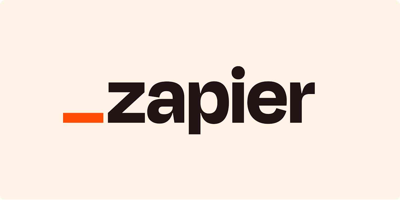
When he landed on the new logo—the orange platform—it was quickly evident it was the right choice. "Personally, I knew straight away that this could be it," Soo said. "But I wasn't 100% sure how others would react. I actually took the logo on a bit of a secret roadshow during the Exec retreat to get some reactions."
Everyone loved it, she said, and they knew this was the one.
Internally, we talk about Zapier as a platform—a product and system that people use in many different ways, Jeter said. This logo allows Zapier to do the same thing with its brand.
"The thing I'm most proud of with the visual identity system is that it both gets out of the way of and allows us to tell any story that is relevant to our users," Jeter said.
The platform in the logo becomes a stage that can highlight anything—photos or videos of an actual user or something more emotional, like the story of a user feeling like a wizard by using automation. And it helps Zapier compete for people's attention against anything on the internet—from other brands to cat videos to TikTok dances.
The brand in action
One of the risks with a rebrand is losing equity you've already built. For Zapier, there was a 10-year history with the asterisk logo and signature bright orange. A lot was due for change with this rebrand, but the team stuck with the orange, making it bolder and brighter.
"Orange is a beloved color at Zapier," Jeter said. "Instrument found the story of 'international orange' and it was perfect. I love that our brand that is all about new possibilities is using the same orange that astronauts used to go to space."
No matter how you feel about a rebrand internally, the real test comes once it's rolled out.
"People are going to have hot takes. We were ready for that," Jeter said. Determining the real success of a rebrand takes time.
Yet, the initial response, Jeter said, has been positive.
"For us, people were really celebrating it and being excited about how interesting and unique and dynamic it was," Jeter said.
My good friend @highlydoctored just shipped the @zapier rebrand. The best startup rebrand I’ve seen a long while 🎯
— Kurt Varner (@kurtvarner) July 6, 2022
Zapier now has life to it! https://t.co/kmfR7NnJEV
Given the whole story behind it—with the last-minute switch and development of the second rebrand—that response has been amazing.
"This was an impossible task. It shouldn't have been able to be done at all," Jeter said.
He credits the design team with making it happen. And in particular, the folks behind the design system, who ultimately had to prep for three launches—first, the one with the scrapped Z logo, then an interim rebrand that brought in new colors and fonts but kept the asterisk logo, and finally the full rebrand that included the orange platform logo.
"Every single person at every level had an impossible task, and they achieved it," Jeter said.
"Not any team could have done this. This one not only did it but did it really well. The team was forged in fire. You can't buy that."
