Data means little on its own. Open a spreadsheet packed with numbers, and it's difficult to tell what's improving and where you should focus your efforts.
That's one of the things that makes reporting on numbers—your site traffic, store sales, or sign-up growth—so frustrating. You have to find the data, figure out how to make sense of it, and then write about what the data shows.
Wouldn't it be better if you could make a dashboard that automatically turns your numbers into clear, actionable insights?
With a spreadsheet and some data integrations, you can build the custom dashboard of your dreams. Let's pull your spreadsheet skills together with the Google Analytics add-on for Google Sheets, and learn how to turn your spreadsheet into the data app you've always wanted to build.
This book focuses on Google Sheets, and this chapter relies on its Google Analytics add-on for the reporting data. But, you could use many of the same steps in any other spreadsheet app to build a dashboard—you'll just have to import the data on your own.
Learn more about using Google Sheets
The Tools to Build a Customizable Dashboard
There are two things you need to make a reporting dashboard: a spreadsheet app, and a source of data to use in the report.
There's a wide range of spreadsheet apps, but Google Sheets is the best tool for this job as it's online, and can pull in data from web apps like Google Analytics automatically.
If you're new to spreadsheets, don't worry. Just jump back to the Google Sheets 101 tutorial in chapter 1 of this book for a quick walk through of spreadsheet basics.
Then, you need the metrics to track in your dashboard. We'll use Google Analytics data to show our blog traffic statistics in a dashboard. But you could import any data you want into your spreadsheet and use these steps to turn it into a dashboard. Just copy in data from your apps, use built-in functions like =finance() to import financial data, or use Zapier integrations to log subscribers, sales, shares and more to your dashboard spreadsheet automatically.
Save new Eventbrite attendees to Google Sheets spreadsheets
Save new Mailchimp subscribers to rows in Google Sheets spreadsheets
Add rows to Google Sheets spreadsheets for new PayPal sales
Tip: Explore more Zapier Google Sheets Integrations to add data from your favorite apps—social networks like Twitter, email marketing tools like MailChimp, and more—to your dashboard as well.
Decide What to Include in the Dashboard
Now it’s time to start building your dashboard. The first step is to determine which metrics matter most.
Anything could be tracked. You can easily set up a report that tracks your new Twitter followers or the number of incoming customer support tickets. But these numbers are meaningless if you don’t have a reason to track them.
So to get started, consider how your performance is measured. For a blog to be considered a success, there are a handful of core metrics that could be tracked:
Users: How many people come to your blog?
Sessions: How many times do they visit your blog?
Bounce Rate: Do they leave right after visiting your blog, or do they stick around?
Organic Traffic: How much of your traffic comes directly from organic search results?
Month over Month Growth: How is your site traffic growing month over month?
These are the basic metrics you will want to keep an eye on—and the ones we'll include in our dashboard in this tutorial.
Your team might have different metrics that are more important for your company: sales, signup rates, conversion rates from ad campaigns, and more. If so, decide which of those are most important, then add sections to the dashboard to track them as well.
Get Data For Your Dashboard
Now, we need data for each of those metrics, so we can turn it into a report. And, to make things automatic, we need to data to be automatically added and updated in our spreadsheet.
That's easy to do for website analytics, with the Google Analytics Spreadsheet Add-On. Once connected to your account, it will automatically import live data about your website into your spreadsheet.
If you need to import other data, here's some other options:
The Zapier Google Sheets integrations above could automatically add data about subscribers, sales, and more to your spreadsheet
The Google Sheets
importfunctions can import RSS feeds, website and XML data, and info from other spreadsheets—something you can learn more about in the Spreadsheet CRM tutorial from chapter 3 of this book.Pre-built Google Sheets add-ons can pull in data from a wide range of sources, including public databases, marketing and ads tools, and more. Skip to chapter 6 to find details on some of the best Google Sheets add-ons, or explore the Google Add-ons Store to find more
Use Google Apps Script to create custom add-ons for Google Sheets and import data automatically from other sources. Jump ahead to the guide to Google Apps Scripts in Chapter 7 to get started building your own add-ons, if you want.
Build a Reporting Dashboard in Google Sheets
It’s time for the fun part: actually building our dashboard!
Let’s get started. The first thing to do is install the Google Analytics plugin for Google Sheets if you haven’t already. We’ll need this to create our report.
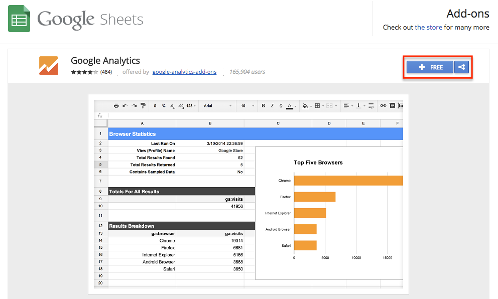
With that installed, open a new Google Sheet, click Add-ons in the menu, and select the Google Analytics plugin. There are a few options for reports, and for this dashboard we'll start with Create new report.

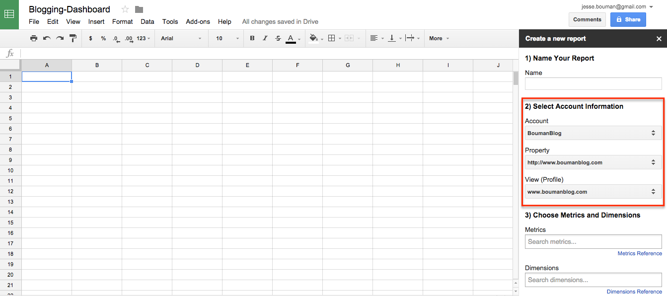
That will open a new Report pane on the right side of your spreadsheet. Here we’ll name our report and select which Google Analytics account, profile, and property to run the report from. I’m going to use my personal blog for this report—you should select the site which you need to create a traffic report about.
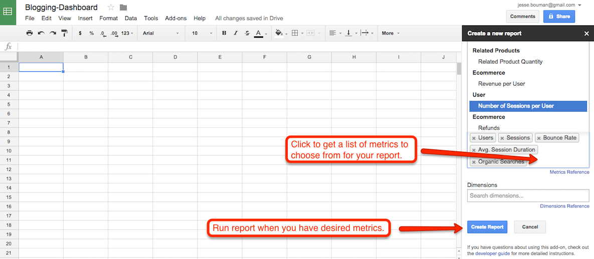
Now, choose which metrics to track with this report. In the input box below your account info, click the box to see a list of metrics, then choose the ones you've selected earlier and click Create Report.
The extension will then add a new "Report Configuration" sheet to your spreadsheet, and it'll automatically populate with your site analytics data. This is where we'll get the data for your dashboard.
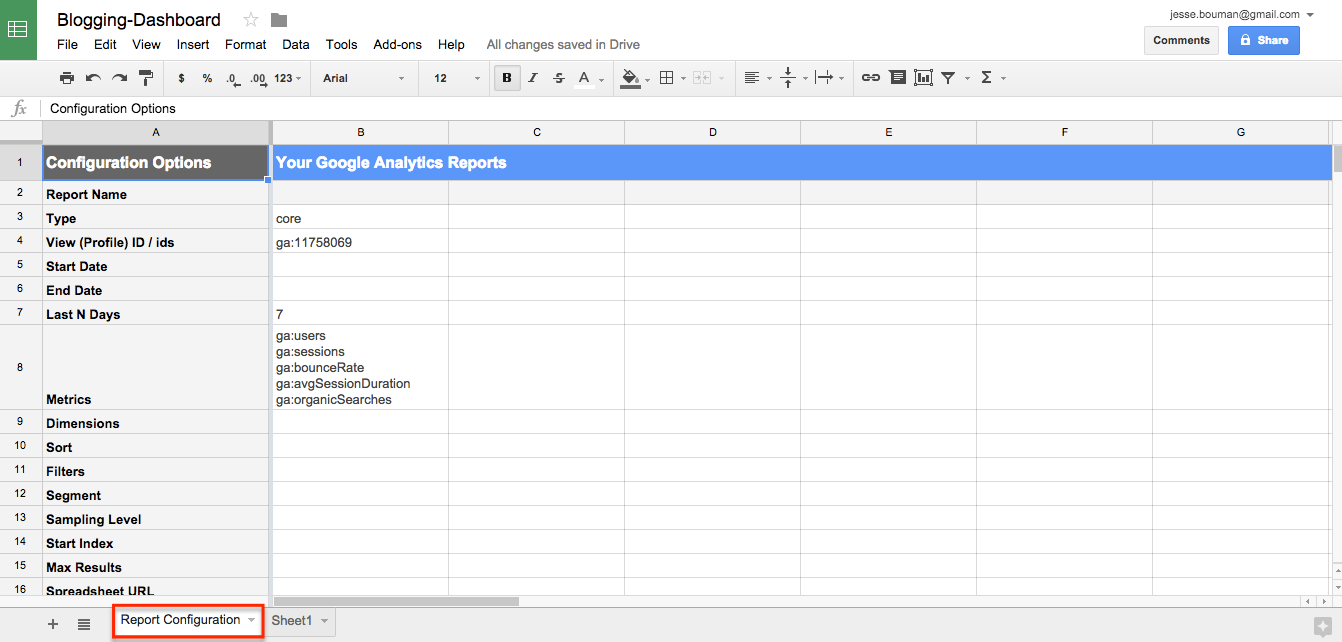
By default, the spreadsheet will show data from the past seven days—but you can change that by changing the number in column B7 beside Last N Days, or removing it and adding start and end dates. I typically find that data from the past 30 days—and comparing that to the two previous 30 day periods—gives the best feel for month-over-month growth.
Note: Don’t forget to delete the cell for the last 7-days. Otherwise, no matter the dates you add in, your data will be off.
To add the days in a way we can easily edit them, let's add a new sheet to our spreadsheet for dates. This will help us get dynamic information for our report—using the past two months in this tutorial, but you could enter any date you want.
First, add a sheet, then add the Start and End date for this month and the previous month, as in the screenshot below. You can then update the dates in the future when you want for new reports, or use Google Sheets' today or date functions to automatically grab the current date or month for the report if you'd like.
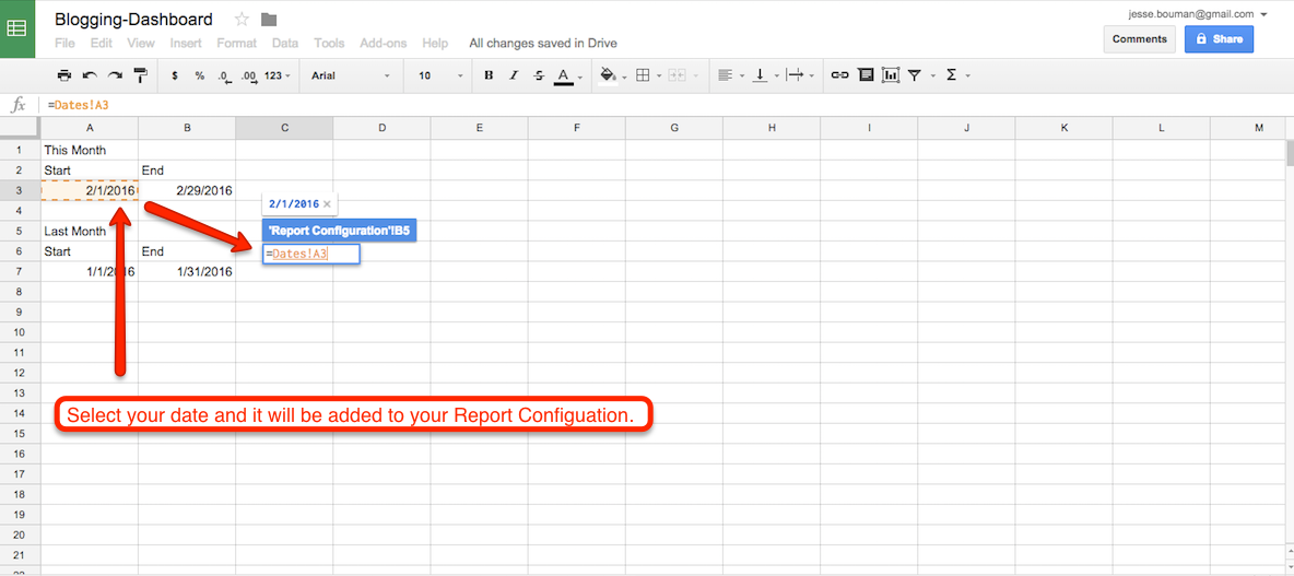
Now, go back to your Report Configuration Sheet and select your Start Date cell. Enter an = sign, then go back to the Dates Sheet you just created and select the first date for this current month. Press the Enter key, and it will automatically populate into your Report Configuration. Now repeat this step for the end date.
After you’ve set the beginning and end dates for your current month, copy and paste the report so we have one for the previous month’s traffic. You can do this as many times as you’d like, depending on how far back you want to track your traffic for this report. For this tutorial, let's go back three months—so we'll copy the data and add it into two more columns. Remember to add the correct dates to each one, and give them a unique name in Row 2.
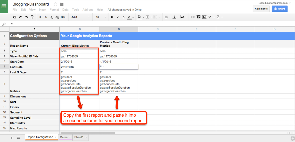
Now that you have the dates for your three reports, it's time to run the report. In the top menu in Google Sheets, select Add-ons -> Google Analytics -> Run Report.

The Google Analytics extension will automatically add three new sheets. Each of them is a report based on the metrics and timeframe that you chose—one for each month, with the title you added to their respective rows in the configuration sheet.
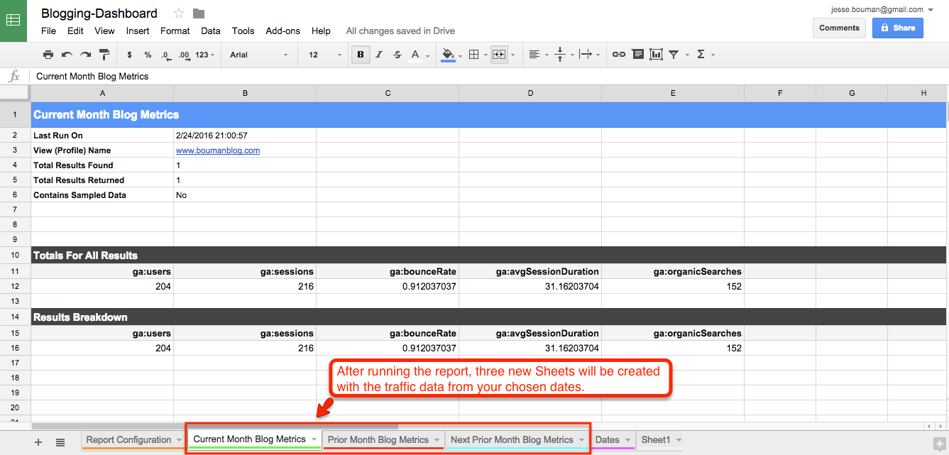
It’s time to take this Google Analytics data, and turn it into a dashboard. For that, select the original Sheet1 sheet, click the arrow on the right, and rename it to Dashboard. You might also want to drag it to the left, so it's the first tab you see when you open this spreadsheet.
Now, let's add data and more to the dashboard. You can make this as simple or fancy as you’d like—but we'll keep it bare bones for now, and you can add style later.
Start by typing in the metrics you want to display on the dashboard. Then, we'll populate it with data just as we did with the date field previously. Select the cell for that month's data, press =, then navigate to the Sheet where the corresponding information is, select the cell, and press enter. Repeat that for each cell to pull in the proper data for your report.
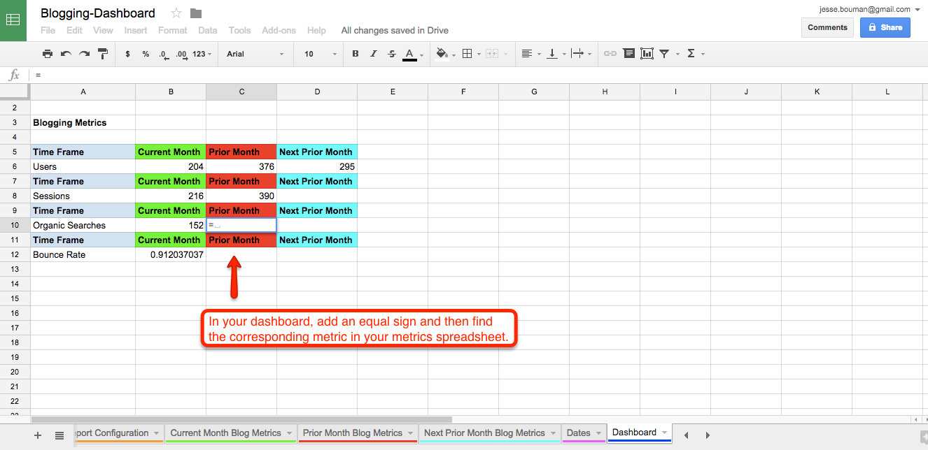
Once this is finished, you'll have a plain dashboard with your site traffic data for the past three months. You can add some quick formatting to make things look nicer, perhaps with background colors for each month and number formatting to make the values stand out.
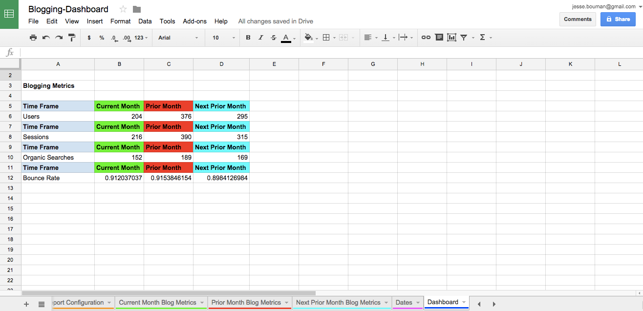
That's still a bit hard to read, so we'll turn these metrics into charts that will let you see what growth—or not—you’ve had over the past three months.
Just highlight the cells that you want to represent visually—perhaps the 3 months of data for Users, first—then click Insert -> Charts in the top menu.
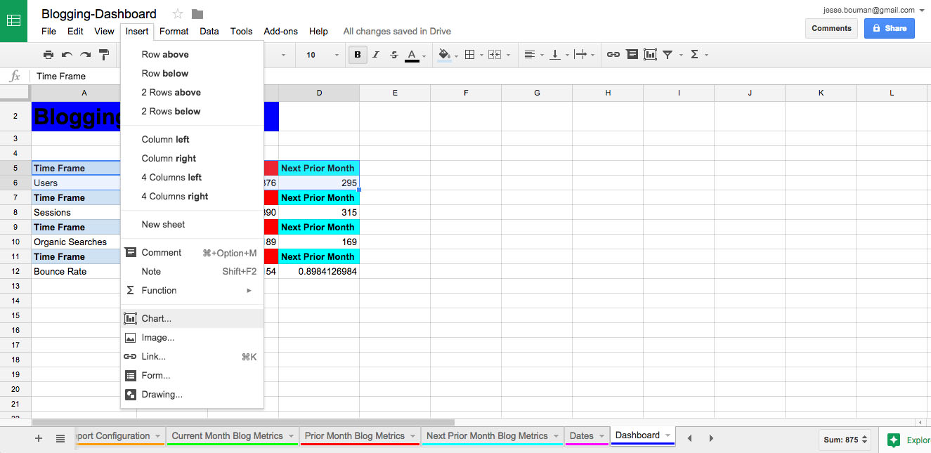
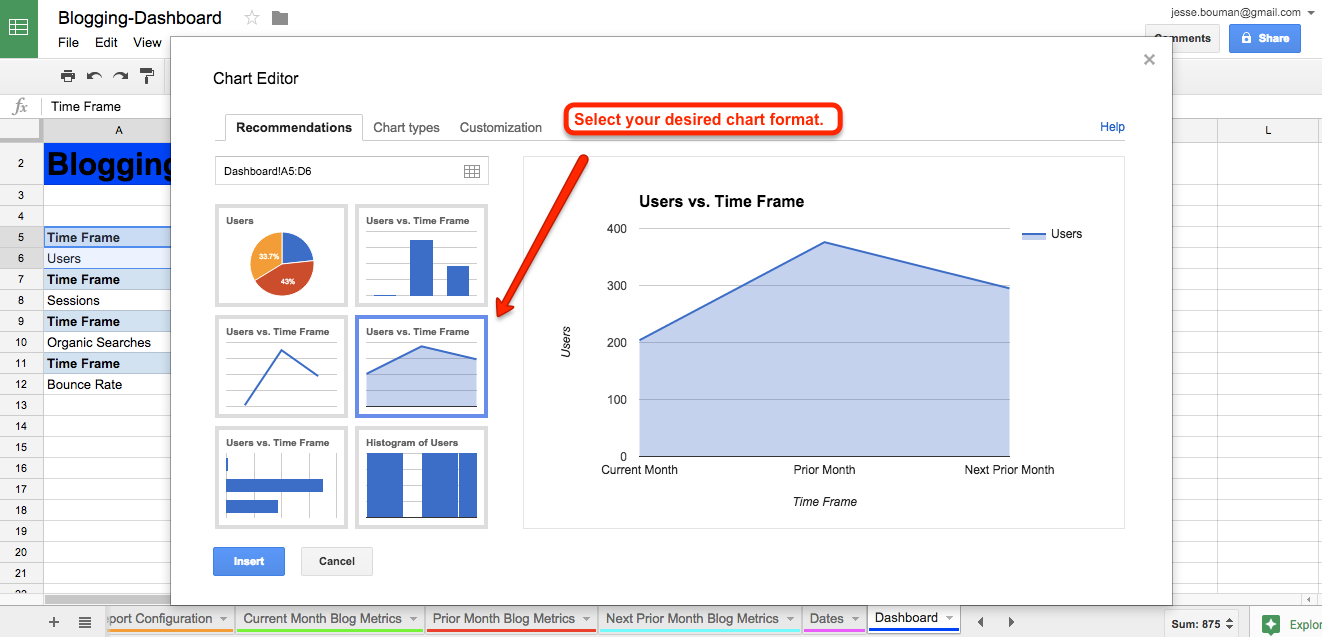
Google Sheets will show you the chart options. Select which one you’d prefer to represent your data—I'll choose a line volume chart for this data.
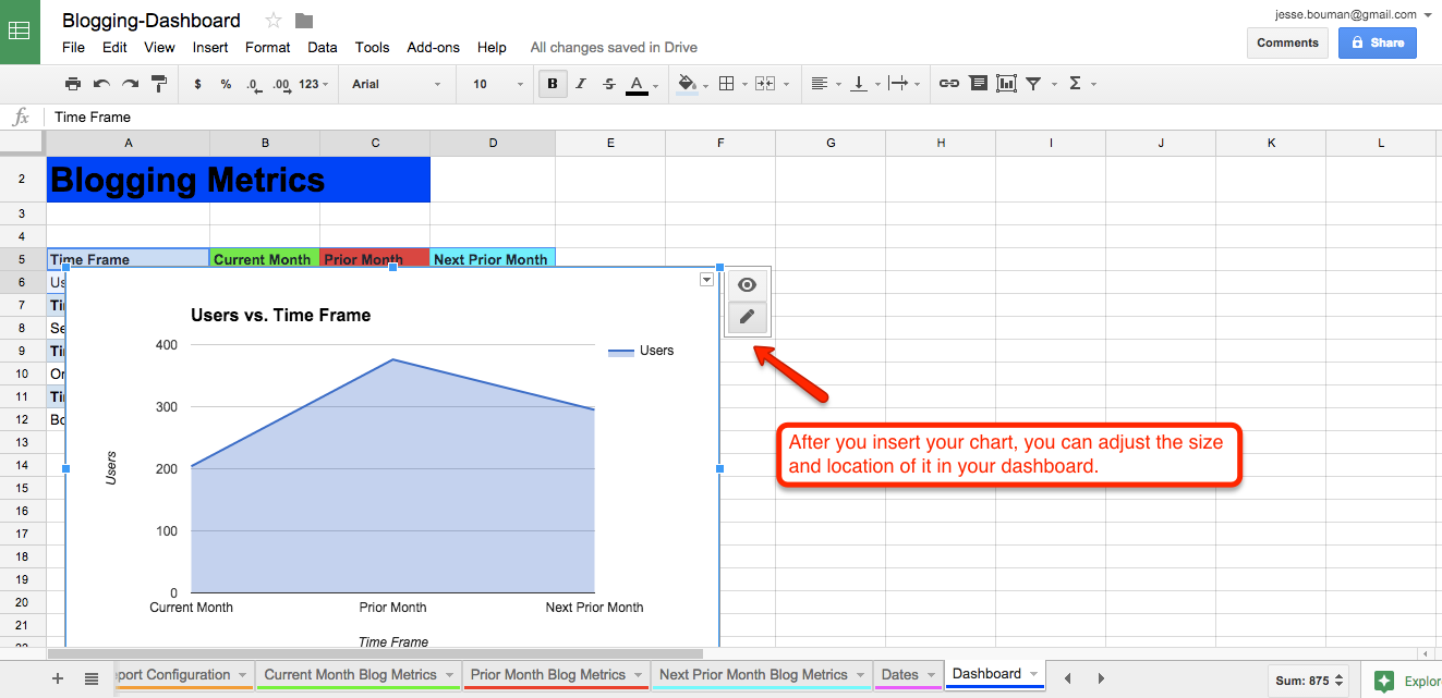
That'll place the chart at a random spot, often on top of your data. Just click and drag on the chart to move it to the place you want, or drag the squares at the corner to resize it. And if you selected the wrong data, click the pencil icon to edit the data, labels, or chart style.
Now, repeat this process for each metric and arrange the charts as you please. I've arranged the charts in a grid on the right, for a quick way to see the stats at a glance.
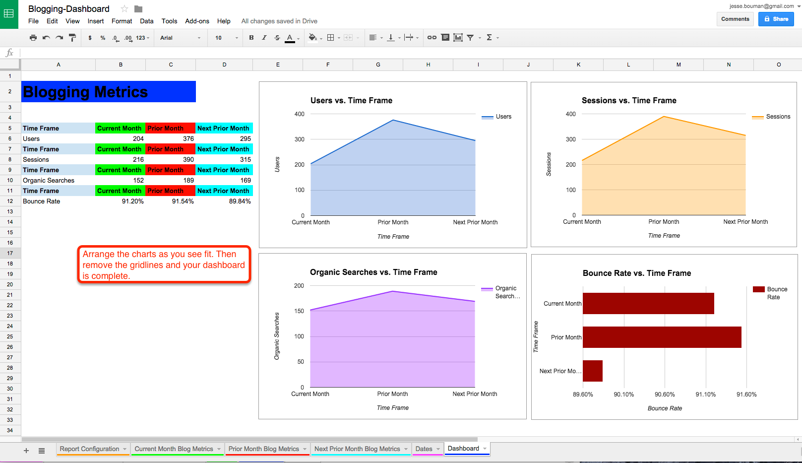
Our dashboard now has our core metrics on the left and visual charts on the right. Let’s add our monthly growth to the dashboard, and format everything automatically with conditional formatting.
In the blank area below our core metrics, add labels for the monthly growth numbers.
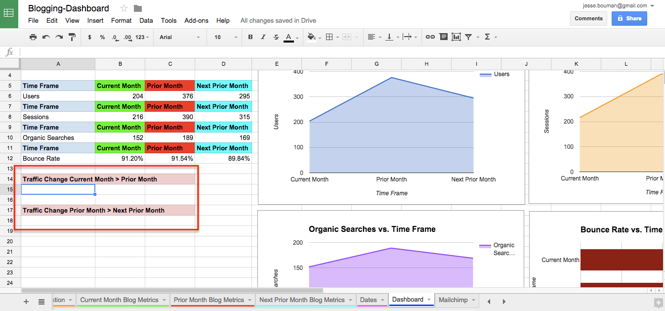
In Cells A15 and A18, let's add conditional formatting. That way, when we create our formula for monthly growth, the spreadsheet will know how to format the cell.
First, select cell A15, then select Format -> Conditional Formatting in the top menu. That will open a pane on the right where we will set up our conditional formatting criteria.
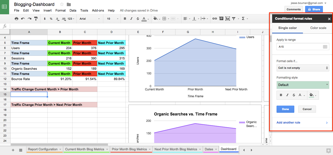
We’re going to set two conditions for Cells A15 and A18. If the value of these cells is less than 0, it will display red. If the value is greater than 0, it will appear green. Now we’ll be able to see if the traffic is growing just by checking the colors.
To populate the cell, just add in a simple formula. In A15, type: =Sum(, then click the cell with the current month's users, then type - and click the cell with the previous month's users and press Enter. This will give you the difference between the two months, and it'll automatically show the correct color thanks to the conditional formatting.
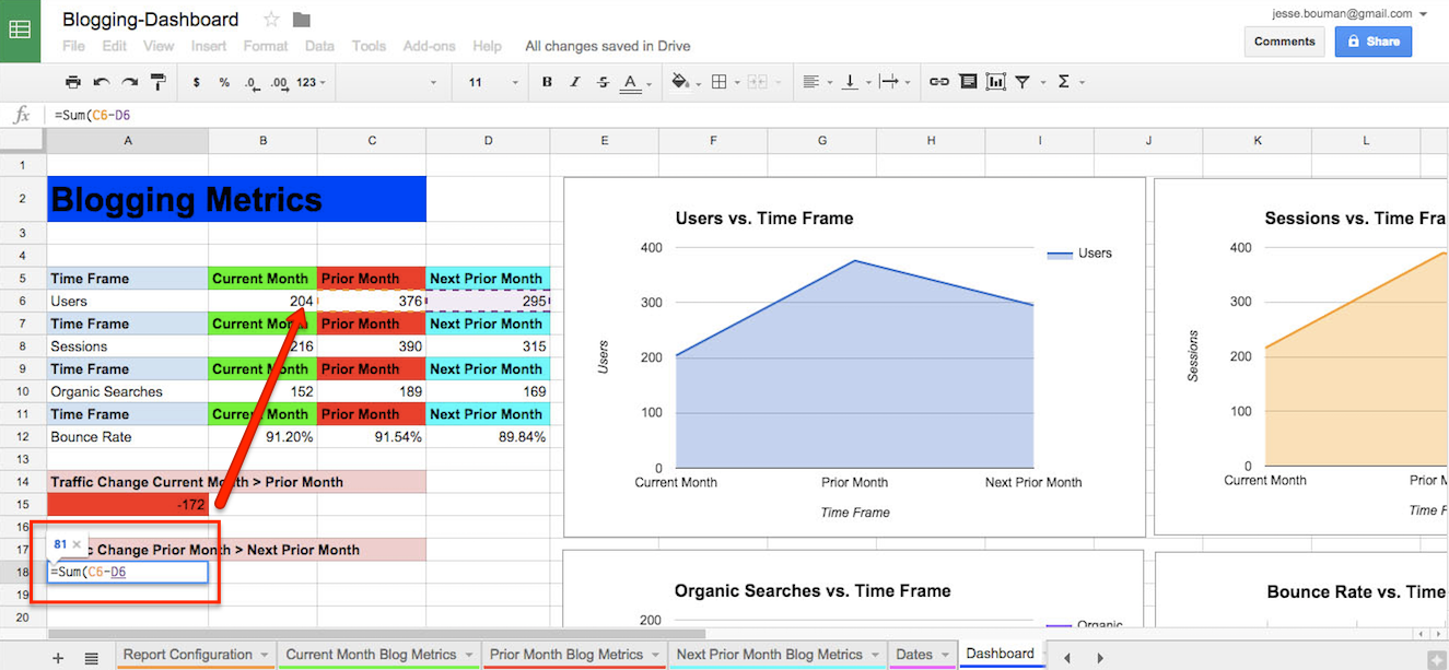
Repeat this process of creating a conditional format for cell A18 and populate the cell with data from Prior Month and Next Prior Month.
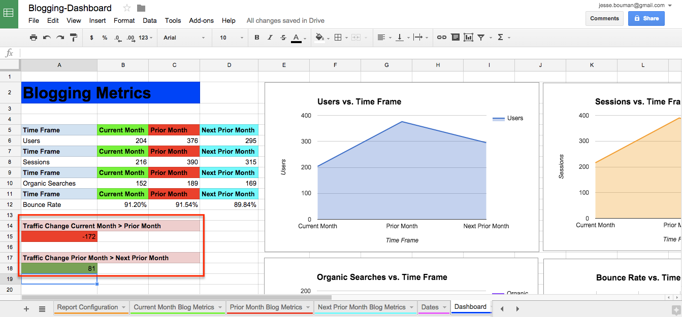
You can repeat this process as many times as you’d like, depending on what metrics you want to track monthly growth. For now, we’re just going to track monthly users.
If the total change in your metrics, month-to-month, is not enough, then you can add the percentage change in the cell next to it with this formula: =(Value1 - Value2) / Value2. You could even add conditional formatting again to see the percentage difference month-to-month easily.
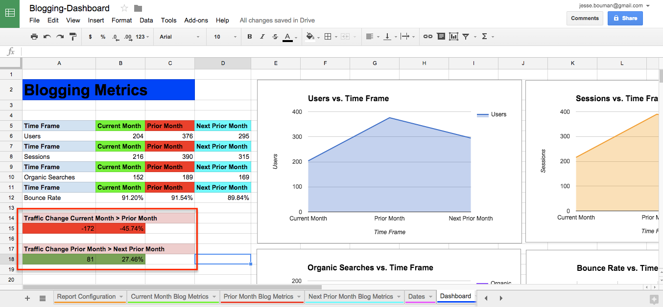
Congratulations! You have just created a site analytics reporting dashboard in Google Sheets without any engineering manpower—one that you can easily tweak to show exactly the stats you want.
Add Additional Metrics to Your Dashboard
You've built a great basic dashboard, one that'll help you track the most important metrics for most sites. But what if your team wants to see more? The Google Analytics add-on can pull in more data, so let's add more dimensions to our dashboard to see a breakdown of how new users found our site.
To do that, we need to go back to the Report Configuration tab. This is where we set the metrics we want to track—and it's where we'll add the new metrics to our dashboard. Click Add-ons -> Google Analytics -> Create Report again, and choose your account, property, and profile just like we did in the first step.
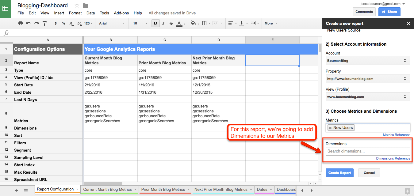
As you can see at the bottom of the report is an option labeled "Dimensions." We originally ignored this option, but we’re going to use it for this next report. Dimensions gives us an extra layer of information for our metrics—a breakdown of where the raw metric comes from.
Let's take a look at where our new users come from, so we can see if most people discover our site via Google Search or social networks. In the "Metrics" field, add New Users. Then below that in Dimensions, add the Source field.
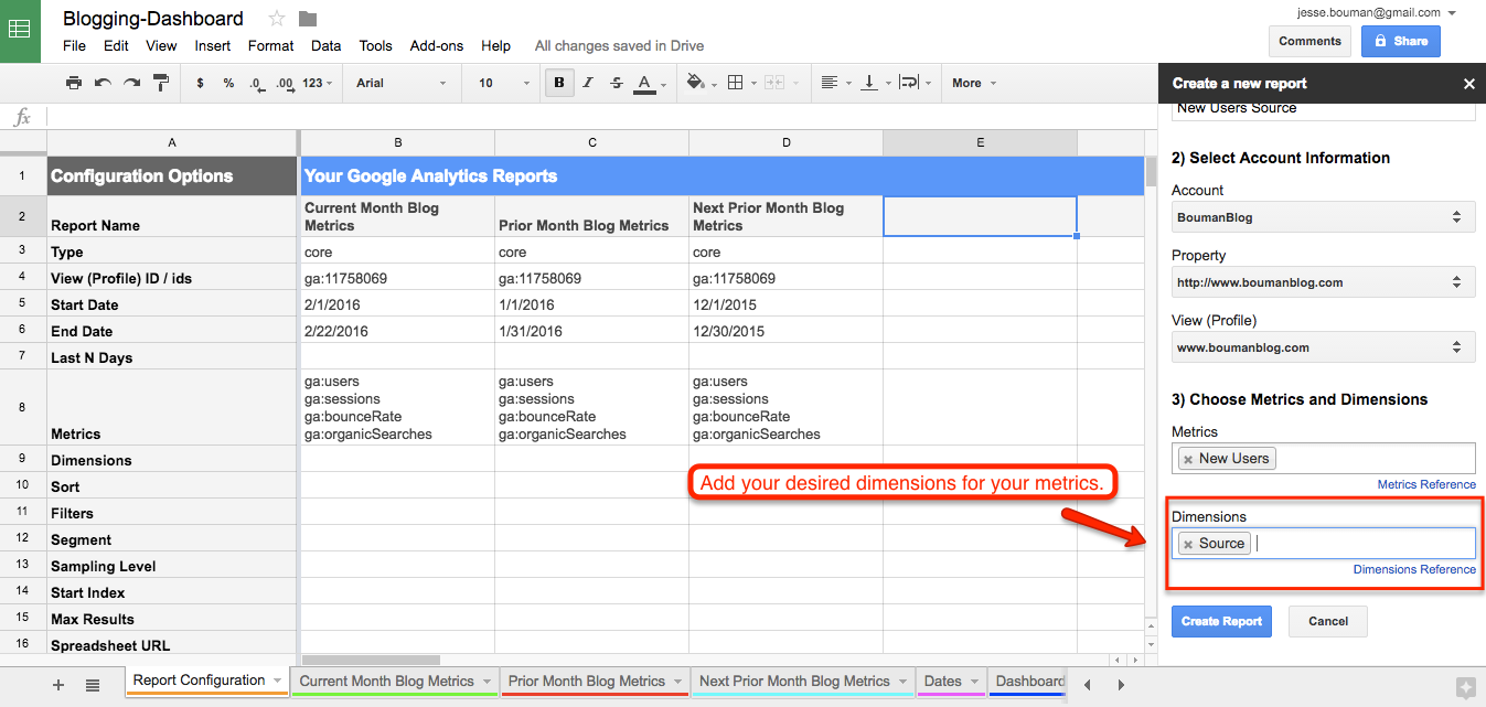
Click Create Report, then set the dates for the three month period of time we’ve been monitoring as before. Once that's done, go back to Add-Ons in the menu and run the report again.
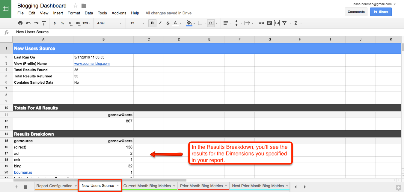
That'll create one more sheet in your spreadsheet: "New Users Sources." It'll include the data we requested, with the total users broken down by which source brought them to our site.
Let’s add this data to our reporting dashboard. Because there is so much more data with this report than previous reports, we'll only look at the top 10 traffic sources for new users on the dashboard. If you ever want to dig deeper into the smaller sources, just switch back to the New Users Sources tab.
We'll first need to format the source data to look nice on our dashboard. Select the data in the ga:source column of the Results Breakdown, then cut it and paste it in the column directly to the right of ga:newUsers. Alternately, you could copy the data by selecting the cell on the right, pressing = and then selecting the correct ga:source item you want, then pressing Enter—and you could hide the ga:source column to clean up the spreadsheet.
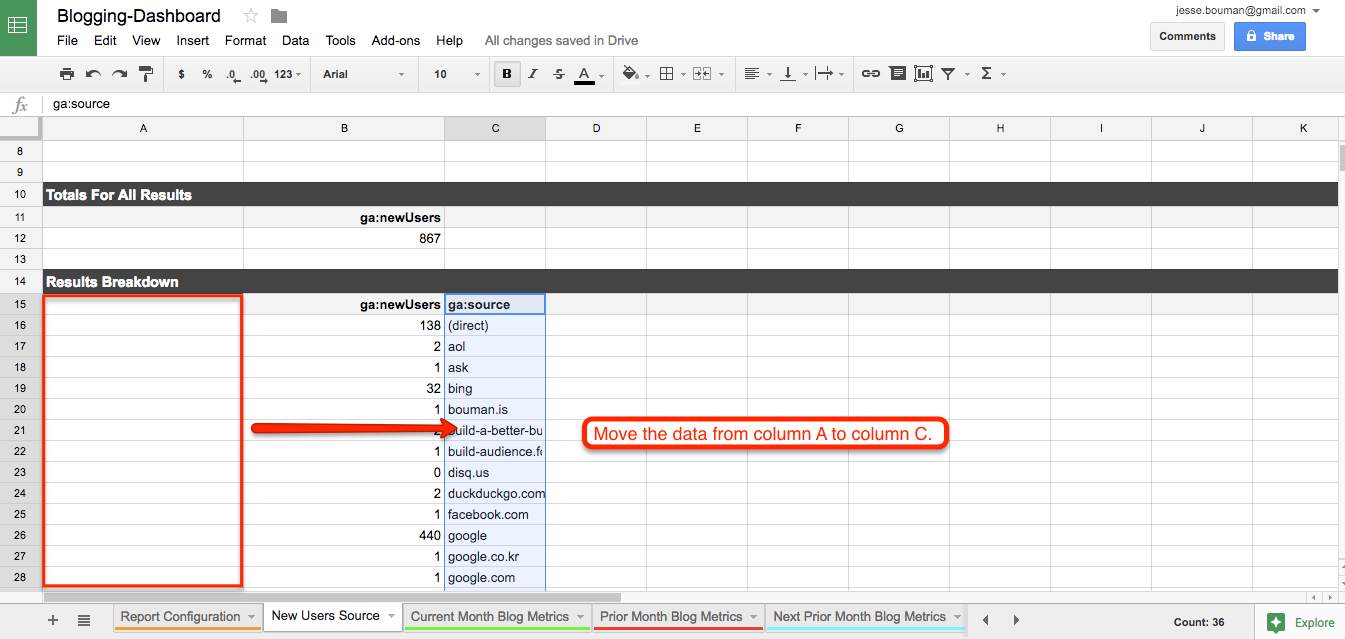
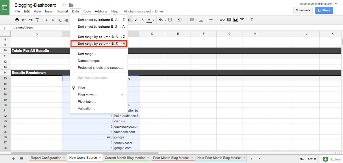
Now, let's sort the columns to see the sites that sent the most visitors. Highlight both of the columns, then select Data -> Sort Range, column B, Z -> A in the menu. Your column will now show the source with the most new users at the top.
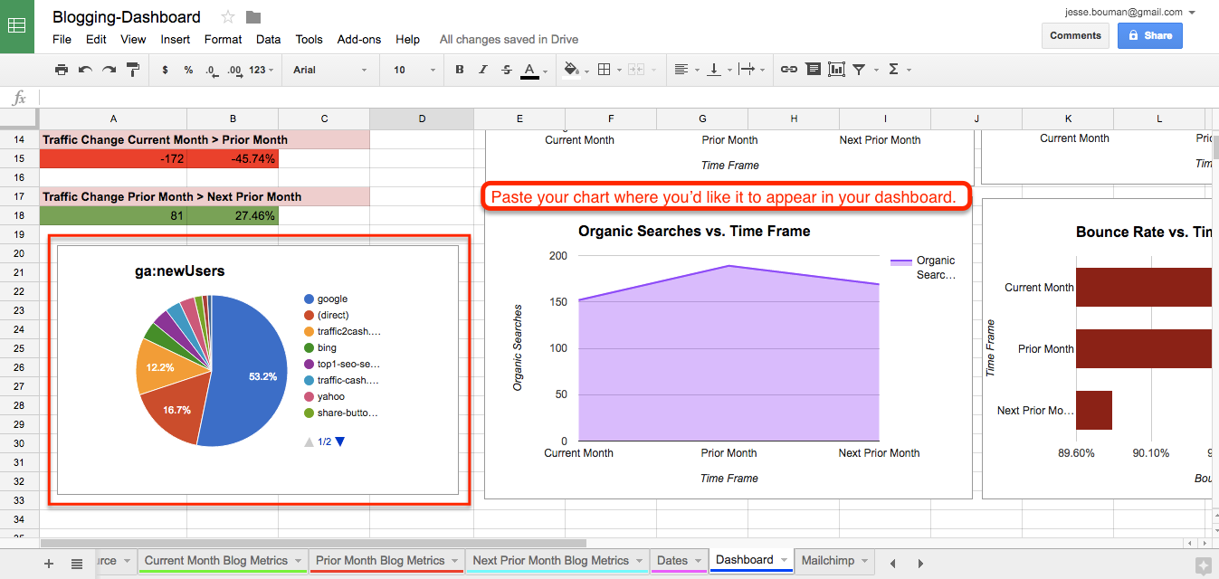
Now that we have our New Users sorted, we'll select the top ten sources and turn them into a chart. Just select the top ten sites and their users, click the Chart option in the menu, and choose the pie chart graph to visualize the data.
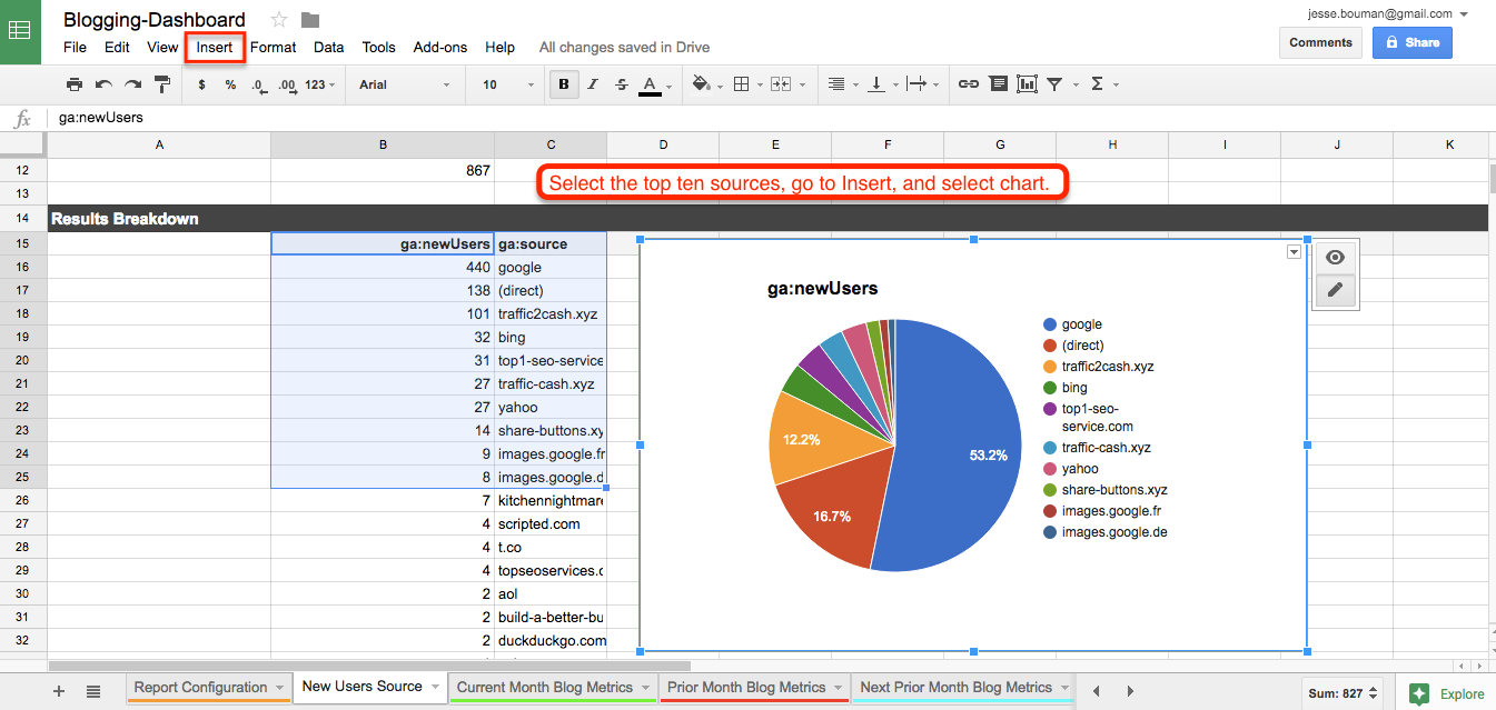
Something’s off here: the chart isn’t in our main reporting dashboard. To rectify this, just select the pie chart and copy it—just press CMD+C or Ctrl+C.
Then, open the main reporting dashboard tab, paste the new graph and move it where you'd like. Now your dashboard shows where your new users are coming from, at a glance.
If you ever decide to rerun the report with new dates, just replicate these steps except for the final paste. The chart in your reporting dashboard will automatically update based on the chart you have in your report.
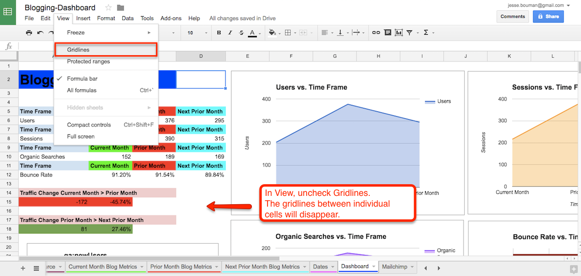
One last thing: we could make the dashboard look less like a spreadsheet, by getting rid of the gridlines in between your charts and graphs. To do this, simply uncheck the gridlines option under the View menu.
The great thing about creating a reporting dashboard in Google Sheets is that you can customize it however you’d like. You could change the typeface or colors, tweak the graph styles, and pull in more metrics as you need.
Now, all that's left is to share your data, or turn it into a presentation for your next board meeting. If you want to share the data for others to view in a spreadsheet, just click the Share button in the top right and add your colleagues' emails to invite them to view and/or edit the spreadsheet.
Or, you could download the spreadsheet in Excel or PDF formats, or publish it to the web where you could embed it in a blog post or internal report. For more info on publishing options, jump back to the end of the Google Sheets 101 tutorial in chapter 1.
Beyond Google Analytics: How to Pull Data from Any App into Your Dashboard
There are so many different metrics your team could be tracking, often spread across dozens of tools. Your sales are in one app, your email subscribers are in another, and your site performance details might be hidden inside your internal tools.
You'll find Google Sheets add-ons for some of those tools. For everything else, Zapier's 600+ app integrations can help. It can automatically copy new form entries, event attendees, emails, Twitter mentions, PayPal sales and much more into your spreadsheet. And if you have internal apps with few integrations, Zapier's Webhooks or MySQL integrations might be able to pull that data into your spreadsheet, too.
Here are some of the most popular ways that people add data to spreadsheets with Zapier (or check out the full list of Google Sheets integrations on Zapier for more ideas).
Save new Eventbrite attendees to Google Sheets spreadsheets
Add rows to Google Sheets spreadsheets for new PayPal sales
Collect new Typeform responses as rows on Google Sheets
Save new Gmail emails matching certain traits to a Google Spreadsheet
Add info to a Google Sheet from new Webhook POST requests
All you need to do is use Zapier to connect your app to a new sheet in your Dashboard spreadsheet. From there, you can use that app's data in your reports.
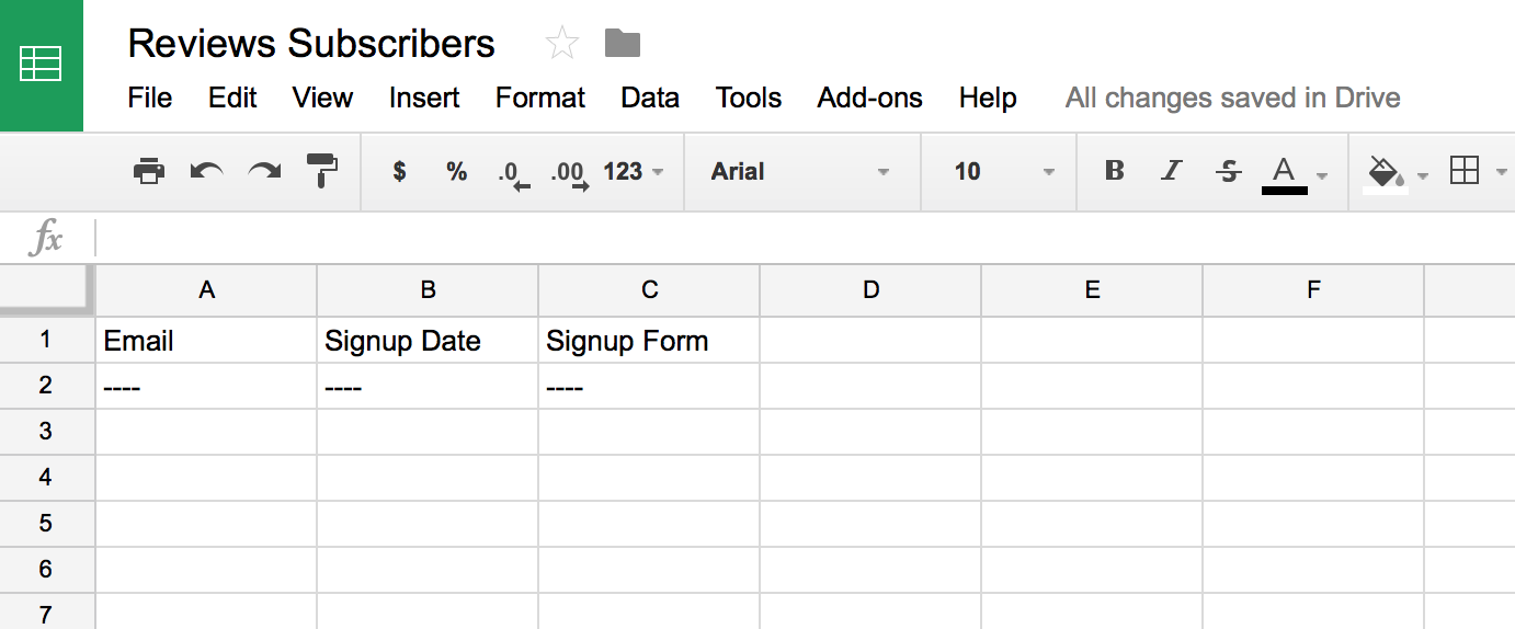
To get started, add a new sheet to your spreadsheet for the data from your app. Add a column for each item you want to track in the report; here, I've added columns for any new email subscriber's email address, the date they signed up, and the form they signed up with.
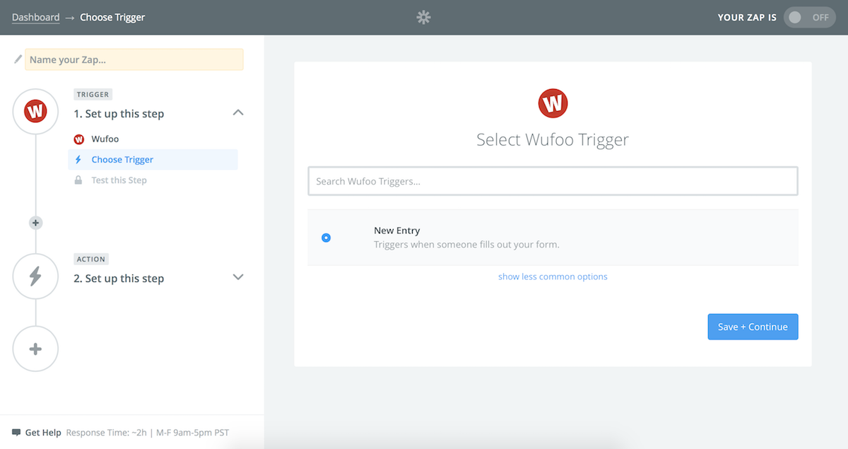
Now, in the Zapier dashboard, create a new Zap and select the app with your data as the Trigger. I use a Wufoo form for my emails, and selected it here. Be sure to select the correct form or any other options your Trigger app may have.
Then, select Google Sheets as the Action app, and choose the Create Spreadsheet Row Action. Select your Google Sheets account, the dashboard spreadsheet, and the new sheet you created for this app's data. Then, click the + icon beside each row, and select the correct data from your original app.
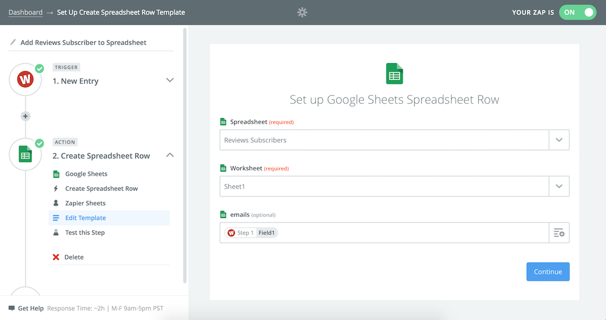
Once you've tested your Zap and everything looks good, you're ready to begin using it. Now, whenever a new item is added to your app—like a new subscriber or sale—it'll be added to your Google Sheets spreadsheet automatically. You can then add up the totals with simple =count() or =sum() functions and add them to your dashboard with graphs as above.
Or, if you want to automatically count the total number of subscribers, sales, or anything else—and are comfortable writing some code—here's a tutorial on using Zapier's Code integration to count the total. Then, use the Update Spreadsheet Row action in Google Sheets to update the number on your dashboard automatically whenever a new sale or subscriber comes in.
Create Your Own Spreadsheet Dashboards
No matter what data you need to track, Google Sheets can turn it into an easy-to-skim report. The traditional spreadsheet cells and formulas make it easy to arrange and format data, while modern integrations let you copy stats, sales, subscribers and more into your account automatically. And with a bit of tweaking, you'll have that data turned into a professional-looking dashboard with your team's most important numbers in one place.
Now it's your turn: Figure out what data you want to track beyond basic Google Analytics stats, and add it to your spreadsheet. Use these steps to build your own simple dashboards from that data, and figure out how to update that data whenever you need—perhaps just by changing dates, or with Zapier integrations.
Then, the next time your manager asks for stats, you'll know exactly where to check. You'll never have to cram a report together in PowerPoint again.
To get that extra data for more detailed dashboards—and to format it automatically so you don't have to spend so much time on your spreadsheet, you'll need more Google Sheets add-ons. There's hundreds of add-ons in the store, so we've tested and found the best Google Sheets add-ons to help you get the most out of Google Sheets.
Read more: How to build a KPI dashboard in Excel in 3 steps (with free templates)


