I love numbers. Perusing collections of statistics and gleaning insights from them is a favorite pastime of mine. Right up there with watching baseball, tinkering with media center software, and wondering how my dog can sleep 20 hours a day.
During my three years on the Zapier support team, I've come to rely on numbers to calculate the effectiveness of our work and where we need to prioritize. The stats we crunch help us understand how well we're meeting the needs of our users, and show us where to look to fix existing and potential problems.
This insight into our customer support doesn't come without question marks though. We can collect all sorts of data points—from tracking support ticket volume to reporting on topic trends—but it's making our customers happy that is the ultimate goal. Admittedly, this goal is a nebulous concept, and getting insight into it is tricky. But through trial and error and new and old stats, we're certain we're on the right track.
As you review help desk data in your own company or organization, hopefully what we've learned will aid how you put your stats to use. This chapter gives you an overview of some of most common support metrics used by customer service teams. It not only details the meaning of those numbers, what they represent and what they say about the quality of support users receive, but it reveals pitfalls that come with those metrics, too.
Support Metrics to Know
Volume
Response Time
Happiness
Product Trends
Volume
Total Conversations
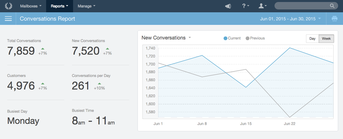
Total Conversations or Total Tickets (depending on your help desk app) is the count of all new support requests that come in for a given timeframe. Each new inquiry, including its ensuing replies, count as one total conversation. Depending on the app you use for support, Conversations might also be called Tickets, or Cases.
The Good
Total Conversations helps give you a sense for the entirety of support. Tracking this over time can help understand when to hire someone new for the support team, and to give a macro-level view of support trends. Larger increases over time might mean a combination of several factors. Some of them are good, like user base growth; others aren't so good, like an increase in problems or bugs in the product.
The Bad
Total Conversations can be a noisy metric depending on how you use your help desk. Between items that don't need to be replied to (like auto-responders) or emails that weren't meant for your support team (like mailing list emails), it can make that count less reliable.
At Zapier, for example, we funnel all Twitter mentions into our support inbox, even those that don't require any action, and each one counts as a conversation. Since Tweets are inflating our numbers, we need to take Total Conversations with a grain of salt.
Total Replies
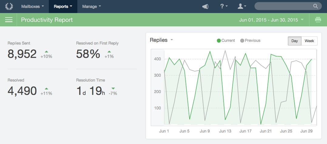
Total Replies counts every reply sent in a given timeframe. Unlike Total Conversations, which will ignore how many replies happen in a given thread, Total Replies adds up each time a message gets sent to the user.
The Good
Total Replies helps you get a sense of how much effort your support team is putting in. While Total Conversations is misleading if you have many or few replies in each conversation, Total Replies captures that volume with more consistency. The stability of Total Replies is one of the reasons that we made the decision to prioritize replies over conversations at Zapier.
The Bad
Total Replies doesn't capture a support team's efficiency. If you're consistently taking five replies to answer questions that could be answered in three, Total Replies will be high even though users are getting a worse experience.
Total Volume by Hours or Working Hours
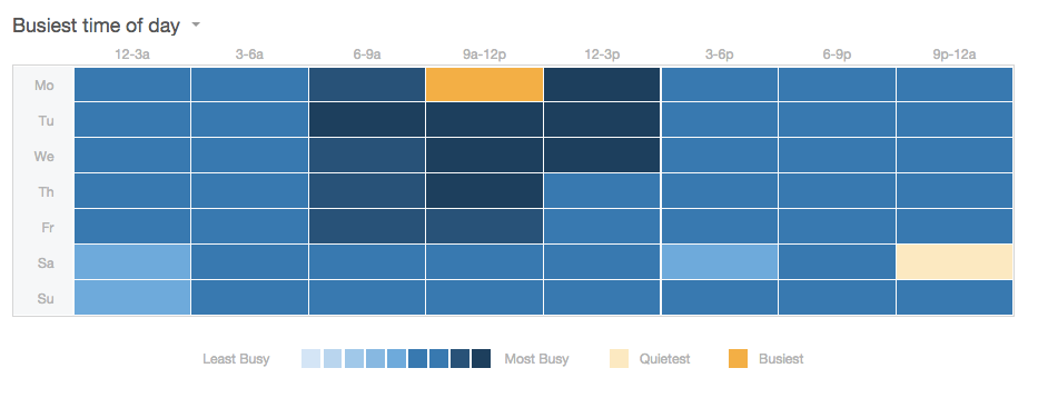
Total Volume can be sliced up into time intervals, which helps you measure your support team's workload during a specific period. Segmenting your volume metric of choice (Total Conversations or Total Replies) by time of day helps you better understand the peaks and valleys of your volume.
The Good
Understanding volume by time of day can help to optimize scheduling in a support team, ensuring customers are getting helped without over-staffing.
The Bad
Depending on your support team's goals, understanding volume by time of day or working hours may not be useful. For example, if your team commits to strictly defined support hours, the exact details of when support requests come in outside those hours may not be as important.
Response Time
Average Response Time
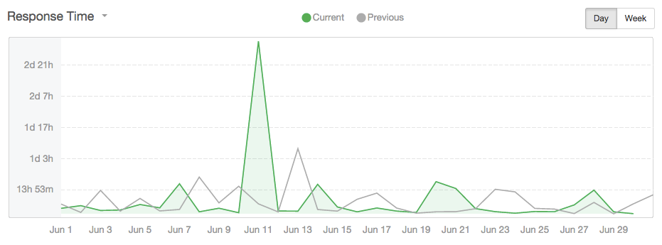
Average Response Time is the average amount time it takes to respond to support requests for a given timeframe, like days, weeks, or months. You normally see it represented as an hours and minutes value, e.g. "Average Response Time this week was 2 hours, 22 minutes."
The Good
Average Response Time can be good for an at-a-glance view of how responsive a support team is to the volume it receives.
The Bad
Since you're averaging your metrics, Average Response Time can be disproportionately impacted by outliers. For example, if five conversations come in, four are replied to in 15 minutes, and the fifth takes 24 hours, Average Response Time is 5 hours. That number still has some use, but it's not a great indicator of the team's overall responsiveness.
Time to First Response
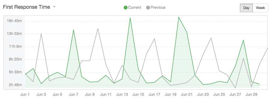
Time to First Response is how long it takes the support team to reply to the initial support request. No replies beyond the first one count towards this metric.
The Good
Time to first response can be useful to understand whether or not users are getting prompt initial responses. Since this is the point of first contact, ensuring the user gets a timely reply is vital.
The Bad
Much like Average Response Time, outliers can distort the value for Time to First Response. Even worse, making Time to First Response an important metric can potentially incentivize the wrong behavior. From "We got your email!" auto-responders to hasty "We're looking into the problem!" emails, Time to First Response can be optimized without truly helping users.
Response Time Bands
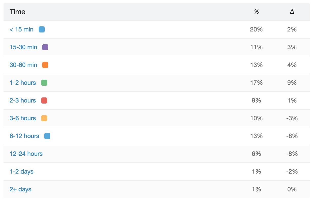
Response Time Bands show the percentage of support volume answered within a specified time range. For example, 50% of emails are answered within one hour, or 99% of emails are answered within two days.
The Good
Response Time Bands help to best encapsulate the support experience for all users, since those bands will not be distorted by a small number of outliers or exceptions. You can also track movement through those bands to see if improvement in one is simply borrowing from a neighbor or making a large difference for that group of users. At Zapier, the three big bands we track are 'Immediate Replies' (less than 1 hour), 'Same-Day Replies' (less than 6 hours) and 'Within 24-hour Replies' (less than 24 hours).
For an example, let's say 30% of users get replies within 1 hour, 80% get replies within 5 hours, and 95% of users get replies within 24 hours at a hypothetical company. If that 30% number goes up, seeing how much those other bands are impacted can help to understand if those new "1 hour reply users" were formerly those getting a reply within 5 hours, within 24 hours, or even more than 24 hours.
The Bad
Like with Total Replies, a fast but inefficient support team might be providing a lesser experience to users than indicated by Response Time Bands. On the other hand, if your team has defined support hours that are clearly communicated to users, Response Time Bands may understate the quality of care users are receiving if those bands include off-hours in the calculations.
Happiness
Net Promoter Score
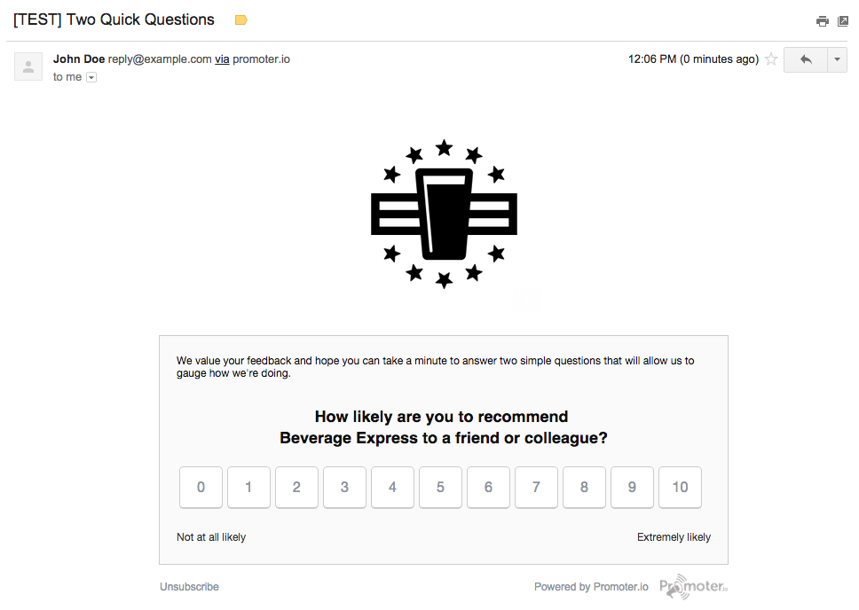
Net Promoter Score (NPS) is a survey where a user is asked to answer questions on a 1-10 scale. Often, it's given after a support experience is ended; sometimes days later.
The Good
NPS can give a support team both granular indicators of how users are feeling, and aggregate info on how all users rate the support they received.
The Bad
Some users might associate NPS surveys with past experiences, where filling in that survey went unacknowledged and therefore didn't matter. As a result, those users might not be answering as honestly as they would otherwise. Similarly, designing a survey for the proper questions (both in content and length) can be a difficult undertaking. (If you need guidance, see our guide to survey design.)
Related: Why NPS matters in customer support
In-Signature Happiness Ratings
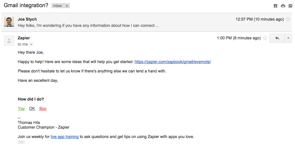
Instead of the more detailed NPS, the option to rate the support received can be included in each reply. This is often a shorter/smaller survey. For example, at Zapier we include a simple "How did I do?" question with three options:
Yay
OK
Boo
The Good
Placing a Happiness Rating in your email signature encourages more immediate, visceral feedback. Since customers can rate each reply—not just the conversation on the whole—there's likely to be more data collected, as well as the opportunity to improve the user's experience by understanding how they feel before the interaction is over.
The Bad
While immediate, visceral feedback can help understand a user's emotional state, it is not always actionable. Negative responses might be caused by frustration about functionality your product doesn't (and won't) have, rather than the quality of the support they received. Emily Chapman has written about how the Trello team avoids that pitfall, while using these ratings to connect with customers on a human level.
Product Trends
Label/Tag Data
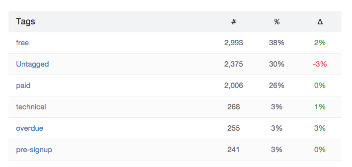
Many help desk apps offer the opportunity to tag conversations. If you have tags for different areas of your product or different categories of user problems, the count of conversations (or replies) for those tags can be viewed and compared.
The Good
By looking at tag data, a support team can better understand which areas of the product are causing the most support volume, or the most common problems a support team receives. This can help to prioritize product improvements, bug fixes, documentation additions or improvements, and inspire helpful videos and webinars
The Bad
Depending on the product and the specific tags and labels being used, it can be difficult to get data that's truly useful. If the tags and categories are too broad, the insights won't be as actionable; if they're too granular, it can become difficult to prioritize which areas to improve. If the tags themselves are not carefully maintained, that can open up a whole other set of issues, too, including where similar but not identical tags exist and old tags aren't removed, both causing confusion.
The Bottom Line
No matter which metrics you use to track support performance and measure the care your customers receive, there are pitfalls along the way. There's no single number that tells you everything you need to know, so tracking several of the most relevant stats for your company can help give you the full picture without succumbing to information overload.


