Google One-tap is a new experience that allows users to create an account or log in to your website with a single click. It builds on the popular Sign in with Google button to cut an entire page out of the authentication flow.
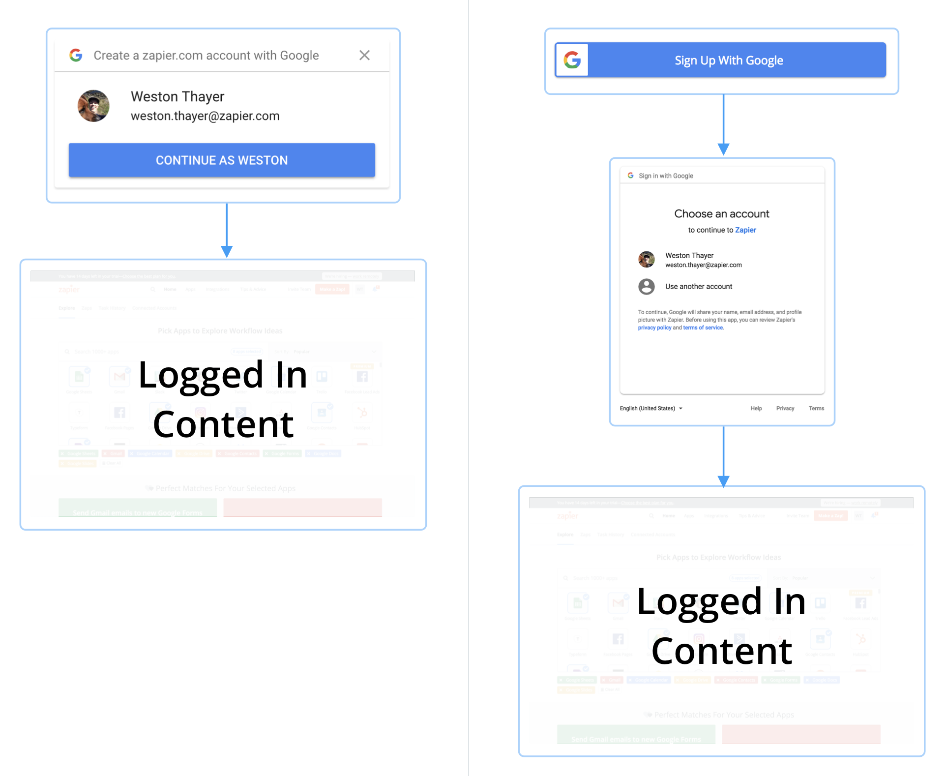
Allowing people to sign in with their Google account on your website is an attractive option—who wants to memorize yet another set of login credentials? Google One-tap makes this benefit even clearer by letting the user choose from their existing Google accounts to sign up for your website. The measurable effect? More users.
Issues With the Out-of-the-Box Experience
While Google One-tap has many benefits, we also found that the default experience comes with some UX issues. Once you include the proper tags for One-tap on your site, you’ll see an overlay in the top-right corner of signed out pages on desktop and at the bottom of the screen on mobile.
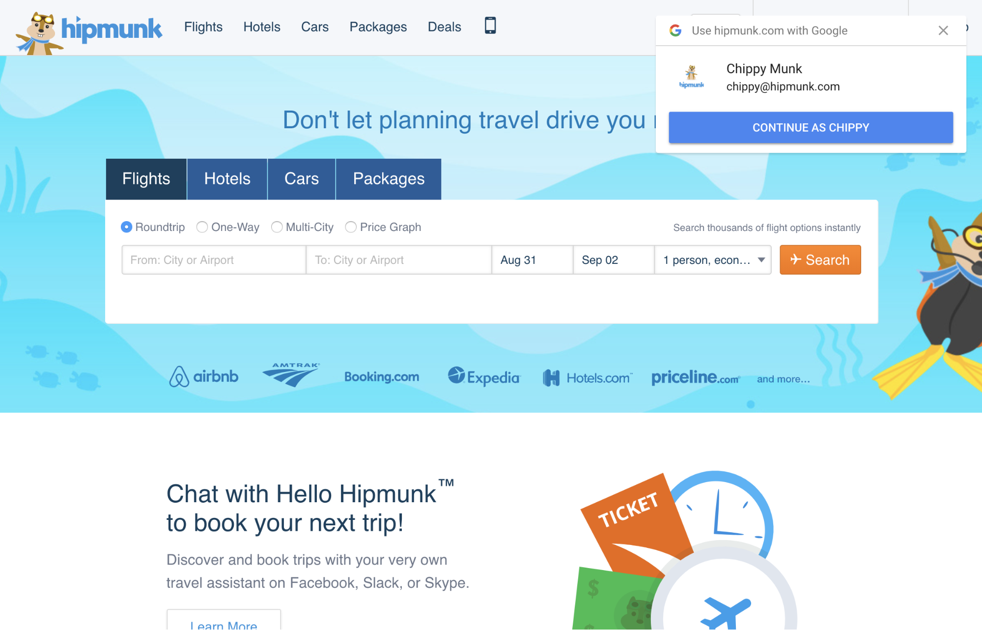
Unfortunately, this often obscures important UI on your website (in Hipmunk’s example above, the language selector is completely hidden—not great for an international website). Google One-tap’s overlay also runs the risk of being mistaken as a popup ad which users have trained themselves to dismiss without a second thought.
iFrame Magic to the Rescue
Luckily, we discovered that Google One-tap is part of the OpenYOLO-Web specification, which permits wrapping Google’s injected <iframe> in our own <iframe> to place it where we like (not without downsides, as noted below). This enables Google One-tap to be a natural part of your designs.
Wranging Google’s <iframe> isn’t the most fun, so we created a sample that demonstrates the technique. It’s fully responsive and accommodates up to 4 Google accounts.
This approach also lets you fallback to a Sign up with Google button to cover edge cases where the user is not signed in to a Google account or uses an unsupported browser.
Smooth Sailing?
Implementing this design had the desired effect. We made Google One-tap available on our home, sign up, and log in pages—resulting in a 7% lift in sign ups. However, we soon noticed an uptick in support tickets around duplicate accounts. Existing Zapier users who usually logged in with an email and password were accidentally choosing to create a new, separate account with Google when they intended to sign into to their existing account.
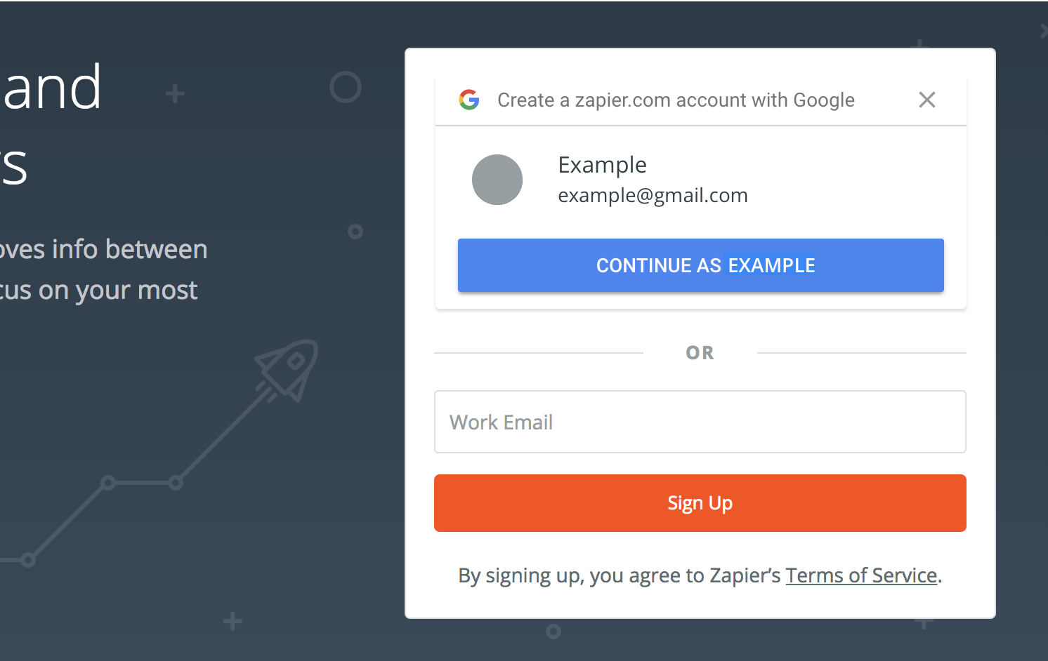
For example, someone who usually logs in with their company email (example@company.com) is now also shown their Google account (example@gmail.com).
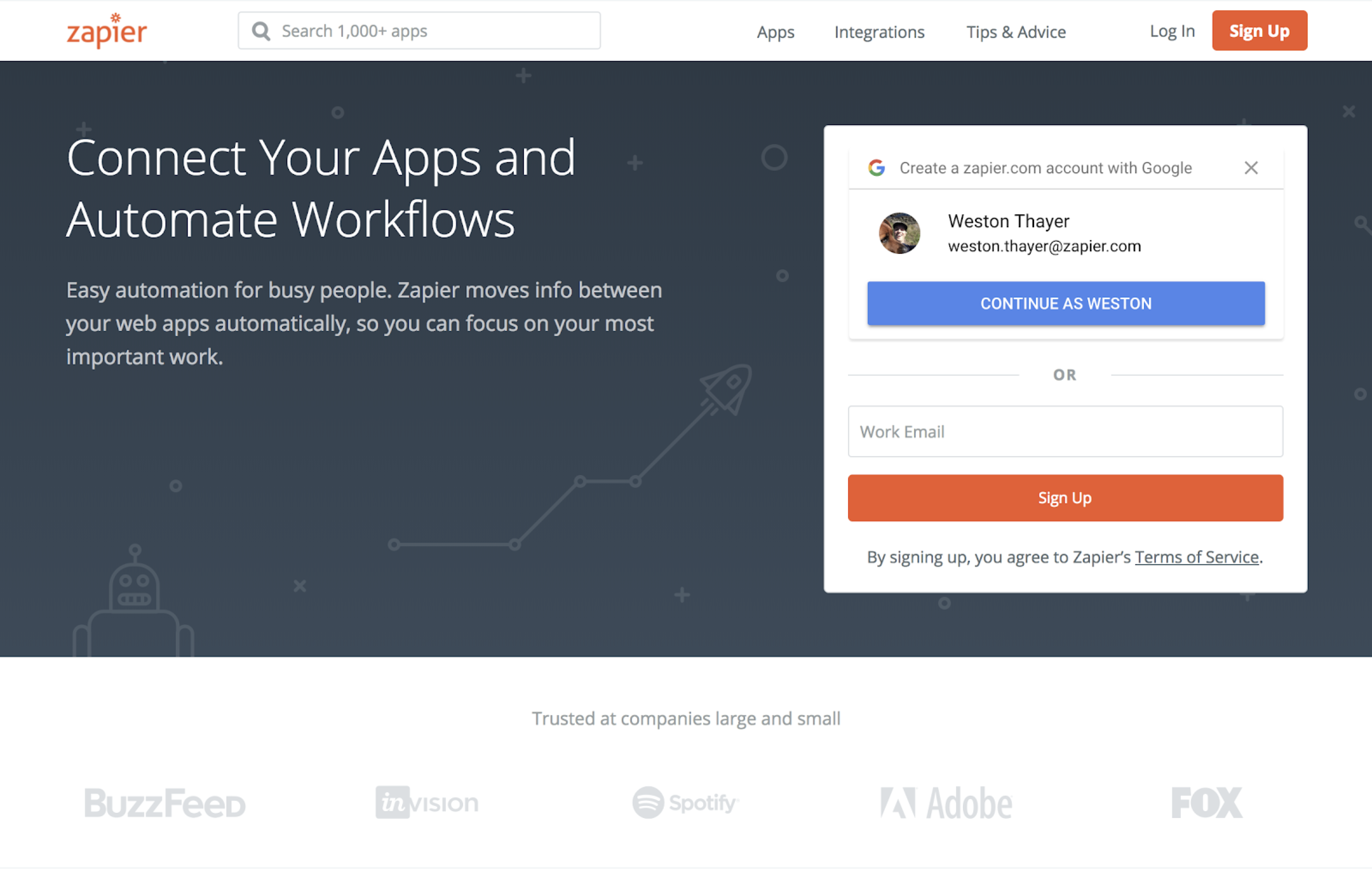
Say it’s been a few weeks since this user last logged in. They navigate to zapier.com, expecting to see their logged in dashboard, but since their session has expired, they’re shown the logged out homepage. Forgetting that they normally use example@company.com and skipping past the Create a zapier.com account… copy, they click Continue as Example, glad that they didn’t have to type their email or password. Unfortunately, they’re dismayed to find that this isn’t their example@company.com account at all, it’s a brand-new account for example@gmail.com.
Our data suggests that this UX issue was introduced by Google One-tap. We did not observe the effect to the same magnitude when only the Sign in with Google button was displayed. It seems Google One-tap’s interface unintentionally suggests to users that the displayed Google accounts are remembered accounts that were used to log in to Zapier before.
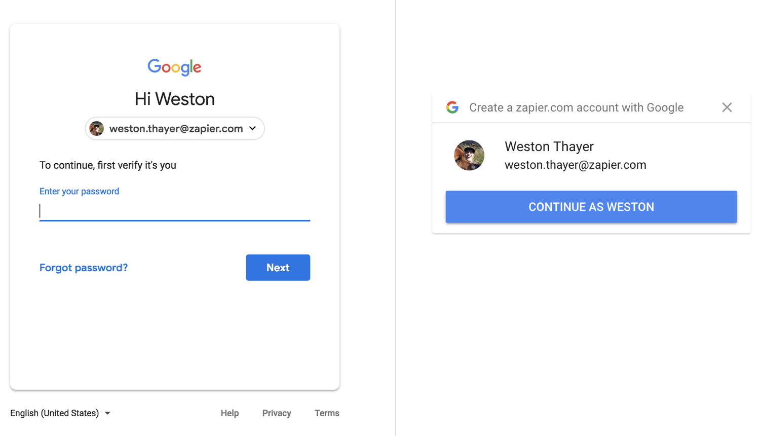
On the left, Google’s password verification screen, shown when your session expires in an app like Gmail. On the right, Google One-tap sign up. Is it any wonder that users confuse these UX patterns at a glance?
At Zapier, this is a significant problem because, for added security, we have users' sessions expire once a week. Every 7 days, users are asked to re-authenticate, requiring them to recall how they last logged in. And these days, nearly everyone has multiple email accounts, making it very easy to select the wrong one.
Remembering You
Google One-tap is a great, low-friction experience to get brand new users signed up for your website. But it’s currently not an effective experience for logging users into their existing accounts.
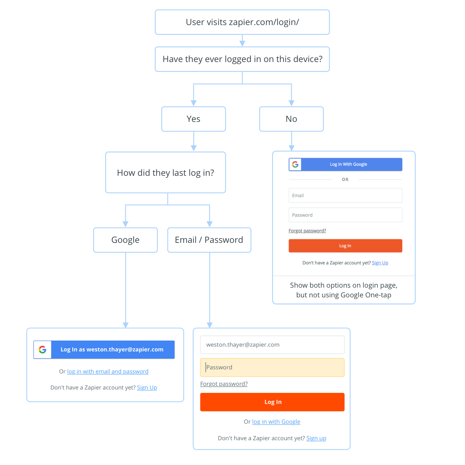
We addressed this shortcoming in two ways. First, by taking advantage of Google One-tap’s automatic sign in eligible users are logged in immediately. Second, we store the account you last logged in with in a browser cookie. If the cookie is present on your device, we keep you on the right track.
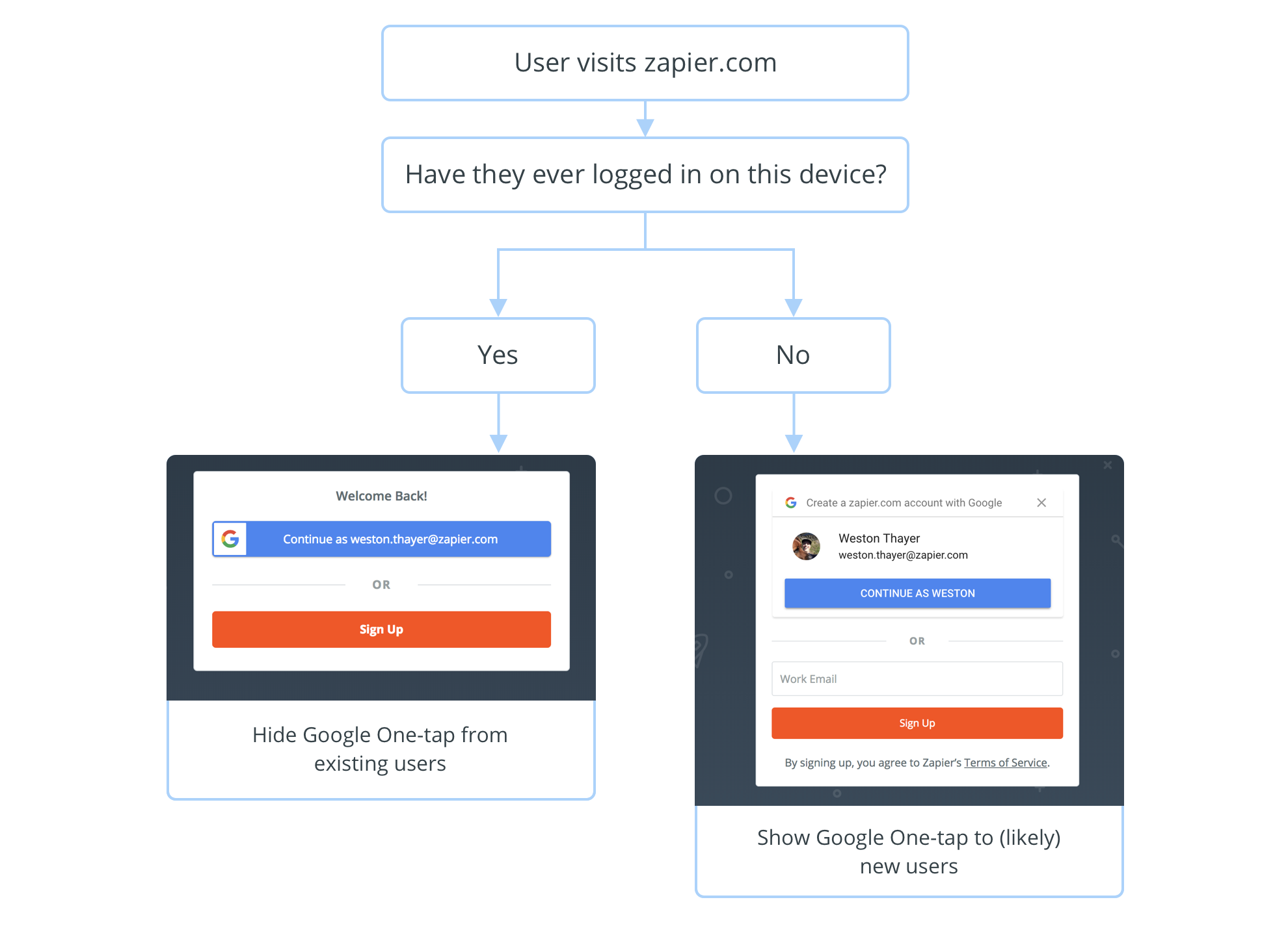
When a user visits the login page, we go one step further by helping them remember how to log in.
Is it Worth it?
Compared to only allowing users to sign up with an email and password, introducing Google log in as a separate option adds a lot of complexity. Is it worth the headache?
As with many things, it depends. With a product like Zapier that requires an account before you can try any of our core features, lowering the barriers to creating an account makes a lot of sense. Any time we can get someone over the hurdle of creating an account and on to creating their first Zap, that’s a win and makes managing the complications worth it.
Our investments in Google sign up yielded more than a 20% lift overall—an initial 13% from introducing it as an option and an additional 7% from One-tap—making all the work more than worth our while. The decision you make for your website will depend on how important accounts are to your business and your users. You may find the secret to success is customizing Google One-tap to feel like a natural choice for your users.
Further Reading
Google is on the forefront of one tap sign up, but the OpenYOLO initiative spans multiple account providers. Someday this may be possible with Facebook, Twitter, or even your company SSO account. Creating an experience that supports multiple providers is attractive, but will likely be a UX challenge.
OpenYOLO’s <iframe> approach has some security concerns. As XSS Jigsaw demonstrated, a malicious site can trick you into handing over your account details via clickjacking. For now, Google is combatting this by whitelisting websites that are allowed to use Google One-tap in production.
It’s still early days for Google One-tap, which is still in a closed beta. As you can see, there are both major advantages and UX hiccups involved with implementing it. We’re looking forward to continued investments to make it easy and intuitive to create your account on Zapier.


