My clients are busy people. I'm not deluded enough to think they're reading every single line of the monthly performance report I send their way. That's why I always include an executive summary at the top, which highlights "must-knows" in a few bullet points.
One-pagers serve the same function as these executive summaries. They boil down pages of detailed information into a single, concise document, enabling stakeholders or investors to quickly review what matters and make important decisions. Needless to say, they need to pack a punch.
Here, I'll share everything you need to know about one-pagers. Plus, one-pager examples and templates you can use for your next project.
Table of contents:
What is a one-pager?
A one-pager is a one-page document that clearly and visually lays out all the key items you need to know about a product, service, project, or concept. With a combination of text, visuals, and design elements, one-pagers grab the reader's attention and provide a comprehensive overview in an easily digestible format.
One-pagers can be for either internal or external use. For example, you may share an internal training one-pager with your employees or a startup plan one-pager with potential investors.
11 one-pager templates
Here are some one-pager templates. Each one is tailored to a specific goal, so you can pick the format that fits your needs, click Make a copy, and start building from there.
1. General or company one-pager template

Best for: Introducing your company to potential customers, partners, or contacts at networking events and conferences.
Key elements to get right: Your value proposition and problem-solution framing. Readers scanning this at a conference or after a meeting need to immediately understand what your company does and why it matters to them.
A general one-pager is like a company overview you'll share with customers and works well for general networking events or conferences. It includes all the standard one-pager elements, including:
Company name and logo
Brief overview
Problem statement
Solution
Key benefits/features
Target market
Future objectives
CTA
2. Startup one-pager template
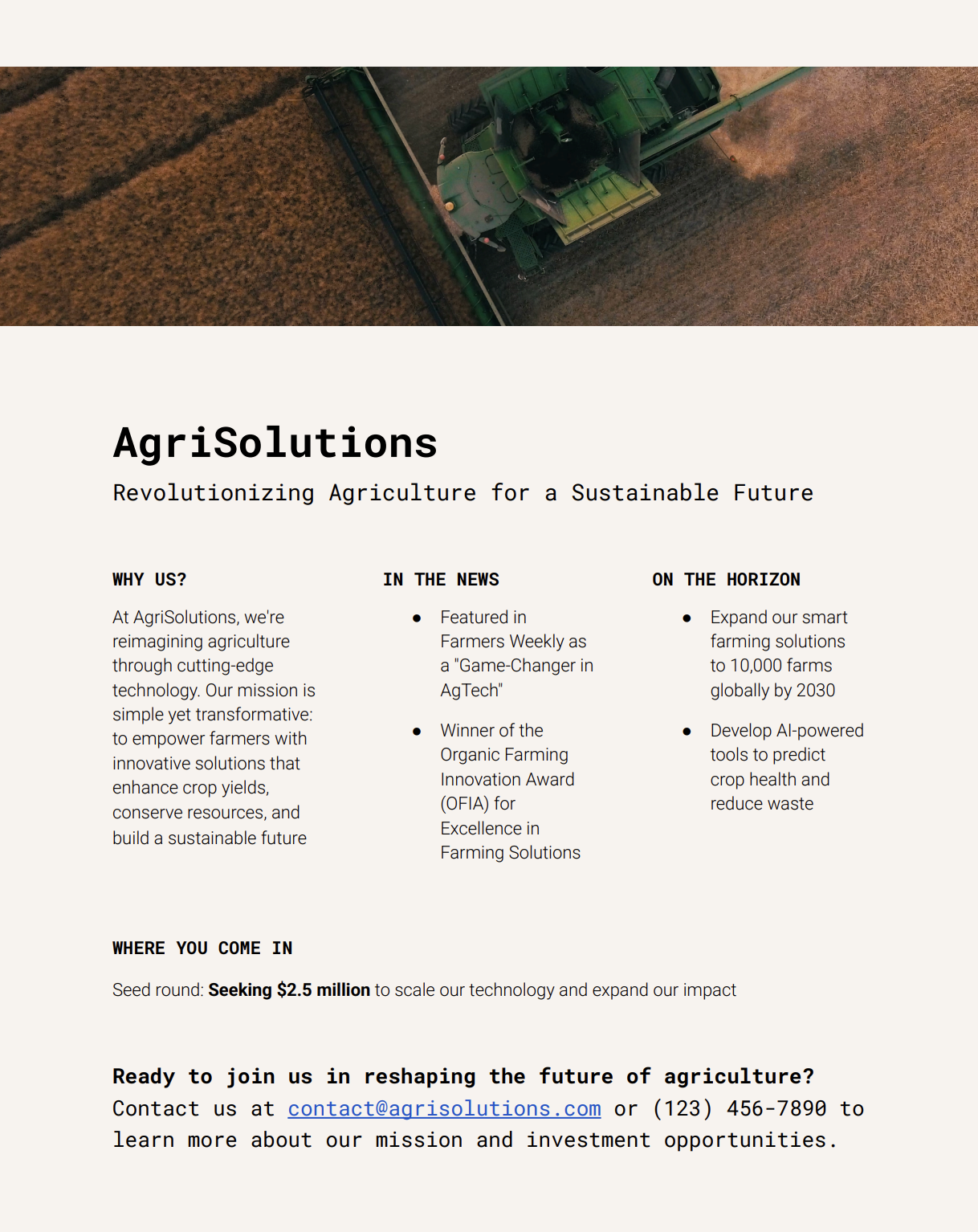
Best for: Early-stage founders seeking funding, partnerships, or early customers.
Key elements to get right: Your pitch and social proof. Investors see hundreds of these, so lead with a sharp, specific pitch and back it up with traction signals like press mentions, user counts, or notable backers.
A startup one-pager is basically your elevator pitch on paper. Whether you're presenting during investor meetings, mingling at networking events, or packaging it with your marketing materials, it should sell your vision and your scrappiness. Beyond the standard one-pager elements, include:
Pitch
Media attention or social proof
Investment stage
3. Pitch presentation one-pager template

Best for: Meetings where you're making a specific request—like funding, a partnership, or a contract.
Key elements to get right: Your ask and team details. Readers need to know exactly what you want and why your team is the right one to deliver.
A pitch presentation one-pager summarizes the benefits you offer your audience. It works double duty: a quick reference during presentations and a leave-behind for potential investors or clients to revisit during follow-up discussions. Include:
Market research summary
Team details and specific expertise
Bid or ask
4. Strategic plan one-pager template
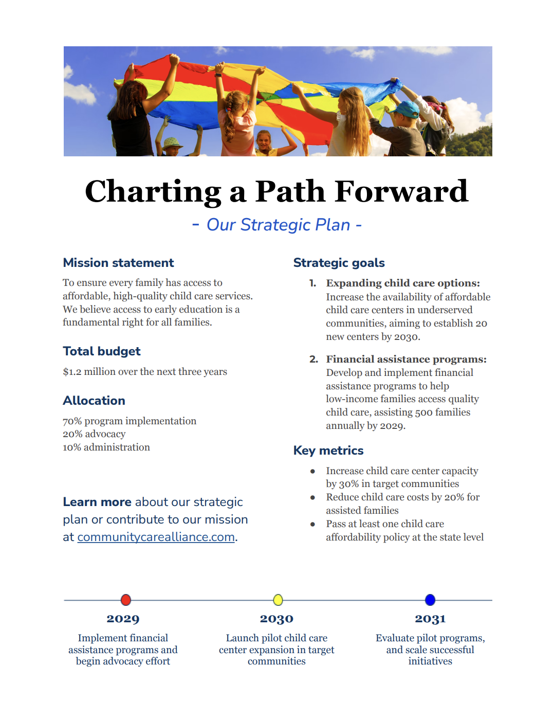
Best for: Internal alignment meetings, board presentations, and donor pitches.
Key elements to get right: Your goals and key metrics. Vague objectives won't hold anyone accountable. Tie each goal to a measurable outcome and a timeline.
A strategic plan one-pager helps stakeholders digest your goals and doubles as an accountability tool. It prevents people from leaving your presentation and immediately forgetting your objectives. Include:
Vision or mission statement
Goals
Key metrics
Timeline
Budget
5. Product one-pager template

Best for: Product launches, sales enablement, and internal training.
Key elements to get right: Your unique selling proposition and pricing. Readers want to quickly understand what makes this product different and what it costs.
A product one-pager helps marketing and sales teams present essential product information to potential customers or stakeholders. They can also serve as an internal resource for onboarding new hires. Include:
Product name
Unique selling proposition
Timeline for launch (if new)
Pricing
6. Company report one-pager template
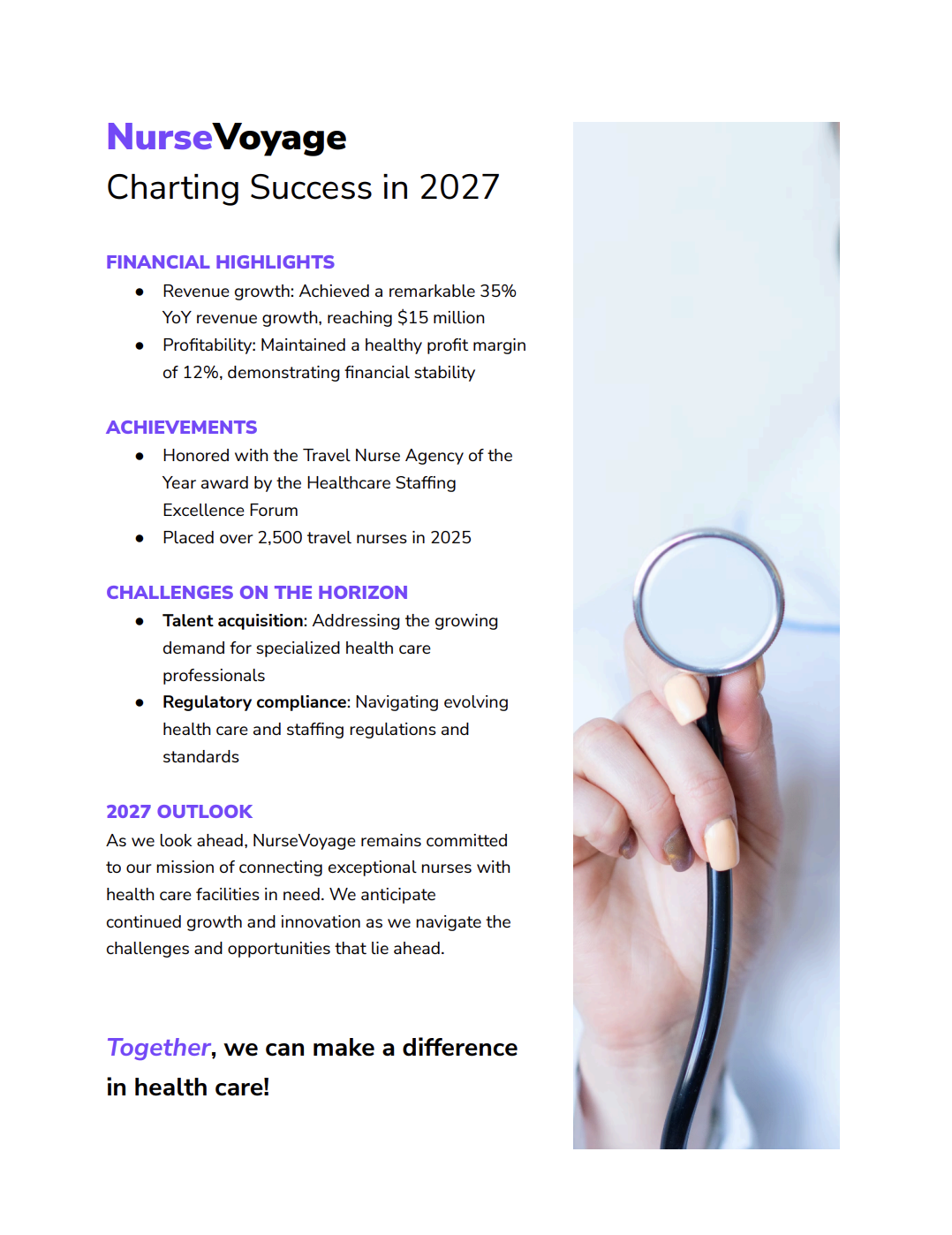
Best for: Annual reviews, board updates, and external stakeholder communications.
Key elements to get right: Financial highlights and outlook. Lead with concrete numbers, and then frame what's ahead. Readers want to know where you've been and where you're headed.
A company report one-pager gives stakeholders a snapshot of your company's performance and future outlook. Use it as an employee handout during annual company meetings or share it externally with investors and partners. Include:
Financial highlights
Achievements
Future challenges
Outlook
7. Investor update one-pager template
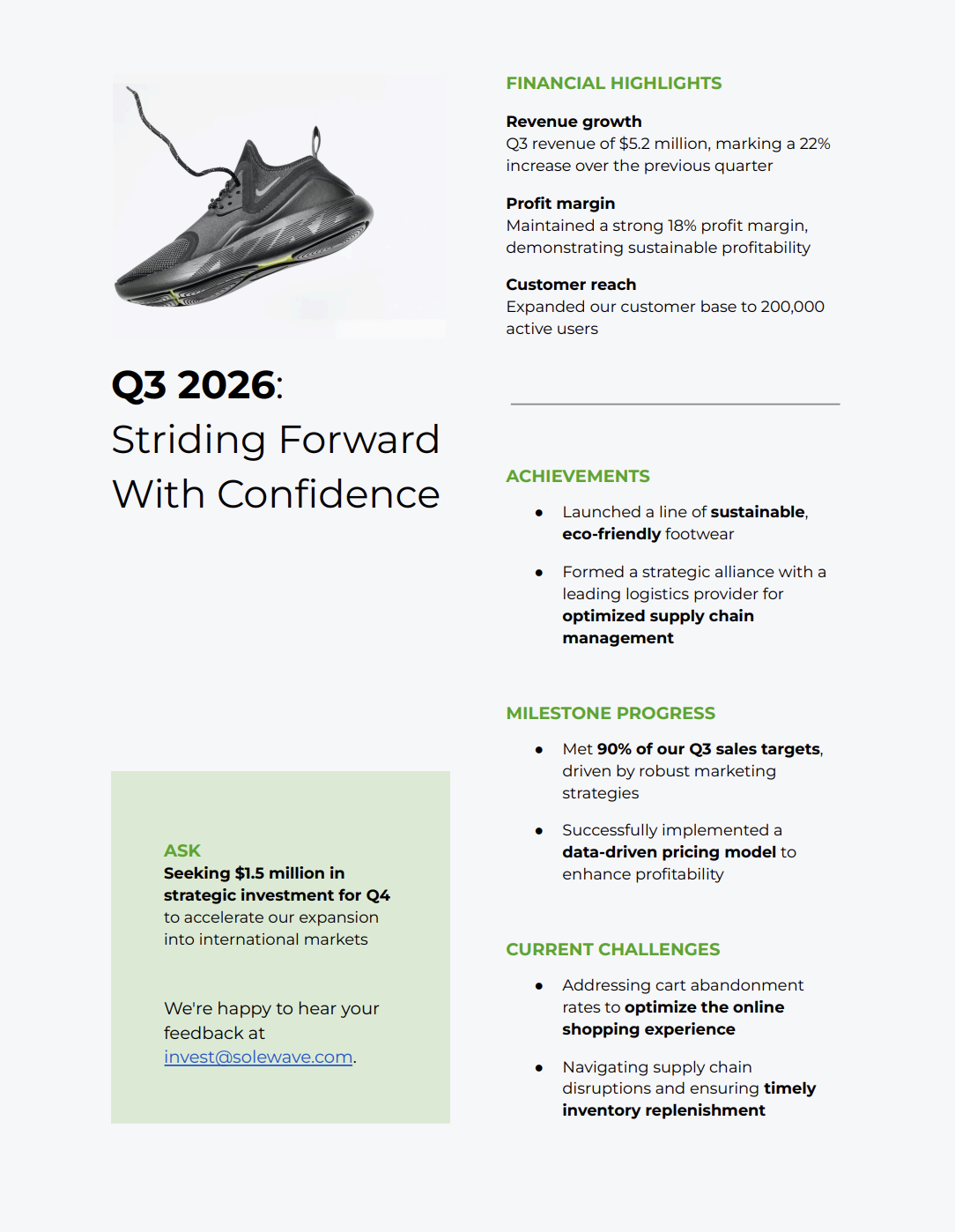
Best for: Quarterly or monthly investor communications.
Key elements to get right: Progress toward milestones and current challenges. Investors expect transparency. Show momentum, but don't hide what's hard.
An investor update one-pager gives your investors a concise rundown on performance and what's happening in your business. It tells them what they need to know and nothing more. Include:
Financial highlights
Achievements
Progress toward milestones
Current challenges
Potential asks
8. Employee orientation one-pager template
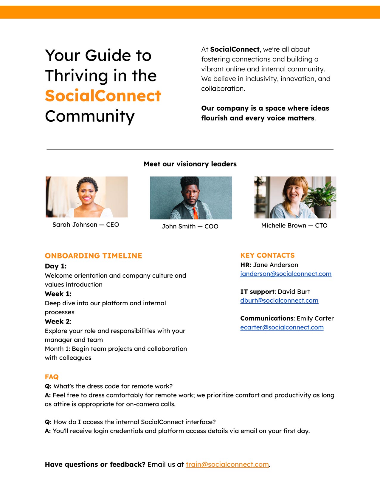
Best for: First-day onboarding packets and HR welcome materials.
Key elements to get right: Key contacts and the onboarding timeline. New hires need to know who to reach out to and what their first few weeks look like.
An employee orientation one-pager gives new hires a quick reference for the key details they'll actually want to remember from day one. Instead of getting bombarded with information, they have one page to come back to. Include:
Company culture
Leadership overview
Onboarding timeline
Key contacts
FAQ
9. B2B one-pager template

Best for: Sales outreach, trade shows, and partnership conversations.
Key elements to get right: Use cases and testimonials. B2B buyers want to see that you've solved problems for companies like theirs. Show, don't tell.
A B2B one-pager cuts through the noise to clearly communicate what your company does and why it's valuable to other businesses. Decision-makers are busy, so leave the jargon at home and let the results speak. Include:
Value proposition
10. Marketing one-pager template

Best for: Cross-functional team alignment, agency onboarding, and new hire orientation.
Key elements to get right: Brand voice and customer personas. Colors and fonts are easy to reference elsewhere—the real value is documenting how your brand sounds and who it's speaking to.
A marketing one-pager is an internal document that keeps your teams aligned on branding and messaging. It's a snapshot of the essentials everyone should be working from. Include:
Logo
Brand colors
Fonts
Brand voice
Marketing goals
Customer personas
11. Consulting services one-pager template

Best for: Client prospecting, RFP responses, and introductory meetings.
Key elements to get right: Services and testimonials. Be specific about what you do (not vague capability statements), and let client results speak for your credibility.
A consulting services one-pager presents your firm's services, expertise, and value proposition to prospective clients. It offers a quick look into your offerings so clients can see how you address their specific needs and challenges. Include:
Services
Client testimonials
Contact information
How to make a one-pager

A one-pager lives or dies by how quickly a reader can extract what they need. Depending on the type of one-pager, you might include different elements, but here's a breakdown of the general elements you should include in each section of your one-pager.
Before you begin, clearly define what you want the reader to do after scanning your one-pager. That single objective shapes every decision that follows—like what to include or cut, and how to frame your key points.
Headline and value proposition. Open with a compelling headline and a one- to two-sentence value proposition. This is the first thing people read, so it needs to immediately communicate who you are, what you offer, and why it matters. Think of it as your elevator pitch in print.
Problem and solution. Briefly describe the pain point your audience faces, and then position your product, service, or proposal as the answer. Keep this tight—a short paragraph or a few bullet points at most.
Proof points. Back up your claims with evidence like key metrics, customer results, notable clients, or relevant awards. Numbers are your friend here. For example, "Increased revenue by 40%" is more persuasive than "Significantly boosted revenue." Choose two to four that directly support your objective.
Call to action. Tell the reader exactly what to do next and make it obvious—whether that's schedule a demo, visit a URL, or email a specific person.
A few formatting principles to keep in mind:
Use headers and bold text to create a visual hierarchy that guides the eye.
Keep paragraphs short (two to three sentences max).
Use white space intentionally—a cramped one-pager defeats the purpose.
One-pager examples in the real world
Let's take a look at some real-life examples of how people use and design one-pagers. Check out this variety of examples from real companies with details on what I think they particularly nail in their one-pagers.
General one-pager example
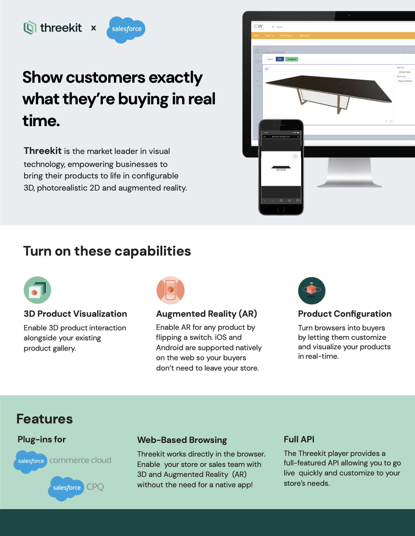
What works: Strong visual hierarchy with clearly defined components and minimal copy.
In this general one-pager example, Threekit briefly explains what it does and how it integrates with Salesforce. It uses a variety of visual elements, including mockups and illustrated icons, to break up the text and show what the company's product looks like in action. Each component is clearly defined with three separate background colors, making it easy to scan. Minimal copy gets the point across, and the largest title and image sit at the top of the page to establish a clear visual hierarchy.
Product one-pager example

What works: Callout boxes, illustrations, and an eye-catching header image.
This product one-pager example from CAT is a little more text-heavy, but it uses callout boxes and illustrations to break things up—plus, the bullet points make it easier to scan. The eye-catching header image is impressive, and there's also a clear headline and CTA.
B2B one-pager example

What works: Customer success story format and colorful stats that stand out.
Customer success stories and testimonials make for great B2B one-pagers. SAP packs a lot of text on here, but it also keeps the document visually appealing with photography, colorful stats, and bullet points.
Consulting one-pager example
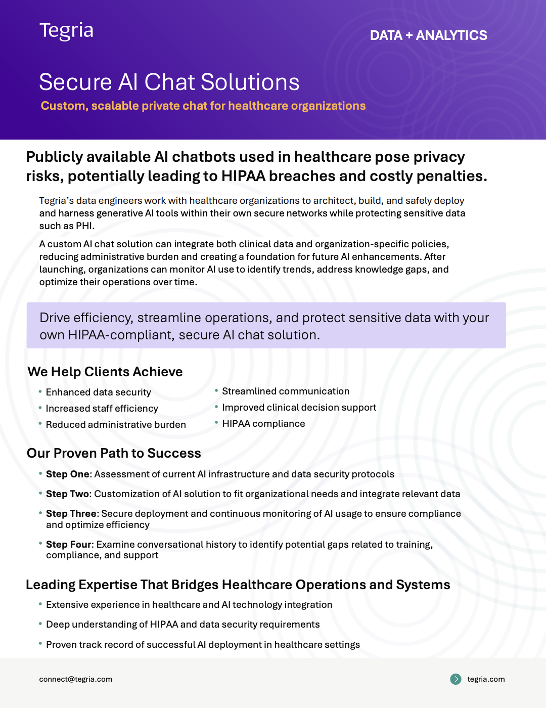
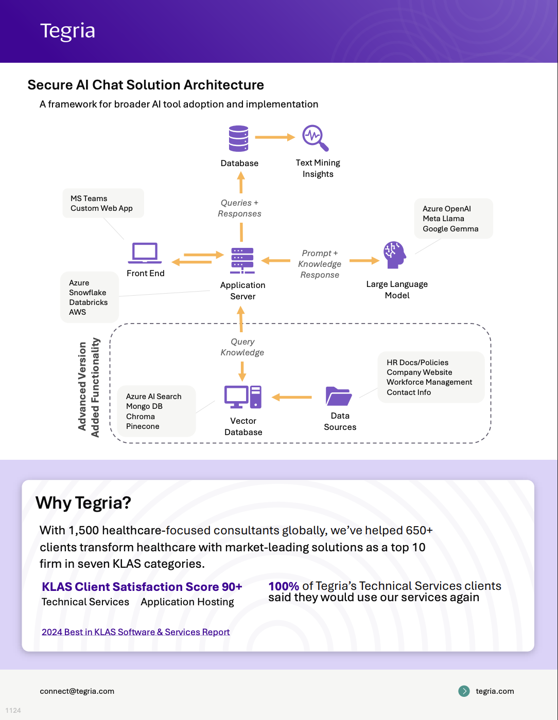
What works: A clear four-step process, an illustrated solutions framework, and strong credibility stats.
This one-pager example is technically two pages, but it packs a lot of info into it. It leads with a bold problem statement and immediately follows it up with a solution and a clear four-step process. The one-pager also includes an illustration to visually explain how the solution works. It also establishes credentials with specific stats like "we've helped 650+ clients transform healthcare." These credibility signals help prospective clients feel confident about choosing them as a partner.
Learning and development one-pager example

What works: High-contrast color palette, clear numbering, generous white space, and concise definitions.
This one-pager example shows definitions for several key learning and development terms. It's a resource to help HR teams conduct L&D, and it conveys a lot of information in a readable, eye-catching format (which is really what any good one-pager should accomplish).
While you can only do so much with a list of definitions, it doesn't hurt to make them easy to read. The classic color contrast of orange and blue shades does wonders here, as does the clear numbering and use of white space. The definitions themselves are short and to the point—perfect for a quick reference or review.
Educational one-pager example

What works: Four digestible sections with horizontal tabs, making a text-heavy topic scannable.
This example shows how one-pagers can be used in the classroom. The information is geared toward teachers, but similar principles could apply to showing students how to share feedback with their peers.
It's heavy on text, but it's broken into four digestible sections with horizontal tabs on the right: overview, strategies, peer feedback, and tools. You can also use a one-pager like this in business settings to communicate learnings from seminars and workshops.
Personal one-pager example

What works: Visual flair that elevates a standard resume format.
Ok, this isn't technically an example from the real world, but it's a good example nonetheless (and you can use an AI resume builder to quickly help you make your own version).
Think of a personal one-pager as a spruced-up portfolio or CV. If you're a freelancer, contractor, or job applicant looking for your next gig, being more visually interesting than the average resume can give you a leg up. This example has all the details you'd expect: contact info, work experience, education, and skills. But it's also got a good deal of visual flair.
Related reading:
This article was originally published in October 2023 and has also had contributions from Dylan Reber. The most recent update, with contributions from Jessica Lau, was in April 2026.


