Spreadsheets offer powerful analysis capabilities, but sometimes it feels like they're missing that extra layer of insight. When there's a massive amount of data, it's tough to summarize or draw conclusions from a basic spreadsheet view.
That's where pivot tables come in. Most Excel power users use pivot tables as their bread and butter. But you can also use pivot tables in Google Sheets.
Here, I'll walk you through how to create and use pivot tables in Google Sheets.
Table of contents:
Debating between Microsoft Excel and Google Sheets? Check out our app showdown to find out which is right for you: Google Sheets vs. Excel.
What is a pivot table in Google Sheets?
A pivot table in Google Sheets is a built-in spreadsheet tool that lets you reorganize, summarize, and analyze large datasets based on whatever dimensions you choose.
Think of it this way. Normal spreadsheets typically have "flat data" represented by two axes: horizontal (columns) and vertical (rows). For example, a sales team might track their sales in individual rows, with each column offering different information about that sale. A pivot table shifts (or pivots) those axes to introduce a third dimension. So instead of looking at individual sales, you can see aggregated data like how many units each sales rep sold per product.
While you could pull many of these insights using formulas, the pivot table allows you to distill it in a fraction of the time and with less chance for human error.
How to create a pivot table in Google Sheets using Gemini
The mechanics of creating a pivot table in Google Sheets are pretty straightforward. Knowing which elements to plug in where—so your pivot table actually surfaces the information you care about—is a different story.
If you want to save yourself the headache, just tell Gemini what you want to know, and it'll build the pivot table for you.
Here's what Gemini created when I asked it to create a pivot table and tell me how much we billed in 2025 for each client across different project types. (It's one sentence versus the multiple steps I'm about to walk you through for the same results.) Gemini even automatically generated a summary of how the data was used to build the pivot table.

How to create a pivot table in Google Sheets manually
If you're more of a DIY-er, respect—I admire the commitment and wish I had it. Here's how to create a Google Sheets pivot table step by step.
As a reminder, this is the question we're asking: How much did we bill in 2025 for each client across different project types? To follow along, grab our demo spreadsheet.
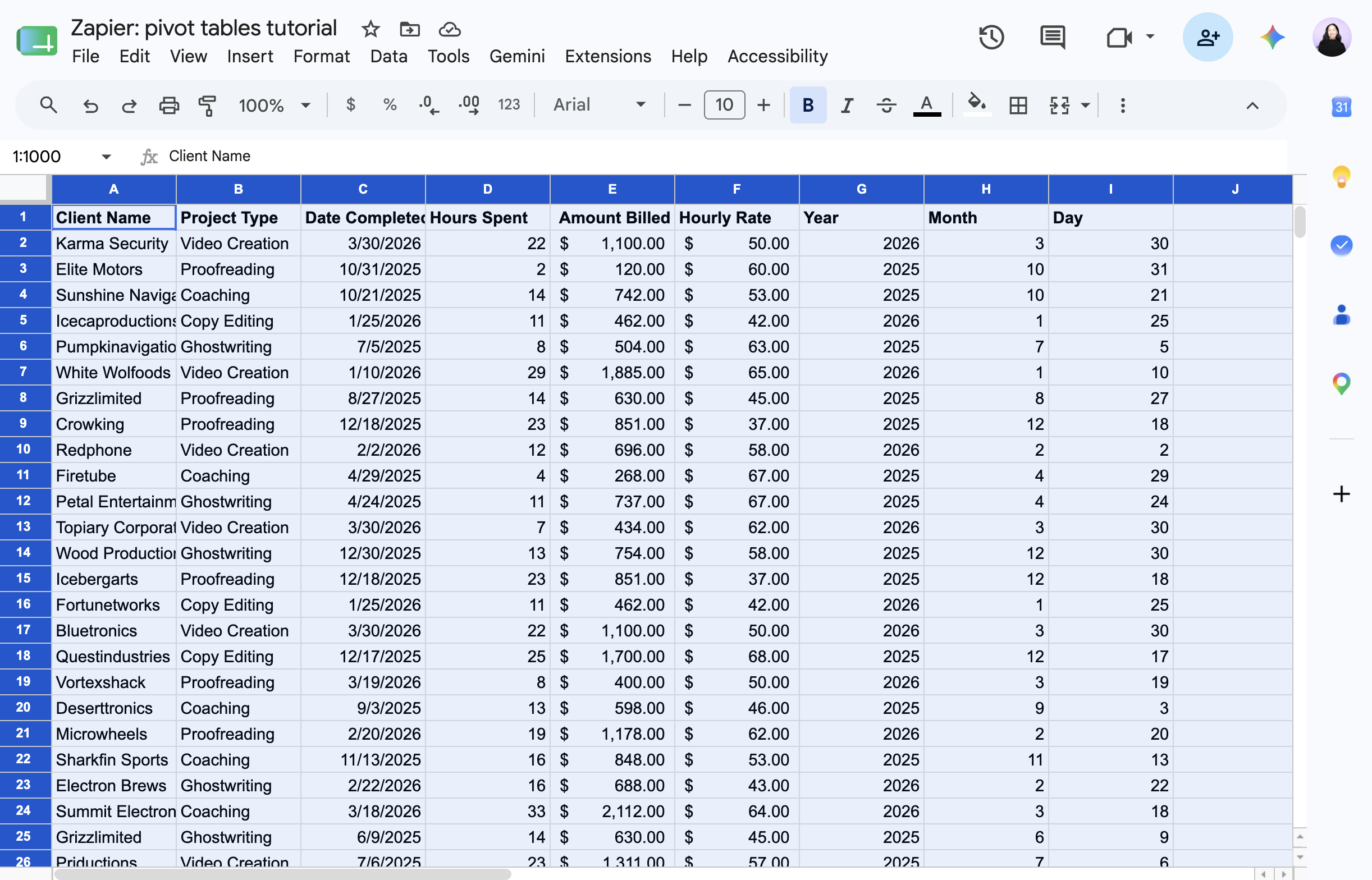
Select the dataset, including the column headers, that you want to summarize or analyze. If your data set contains columns without headers, you'll need to name these columns in order to create a pivot table.
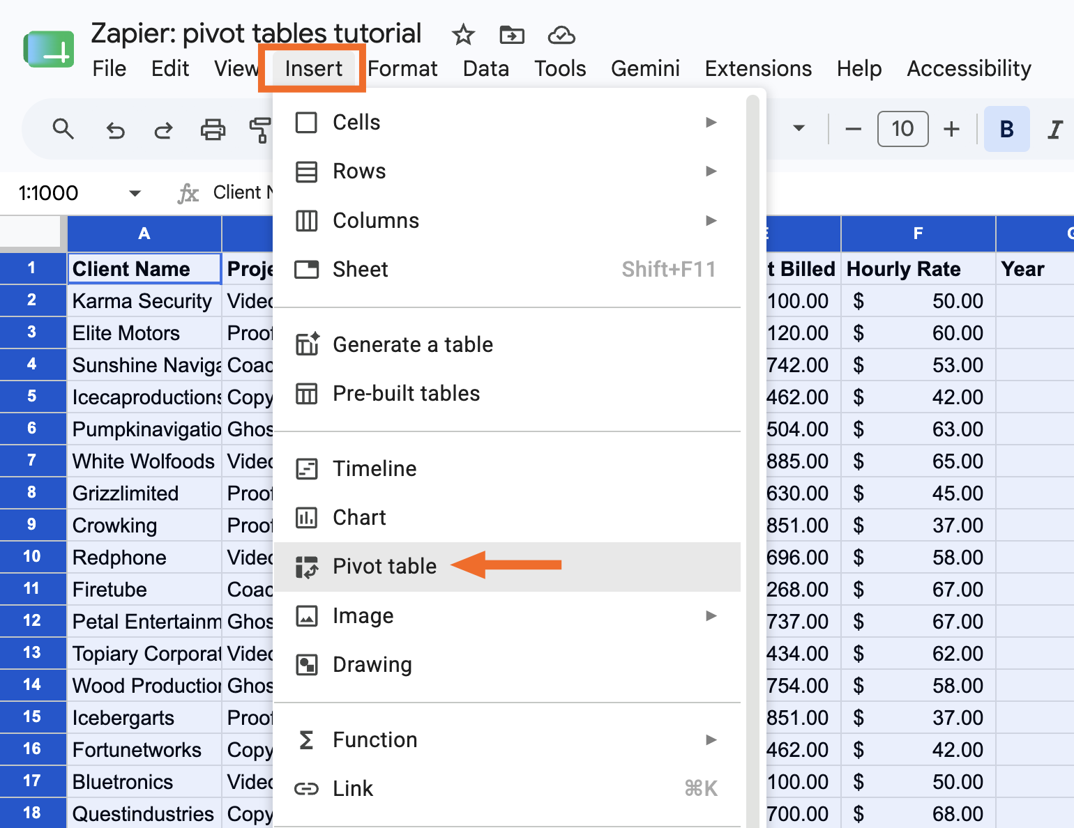
Click Insert, and select Pivot table.
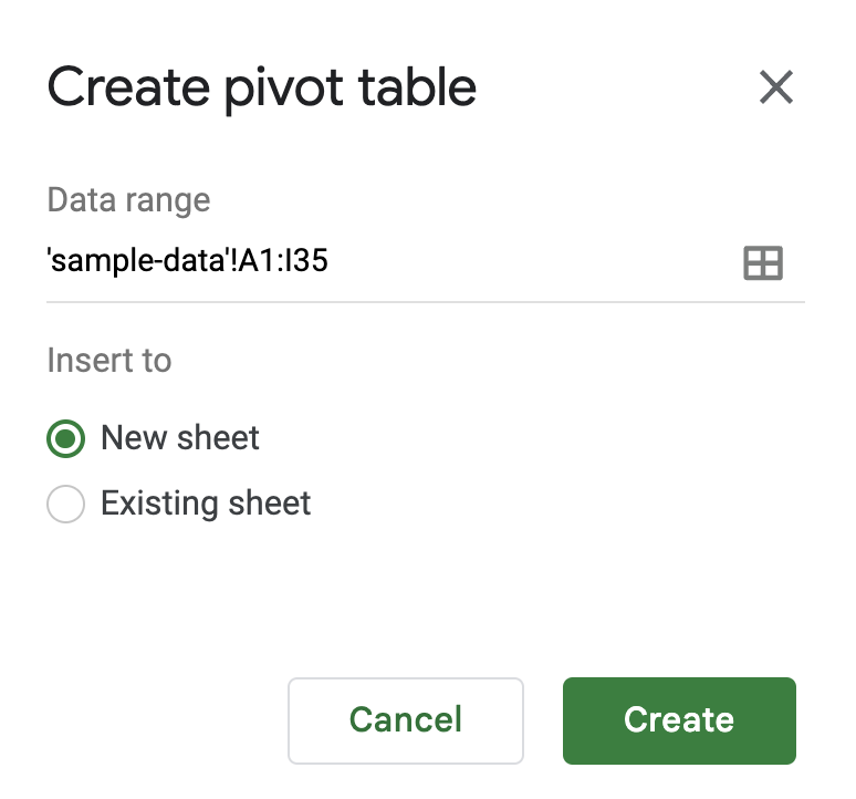
In the Create pivot table panel that appears, choose if you want to insert your pivot table into a new sheet or an existing sheet. Then click Create.
In the Pivot table editor panel that appears, you'll see a few elements you can add to configure your pivot table.
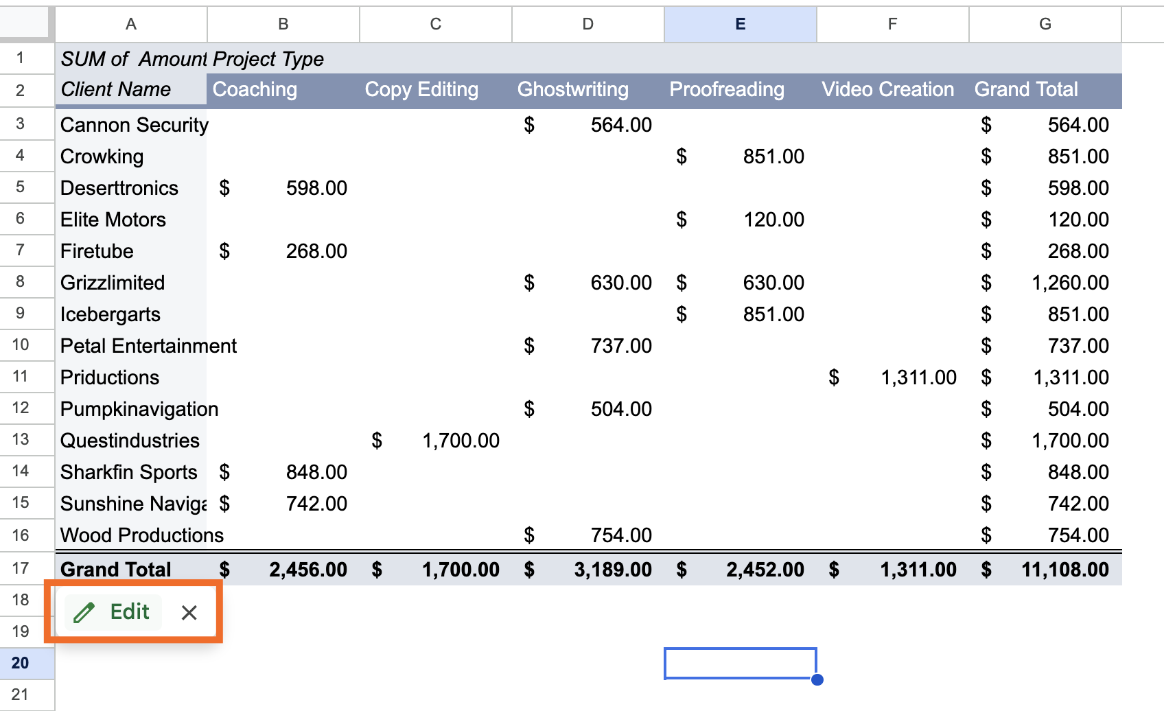
Rows: Choose which field you want to list down the left side of your pivot table. Google Sheets will pull every unique value from that field and stack them as rows. In our example, that's Client Name, so each client gets its own row.
Columns: Choose which field you want to spread across the top of your table. Each unique value will become its own column header. In our example, that's Project Type, so each project type gets its own column.
Values: Choose what number you want to see where each row and column meet. You can show these values in different ways (sum, average, count) depending on the value type. In our example, we want the SUM of Amount Billed, so each cell shows the total billed for that client and project type.
Filters: Choose a field to limit which data gets included in your table at all. In our example, we filter by Year and select only 2025.


That's it! Now you have a pivot table that answers the question, "How much did we bill in 2025 for each client across different project types?"
How to refresh a pivot table in Google Sheets
Let's say you've edited your original source data. These changes should automatically be reflected in your pivot table. If you don't see the changes reflected, refresh your web page. It may take a minute depending on the volume of data.
If you've added new rows or columns of data to your original source data, however, a simple refresh won't do the trick. Instead, you need to update your pivot table's data range to include the new rows or columns.
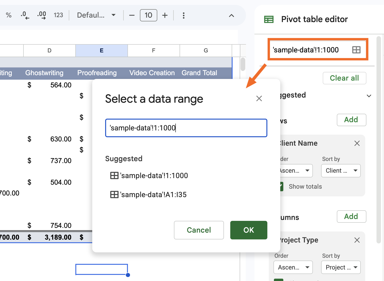
Hover over the pivot table, and click Edit.
Click the Select data range icon at the top of the panel, and enter your new data range.


How to create and use pivot tables in Google Sheets: FAQs
Still have questions about how to use pivot tables in Google Sheets? Check out the answers to these frequently asked questions so you can get the most out of your spreadsheets.
Do pivot tables update automatically in Google Sheets?
Yes, with one caveat. If you edit existing cells within your data range, changes will automatically show up in your pivot table. If you add new rows or columns outside of it, you'll need to manually update the data range first.
Can a pivot table pull from multiple worksheets?
Pivot tables in Google Sheets can only reference a single worksheet. If you want your pivot table to reference data from multiple worksheets, you need to first combine that data into one worksheet. Then, you can create a pivot table as you normally would.
Can you have two pivot tables in one sheet?
You can insert multiple pivot tables into one Google Sheets worksheet.
Create a pivot table as you normally would.
In the Create pivot table panel that appears, select Existing sheet, and enter the worksheet and cell where you want to add your new pivot table.
Click Create.
Can you merge two pivot tables?
There's no way to merge two pivot tables in Google Sheets, but there is a workaround. Combine the original source data for both pivot tables into one worksheet, and then create a new pivot table.
Automate Google Sheets with Zapier
Pivot tables are only as good as the data behind them. Zapier connects Google Sheets to 9,000+ apps, so you can automatically pull in data from wherever you need it, including form submissions, CRM updates, and ad leads.
And if you're already working in Claude, ChatGPT, or another AI tool, Zapier MCP lets you go further: you can ask your AI assistant to pull data from your connected apps, update your spreadsheet, or practically anything else you can think of, all without leaving your chat window. You could even ask it to figure out which client you billed the most in 2025, pull up their contract in Docusign, and draft a renewal email. Discover more ways to automate Google Sheets.
Related reading:
This article was originally published in September 2018 by John Thomas. The most recent update was in June 2026.