
One of Google Sheets' many hidden features is its timeline view. While it has disappointingly few (some might say none!) flux capacitors, lightning rods, or world-ending paradoxes, it does allow you to create a Gantt chart in Google Sheets, filling in a feature gap that Sheets has had for a few years now. And you don't even need to source any plutonium to power it.
What is a Gantt chart in Google Sheets?
A Gantt chart in Google Sheets is actually just the timeline view. It's a direct result of Google's switch to canvas-based rendering. Put briefly (I'll put it not-briefly in a second), it's a new way of viewing your spreadsheet data chronologically, rather than in millions of tiny cells. It helps you make sense of the world in a way that might actually, you know, make sense.
Google Sheets Gantt chart template
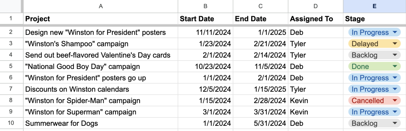
I'm nothing if not full of Google Sheets templates, so here's a Gantt chart template to get you started. You'll need to customize the columns and tinker with the settings to get it exactly how you want it, but this should give you a head start.

How to make a Gantt chart in Google Sheets
People have been trying to make Gantt charts in Google Sheets for a while (as evidenced by the surprising number of people searching for it every month). Google heard them loud and clear, and even though it's called a timeline, it's really a Gantt Chart.
Here are the step-by-step instructions for how to create a Gantt chart in Google Sheets. I'll use the template above to walk through it, but the steps will work the same in your own spreadsheet.
Open any Google Sheets file that has at least one date column.
Go to Insert > Timeline, and you'll be prompted to select a range of data to create the timeline from. I recommend including your entire data set, so you have more to work with in the settings—either way, remember to include at least the date columns.
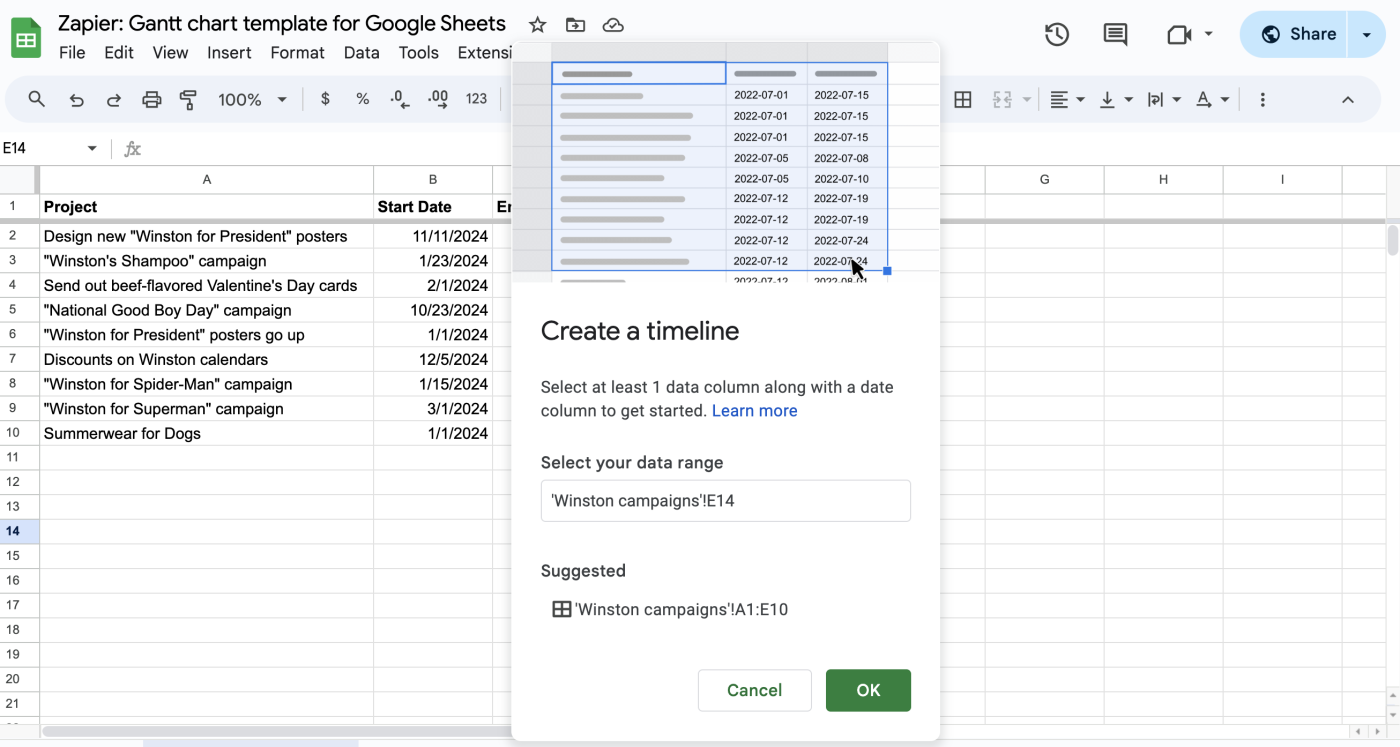
Click OK.
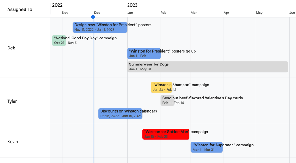
Even though the menu is called Insert, it will create a new tab in the spreadsheet, where the selected data is turned into a horizontal "timeline."


To me, the result looks as though you're cutting together your spreadsheet in Final Cut Pro at 3 a.m. for the third day in a row and the director has stopped returning your calls and you've just eaten an entire family-size bag of Swedish Fish and the last scene in this project that's due tomorrow just isn't coming together aaaaAAAAAAHHHHHHHHHHHHHHH. Sorry, just flashed back to film school for a second there.
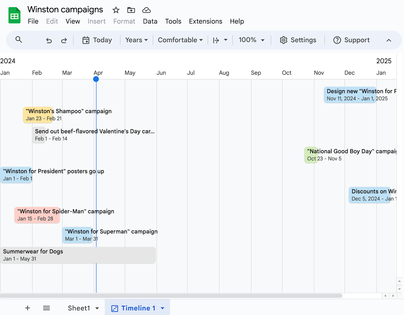
The point is: now you're viewing the spreadsheet with relation to time, rather than row number. The new things you see are called cards, and they're organized from left to right based on the first date column in your selection.
It makes it easy to see at a glance if—as is the case in this example—you have a lot going on during one period and not a lot during another. But you can get even more granular.
Adjust the settings for your Google Sheets Gantt chart
Click into Settings if it's not already open. From there, you can tweak your Gantt chart based on a few things.

If you included an end date (like in the template), it should automatically detect that. The cards will stretch out based on any second date column (either an end date, a duration in days, or a time frame in hh:mm:ss format). You can always tweak which columns are powering your Gantt chart.
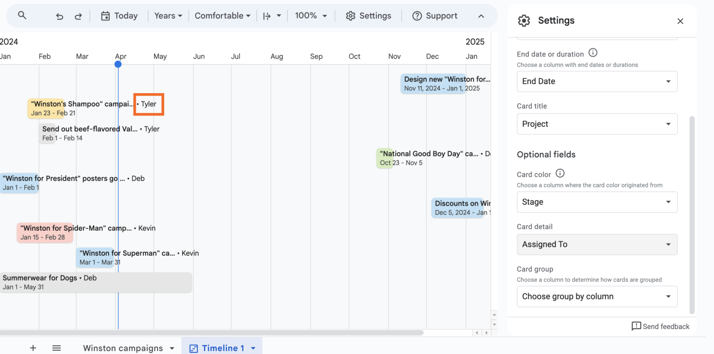
You can group your Gantt chart based on another column. This lets you do things like see who's in charge of each initiative.
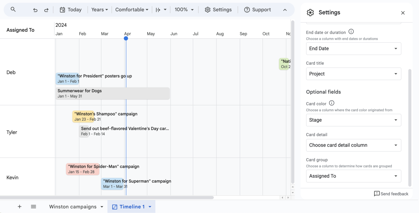
You can change the view to look at it by day, week, month, quarter, year, or just what's up for today.
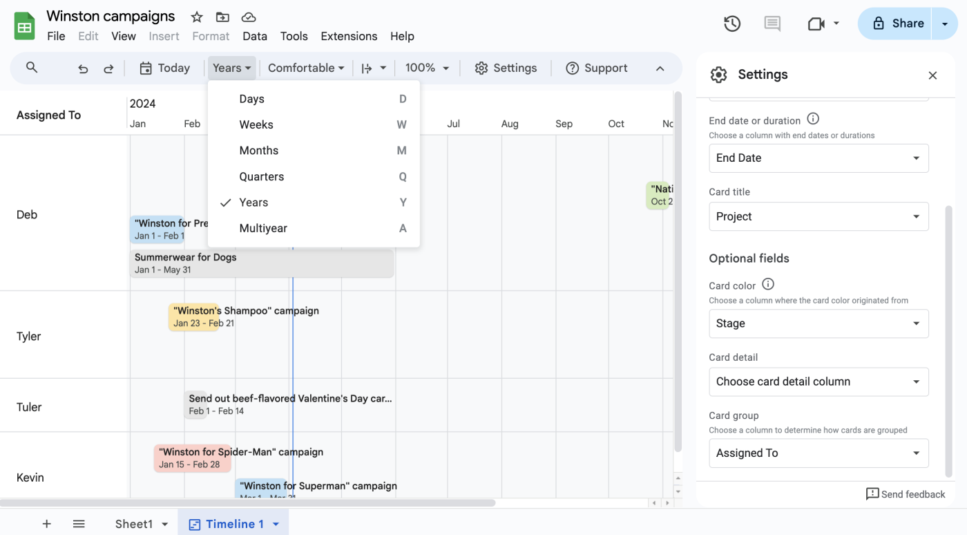
Cards can be colored based on conditional formatting from the original sheet (or, in the case of the template, the color of the dropdowns), letting you do things like turn a card red if it has unfinished related tasks, or green if it's been finished successfully. (Note: only the background color changes, while the font color stays black, so stick to lighter colors to retain legibility.)
You can add details to your cards, so you can see extra information at a glance.


Why use a Gantt chart in Google Sheets?
The target market here seems to be project managers, and if you're a PM reading this right now, there's a good chance you already have strong opinions about this feature. I do think there are a lot of interesting possibilities beyond project management, though.
To-do lists. Non-controversial opinion: Deb at Zapier was right, and you should be using Google Sheets as a to-do list. Adding a timeline view can not only help you see what needs to get done now; it might give you a better look at what you've already done (and not enough to-do lists celebrate past success, IMO).
Dashboards. If you're not a project manager, reading a spreadsheet filled with due dates probably isn't something you're used to (or enjoy). This quick solution provides a visual way to track where things have been, where they're at now, and where they're going next.
Visualization of time. I'm enamored with spreadsheets made for purely personal use, like Maxwell Neely-Cohen's spreadsheet of songs stuck inside his head when he wakes up in the morning. This feature makes me imagine spreadsheets filled with small journal entries, Butterfly Effect-style, visualized on a cascading and shifting timeline as life goes on.
Why use a Gantt chart in Google Sheets instead of another app?
The big draw here is that Google Sheets already integrates with everything—including Zapier—making it easy to pull in data from existing spreadsheets or other apps and jump straight into a usable timeline. If you don't have that data in Google Sheets yet, here are a few common workflows to get you started.
Save new Gmail emails matching certain traits to a Google Spreadsheet
Add new Facebook Lead Ads leads to rows on Google Sheets
Send emails via Gmail when Google Sheets rows are updated
Create Google Sheets rows for new Google Ads leads
Of course, plenty of other apps integrate with Zapier, and a lot of them—especially project management apps—have built-in Gantt chart views.
So it's also important to remember that Google Sheets has something like 500 functions now, and the ability to create your own functions with Google Apps Scripts. That means that you can make all of the data going into the cards fully dynamic, such as using the NOW() function to stretch a card from its start date to the current time, or using DAYS() to see how close you are to a due date and change a card's priority accordingly. This tutorial just covered the basics, but there's a lot more you can do here.
Lastly, there's a good chance that you or your team is already using Google products. Even though it's "just a Gantt chart," it's a Gantt chart in a product you already have access to, which isn't nothing. If you've ever had to walk a teammate through a new app's features, or make sure that your boss remembers their password for something they haven't touched in months, the relief of knowing that everything is in one place is almost palpable.
Why wouldn't I use Google Sheets for my Gantt chart?
I'm "The Google Sheets Guy" at work (it's my own fault), and I'm aware that a lot of this may seem like lengthy free advertising for Google. But I want to make this point as clear as I can: no matter how many features they add to it, Google Sheets is still "the spreadsheet tool." It's not "the survey tool" or "the apps script tool," for example.
While being a proverbial Jack of all trades isn't a bad thing, it does mean that it might not immediately replace other apps that push the Gantt chart as a primary feature, like ClickUp or monday.com. Apps that built themselves up around the Gantt chart are likely going to have more—and more stable—tools for building this kind of view, if that's something you rely on.
It's also not a silver bullet for organizations: the timeline cards aren't overly accessible or customizable, meaning that users who rely on screen readers or vertical organization may continue to prefer the default spreadsheet view. This won't replace the need to keep your data clean, sorted, and meaningful. (Sorry!)
We have to go back, Marty! Back… to the spreadsheet!
Will Gantt charts revolutionize the way you work? Maybe not. But they're a good reminder that a spreadsheet is often more than it appears to be on the surface. When done well—meaning with clear intention, rigorous testing, and descriptive values—they can be a vision of the past, present, or future that we want to build for ourselves and others.
Making a spreadsheet isn't just lumping numbers into a grid. It's a way to tell a story, whether that's about your business, your profits, your projects, or your dreams. And even if a Gantt chart in Google Sheets is just another canvas for telling that story, I'll take all the canvases I can get.
Related reading:
This article was originally published in December 2022. The most recent update, with contributions from Deb Tennen, was in April 2024.


