Every time I use Microsoft Excel, I immediately start humming "Dilemma" by Nelly and Kelly Rowland. (And yes, I'm a millennial, thanks for asking.)
In an iconic scene in the 2002 music video, Kelly gets upset that Nelly hasn't responded to her text. But when the camera cuts to her phone screen, it shows she used Excel to text him. Yes, Microsoft Excel—the spreadsheet software—to send a text message.

If only Kelly had used Excel's forecasting capabilities with historical data, she could have predicted a 0% response rate when messaging through spreadsheets. A simple trend analysis would have saved her from the infamous Excel texting debacle that's now immortalized in meme history.
While Excel can't send texts to your early aughts crush, it can help you predict the future in other, more practical ways. In this post, I'll show you how to forecast in Excel based on historical data, from basic functions to advanced features. And unlike Kelly's Excel misadventure, these methods actually work.
Table of contents:
Prepare your historical data
Before you can forecast accurately, your data needs to be clean and well-structured. Garbage in, garbage out is the golden rule here—even the most sophisticated forecasting tools can't overcome messy, inconsistent data.
The first step is ensuring your data is properly formatted. For time-series forecasting (predicting future values based on historical trends), follow these best practices:
Keep your data in a continuous format, with one column or row for time periods (like dates) and an adjacent column or row for values.
Maintain consistent time intervals—daily, weekly, monthly, or whatever fits your needs.
Eliminate errors or gaps that could throw off your forecast, like missing values, duplicate entries, or formatting inconsistencies.
I always convert my data range into a proper Excel table (just select your data and press Ctrl+T or command+T) before forecasting. This gives you dynamic range benefits, meaning your formulas will automatically update as you add new data. Plus, tables just make everything look nicer.
Forecast using the FORECAST.LINEAR function
If you're new to Excel forecasting, the FORECAST.LINEAR function is a great place to start. It's like a crystal ball within Excel, predicting future values based on the assumption that your data follows a straight-line trend.
The steps outlined below work in both the desktop and cloud versions of Excel. The FORECAST.LINEAR function and functionality are nearly identical across versions, with only minor interface differences.
This Excel forecast function uses this syntax:
=FORECAST.LINEAR(x, known_ys, known_xs)
xis the future point for which you want a prediction (like a future date)known_ysis your historical values (sales, website visits, etc.)known_xsis your historical time periods (dates or numbered periods)
Here's how to use the FORECAST.LINEAR function:
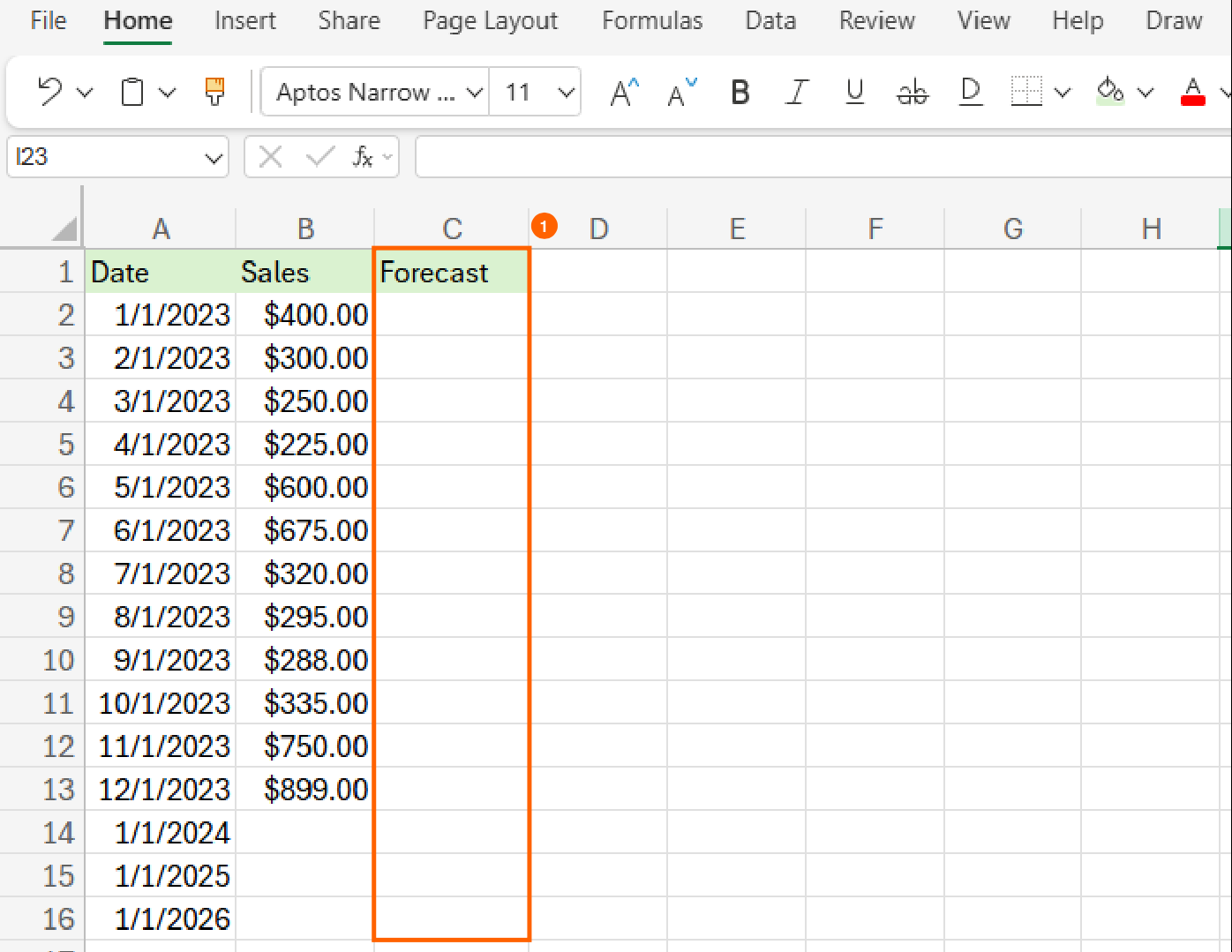
Create a column for your forecast, and add the dates you'd like to forecast in the Date column.
Type the formula,
=FORECAST.LINEAR((with an open bracket) in the Forecast column in the cell corresponding with the future date.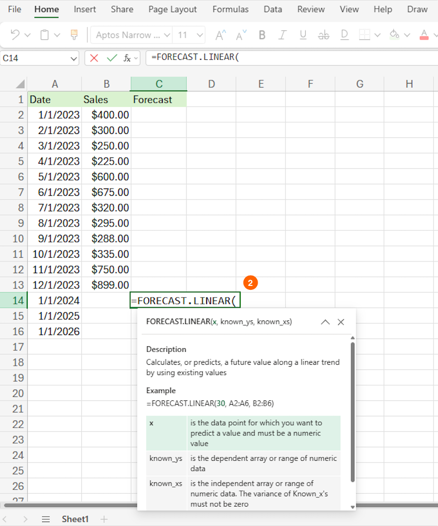
Click on the corresponding future date, and add a comma. Now, your formula will look something like
=FORECAST.LINEAR(A14,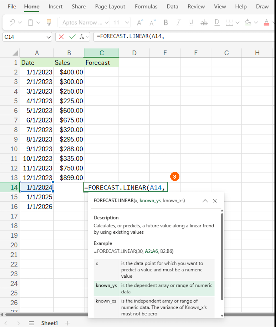
Select the historical sales data range. That will change your formula to something like
=FORECAST.LINEAR(A14,B2:B13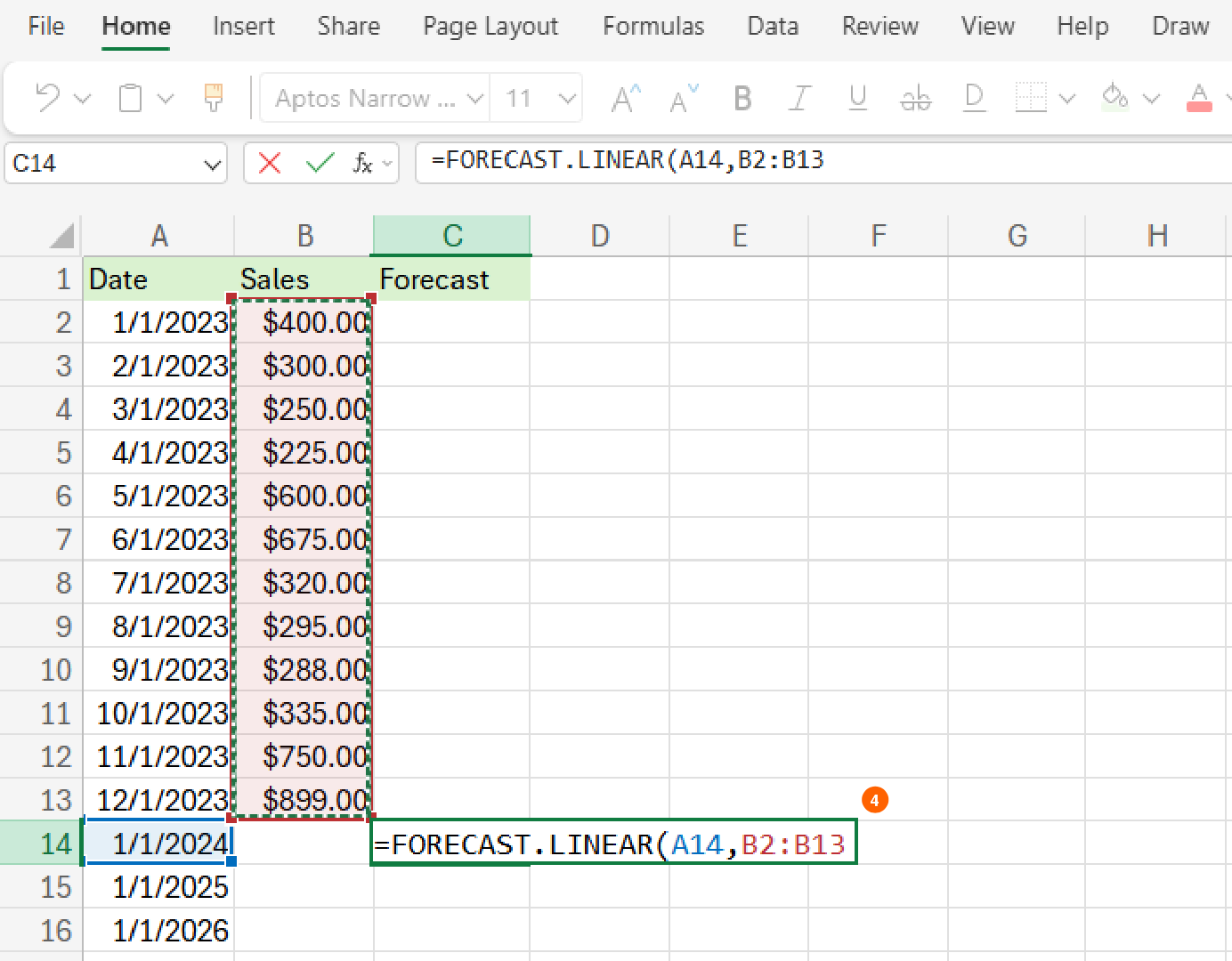
Press
F4(orfn + F4on a Mac) to keep the sales data range fixed when you copy the formula to other cells. This tells Excel not to shift the range as you drag the formula down, and it will update the formula to something like=FORECAST.LINEAR(A14,$B$2:$B$13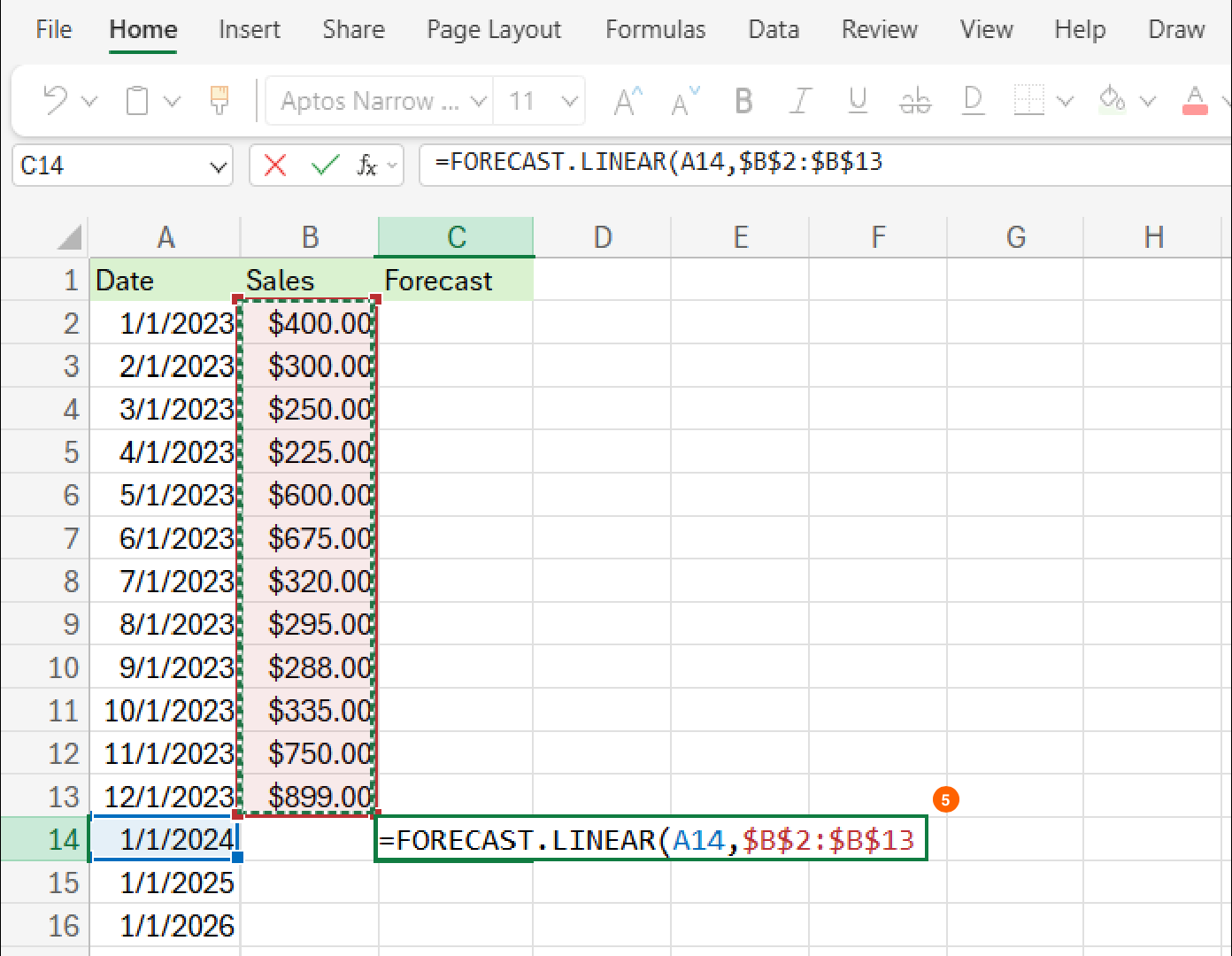
Add a comma, then select the dates from the historical sales data. Press
F4orfn+F4again to lock in the dates, then close the parentheses. Your final formula will look something like this:=FORECAST.LINEAR(A14,$B42:$B$13,$A$2:$A$13)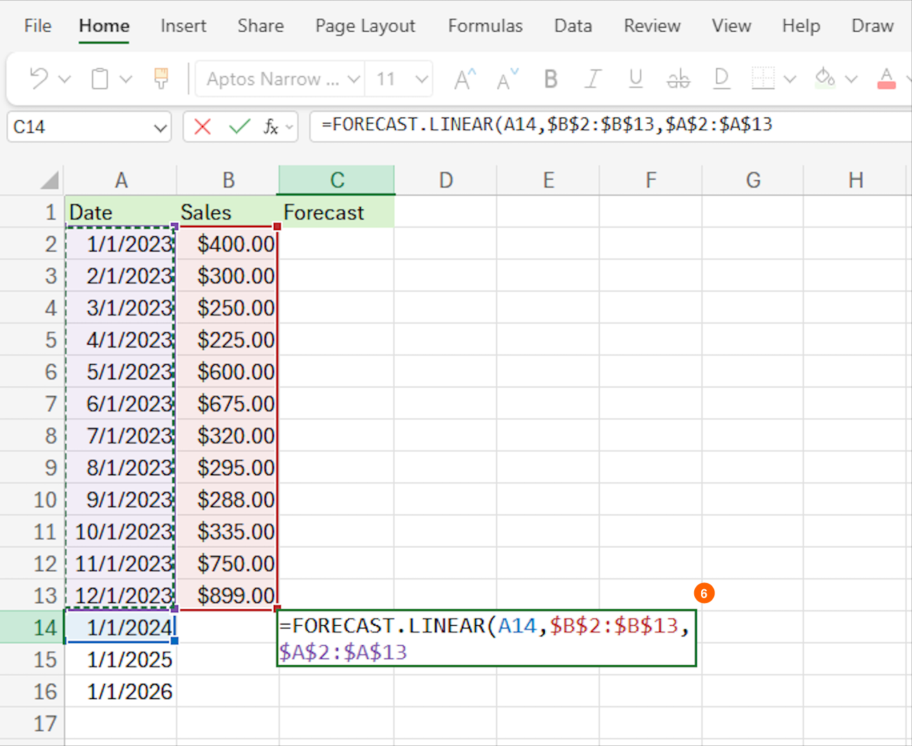
Press Enter to see the forecast.
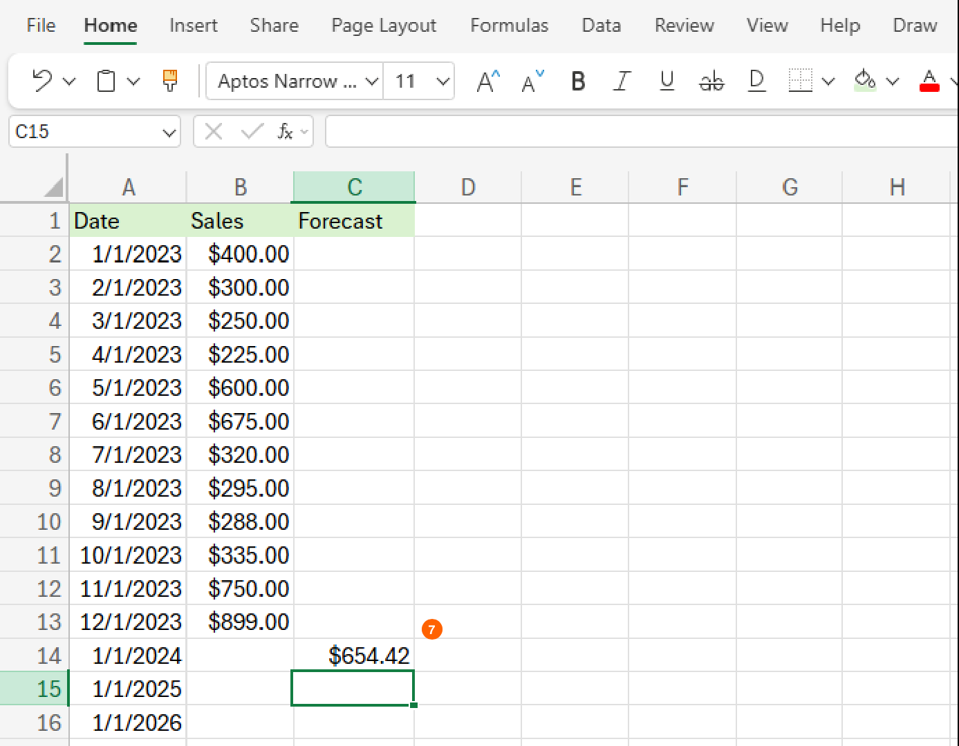
Click and drag the small square in the bottom right corner of the cell down to fill in all future dates.
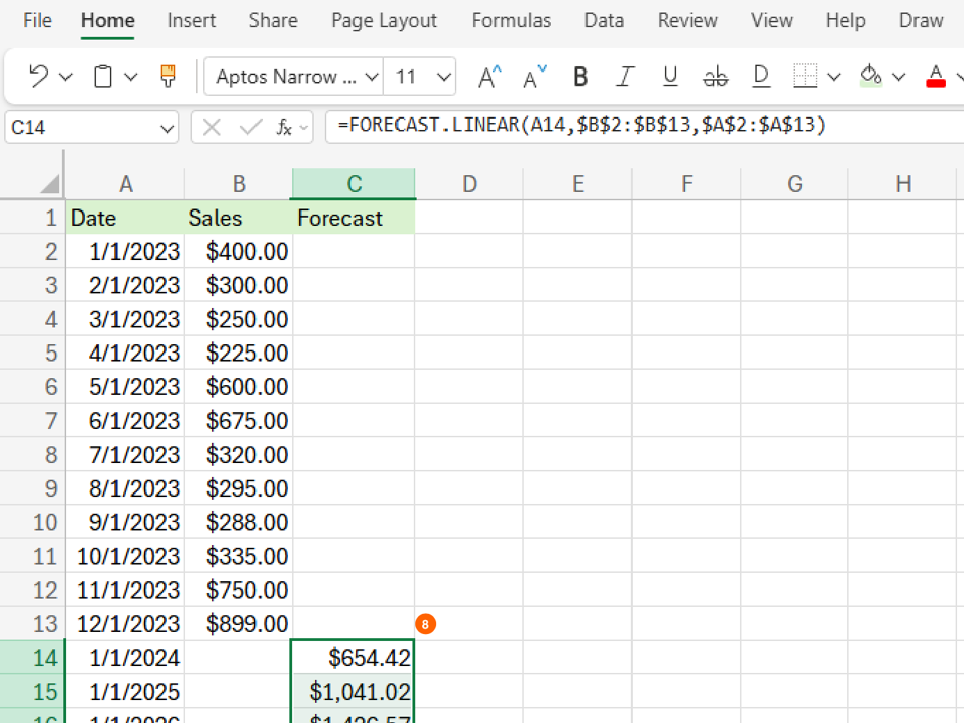


Just like that, Excel draws an invisible line through your historical data points and extends it into the future. It's like connecting the dots, but with math doing the heavy lifting.
If you're curious what's going on behind the scenes, the FORECAST.LINEAR function uses a straight-line prediction method based on linear regression. That means it assumes your data changes at a consistent rate over time and doesn't take into account things like seasonality, trends, or irregular spikes. It's best used when your data follows a relatively steady trend without complex patterns.
Forecast using the Forecast Sheet tool
While the FORECAST.LINEAR function is great for quick forecasts, Excel's Forecast Sheet tool is like upgrading from a flip phone to a smartphone (looking at you, Kelly Rowland). It gives you a complete visual forecast package with just a few clicks—and it even uses AI to help detect trends and seasonality in your data.
Here's how to create a forecast sheet in Excel using this tool:
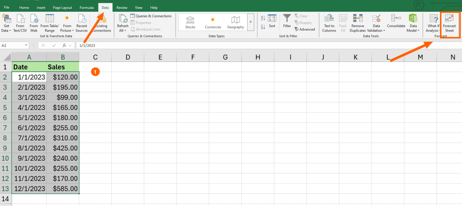
Select the historical dates and data. Make sure your time periods are in chronological order as Excel needs a clean timeline to work with.
Click the Data tab, then click the Forecast Sheet button located in the Forecast group.
As soon as you click this button, Excel immediately generates a preview graph of your forecast based on the selected data. You'll see a line chart by default, but you can choose a bar chart instead by clicking the icon in the top-right corner of the preview.
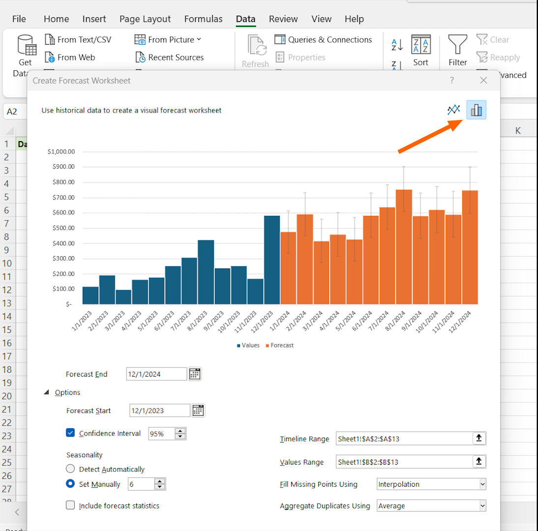
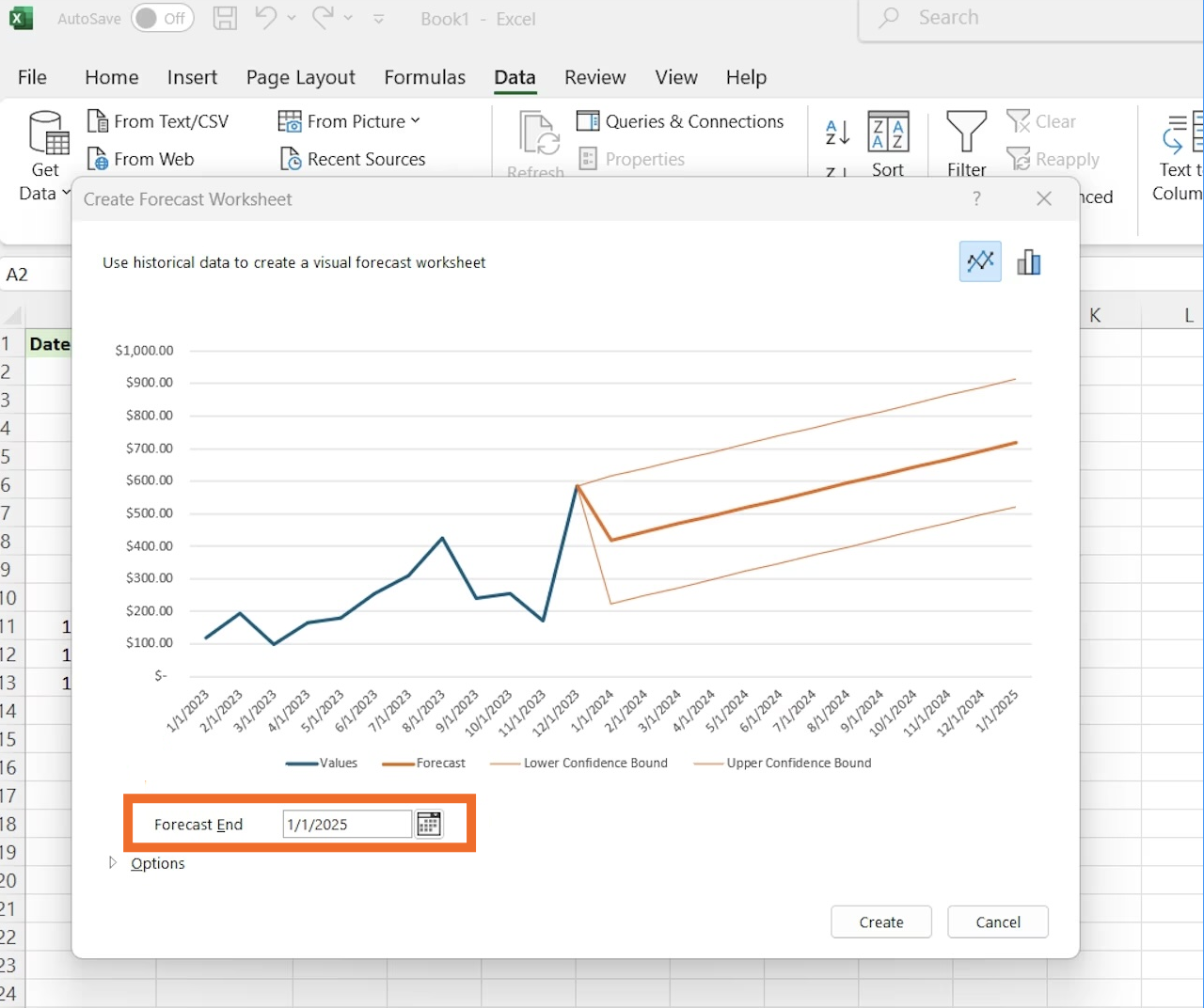
And by default, Excel forecasts a few periods into the future, but you can tailor this by adjusting the end date in the Forecast End field.
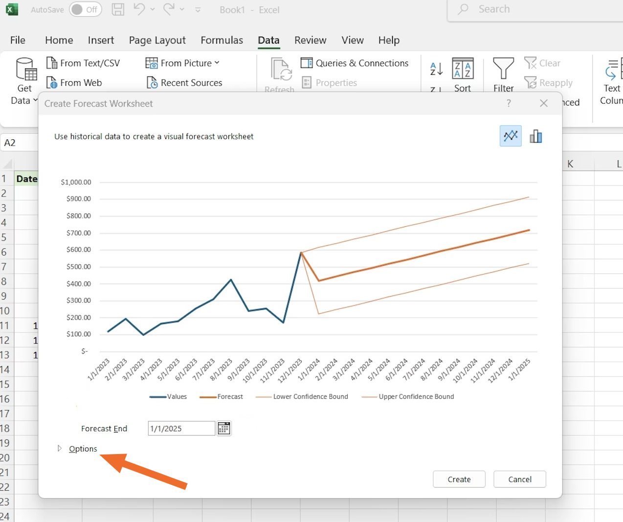
When you create a forecast sheet, Excel makes some assumptions about your data that you might want to tweak. Click the Options button in the Create Forecast Sheet dialog box to access these customization features:
Confidence interval: This controls the width of the shaded area around your forecast line. A 95% confidence interval (the default) is wider but more likely to contain the actual values. For higher-stakes forecasting, stick with 95%. If you want a tighter range, try 80%.
Seasonality: This is where Excel's AI kicks in. It tries to automatically detect seasonal patterns in your data, but you can override this by setting a specific value (like 12 for monthly data with annual seasonality) or turning it off completely for non-seasonal data.
Missing points: If your historical data has gaps, Excel can fill them in before forecasting.
Aggregate or remove duplicates: If multiple data points exist for the same time period, Excel can combine them.
Since our data showed spikes in August and December, I selected Set Manually under Seasonality and entered a six-month range. As you can see, the forecast reflected the historical data more accurately.
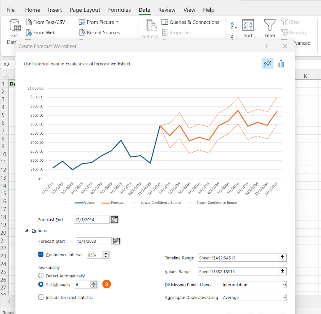
Click Create to generate your forecast sheet.
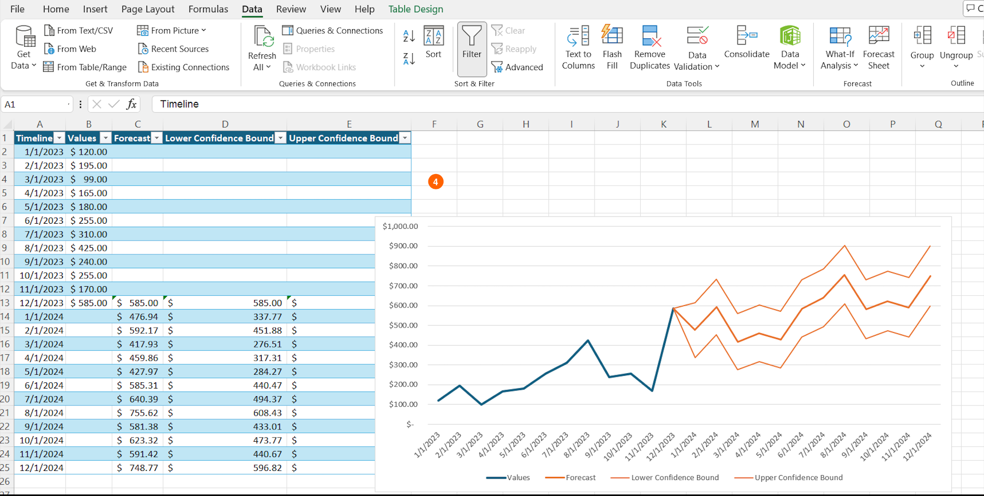


Excel will open a new worksheet with your forecast. At the top, you'll see a chart: historical data appears as a solid line, forecasted values as a dotted line, and the confidence intervals as a shaded band around the forecast. Below that, you'll find a table listing your original data and the projected values for future periods.
Forecasting with AI in Excel
If FORECAST.LINEAR is like having a calculator and Forecast Sheet is like having a graphing calculator, then Excel's AI features are like having a data scientist at your disposal.

Using Excel with Microsoft Copilot, you can simply type natural language prompts like:
"Forecast our quarterly sales for the next year based on the last three years of data"
"Show me a forecast of inventory needs with seasonal adjustments."
Copilot interprets your data, applies appropriate forecasting models, and generates both predictions and visualizations—no formulas required.
To use it, just open the Copilot pane in Excel (you’ll find it in the ribbon), and type your prompt in the sidebar. From there, Copilot analyzes your spreadsheet, identifies relevant columns, and delivers results directly into your workbook—often in the form of a table, chart, or new sheet.
Copilot can even detect patterns that might not be obvious to the human eye. While traditional Excel functions assume linear relationships or require you to specify parameters like seasonality, AI can automatically identify complex patterns like seasonal fluctuations, cyclical trends, or even the impact of outliers.
Some things to keep in mind:
Excel Copilot is only available in Microsoft 365 enterprise and business plans—it's not included in standalone or free versions of Excel.
Access depends on your organization's IT permissions. If you don't see Copilot in your ribbon, check with your administrator to confirm whether it's included in your plan.
Of course, AI forecasting isn't perfect. It still needs clean, quality data to work with and should be double-checked to make sure everything is accurate. But if you've properly prepared your data, Excel's AI tools can help you uncover insights and predictions that might otherwise require advanced analytics or specialized statistical software.
Bonus tips for Excel forecasting
After years of forecasting in Excel, here's some expert advice that might save you a headache or twelve.
1. Understand your data's behavior before choosing a forecasting method
If your historical trend looks like a roller coaster, a simple linear forecast will be about as accurate as predicting the weather by looking out the window. The FORECAST.LINEAR function works best for steady, consistent trends—not for seasonal or highly variable data.
2. For data with seasonality, use the right tools
If your data follows seasonal patterns (like retail sales that spike during holidays), use Excel's FORECAST.ETS function or Forecast Sheet with seasonality enabled.
Unlike FORECAST.LINEAR, which assumes a straight-line trend, FORECAST.ETS applies exponential smoothing, giving more weight to recent data points to account for seasonal variations.
While FORECAST.LINEAR is a great general-use tool for steady trends, Excel offers other forecasting models for different scenarios, such as:
FORECAST.ETS.CONFINT: Generates confidence intervals around ETS forecasts
FORECAST.ETS.SEASONALITY: Detects seasonality patterns in data
FORECAST.ETS.STAT: Returns statistical details about ETS forecasts
If you're dealing with highly irregular patterns, external factors, or multiple influencing variables, you might need more advanced modeling, such as regression analysis or machine learning-based forecasting. But for most Excel users, FORECAST.LINEAR is the simplest and best starting point, with FORECAST.ETS as the go-to for seasonality.
3. Be cautious when forecasting far into the future
Most forecasting methods become less reliable the further out you predict. A good rule of thumb: limit forecasts to about 30% of your historical data period. So if you have three years of history, avoid forecasting more than a year ahead.
4. Update your forecasts regularly as new data becomes available
A forecast is a living entity that should evolve with fresh information. I set a calendar reminder to refresh our key forecasts monthly when new data arrives.
5. Always sense-check your results
If your forecast suggests your company will sell more widgets than there are people on Earth, something's probably off with either your data or your forecasting approach.
Simplify Excel with automation
Knowing how to forecast sales in Excel based on historical data makes it easier to get more accurate projections. But let's be real—no one wants the dilemma of constantly updating forecasting spreadsheets manually.
While Excel doesn't automatically refresh forecasts when new data arrives, you can use Zapier to streamline parts of the process. For instance, Zapier can:
Pull fresh sales data from your CRM into your forecasting spreadsheet on a schedule.
Notify your team in Slack, email, or another alert when new data is added, prompting them to review the updated forecast.
Send automated reports by exporting forecast data to another tool, like Google Sheets or an email summary.
Here are some pre-made workflows to get you started.
Add new Jotform submissions to Excel spreadsheet rows
Add new Jotform submissions to Excel as rows in a table
Add new Jotform submissions to Microsoft Excel as rows
With the Excel automations in place, your Excel forecasting becomes a reliable system rather than a periodic scramble—giving you more time to actually use those insights in your business decisions.
Related reading: